Been doing some sleuthing, thanks to a good question on my post of a couple of days ago.

As a followup to the question, I promised to do a bit of research to identify whether there was a correlation between dissatisfaction with standard of living (versus Gross Domestic Product, or GDP) and inequality as measured by the Gini coefficient.
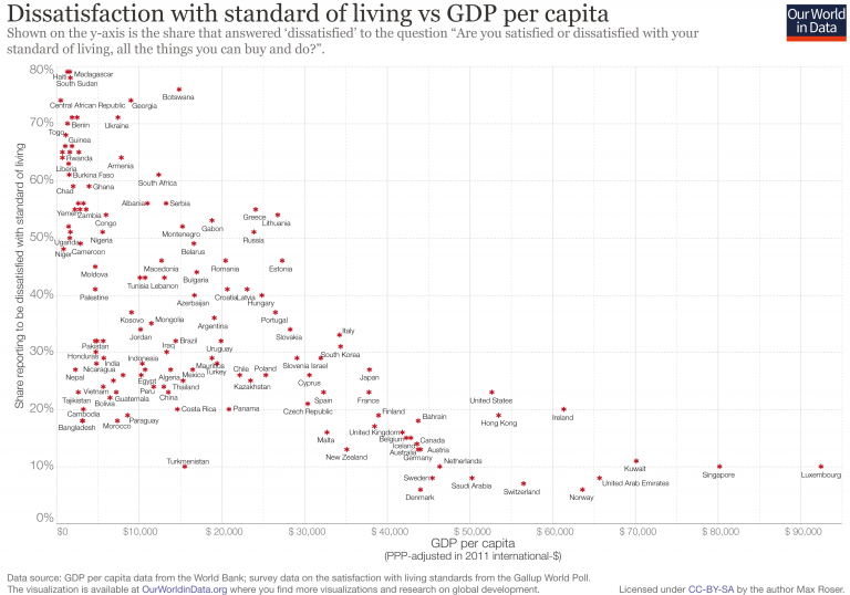
As a reminder, I had picked six countries from a graph showing how lots of countries rank on dissatisfaction with standard of living versus GDP per capita.
Lo and behold, this is how five of the six countries Gini coefficients appear over the period 1980-2015:
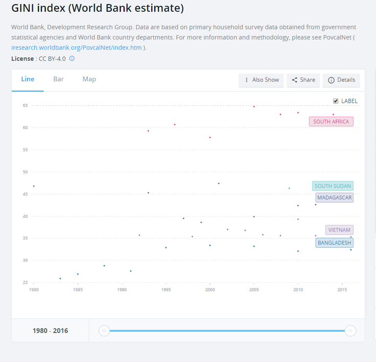
You might have to zoom in to see the dots, but essentially South Africa sits at the top of the pile with the highest Gini coefficient out of the five countries - higher than South Sudan, Madagascar, Vietnam and Bangladesh. Cambodia was the sixth country I picked from the left side of the graph yesterday, but the World Bank doesn't appear to have Gini index data for them.
No matter. You've probably deduced by now, excellent co-sleuths that you are, that the higher the Gini coefficient, the more unequal the society. This gives us another possible reason why South Africans are more dissatisfied with their standard of living (vs GDP) than the citizens of those three countries at the bottom of the first graph, Bangladesh, Cambodia and Vietnam.
Before you ask....
Here's what the World Bank has to say about the Gini coefficient:
Gini index measures the extent to which the distribution of income (or, in some cases, consumption expenditure) among individuals or households within an economy deviates from a perfectly equal distribution. A Lorenz curve plots the cumulative percentages of total income received against the cumulative number of recipients, starting with the poorest individual or household. The Gini index measures the area between the Lorenz curve and a hypothetical line of absolute equality, expressed as a percentage of the maximum area under the line. Thus a Gini index of 0 represents perfect equality, while an index of 100 implies perfect inequality.
Source: World Bank, Development Research Group. Data are based on primary household survey data obtained from government statistical agencies and World Bank country departments. For more information and methodology, please see PovcalNet ( iresearch.worldbank.org/PovcalNet/index.htm ).
The Bank makes some general comments about the sources of the data used to calculate the Gini coefficient:
The World Bank’s internationally comparable poverty monitoring database now draws on income or detailed consumption data from more than one thousand six hundred household surveys across 164 countries in six regions and 25 other high income countries (industrialized economies). While income distribution data are published for all countries with data available, poverty data are published for low- and middle-income countries and countries eligible to receive loans from the World Bank (such as Chile) and recently graduated countries (such as Estonia) only. See PovcalNet (iresearch.worldbank.org/PovcalNet/WhatIsNew.aspx) for definitions of geographical regions and industrialized countries.
The Bank also comments on limitations and exceptions:
Gini coefficients are not unique. It is possible for two different Lorenz curves to give rise to the same Gini coefficient. Furthermore it is possible for the Gini coefficient of a developing country to rise (due to increasing inequality of income) while the number of people in absolute poverty decreases. This is because the Gini coefficient measures relative, not absolute, wealth. Another limitation of the Gini coefficient is that it is not additive across groups, i.e. the total Gini of a society is not equal to the sum of the Gini's for its sub-groups. Thus, country-level Gini coefficients cannot be aggregated into regional or global Gini's, although a Gini coefficient can be computed for the aggregate. Because the underlying household surveys differ in methods and types of welfare measures collected, data are not strictly comparable across countries or even across years within a country. Two sources of non-comparability should be noted for distributions of income in particular. First, the surveys can differ in many respects, including whether they use income or consumption expenditure as the living standard indicator. The distribution of income is typically more unequal than the distribution of consumption. In addition, the definitions of income used differ more often among surveys. Consumption is usually a much better welfare indicator, particularly in developing countries. Second, households differ in size (number of members) and in the extent of income sharing among members. And individuals differ in age and consumption needs. Differences among countries in these respects may bias comparisons of distribution. World Bank staff have made an effort to ensure that the data are as comparable as possible. Wherever possible, consumption has been used rather than income. Income distribution and Gini indexes for high-income economies are calculated directly from the Luxembourg Income Study database, using an estimation method consistent with that applied for developing countries.
Well, that's a mouthful. But it's hard to argue with the trend shown in the South African data from 1980 to 2015. That encompasses both the time of Apartheid and more than 20 years into our country's democracy. Not a pretty picture.

Team South Africa banner designed by @bearone
Congratulations @kiligirl! You have completed the following achievement on the Steem blockchain and have been rewarded with new badge(s) :
You can view your badges on your Steem Board and compare to others on the Steem Ranking
If you no longer want to receive notifications, reply to this comment with the word
STOPDo not miss the last post from @steemitboard:
Vote for @Steemitboard as a witness to get one more award and increased upvotes!
Congratulations @kiligirl! You received a personal award!
You can view your badges on your Steem Board and compare to others on the Steem Ranking
Vote for @Steemitboard as a witness to get one more award and increased upvotes!
Your level lowered and you are now a Minnow!
Vote for @Steemitboard as a witness to get one more award and increased upvotes!
Your level lowered and you are now a Red Fish!
Vote for @Steemitboard as a witness to get one more award and increased upvotes!
Congratulations @kiligirl! You have completed the following achievement on the Hive blockchain and have been rewarded with new badge(s) :
You can view your badges on your board And compare to others on the Ranking
If you no longer want to receive notifications, reply to this comment with the word
STOPDo not miss the last post from @hivebuzz: