INFOGRAPHICS FOR NON DESIGNERS 101
Hi! As I was telling you in my introduction I design infographics very often, I love that format because our lives seem to go so fast, not everyone has the time to read a 10 page investigation, or a 10000 page book in order to understand something.
Infographics are also a field where two of my passions meet: politics and graphic design, that´s why I´ve developed an easy method to design an Infographic in a short time that today I´ll be sharing it with you steemers, it could be helpful to use it in your slides, projects, school, etc.
You can both try this on Adobe Illustrator or in any software you are familiar with that´s capable of puting images and text together.
1. RESEARCH
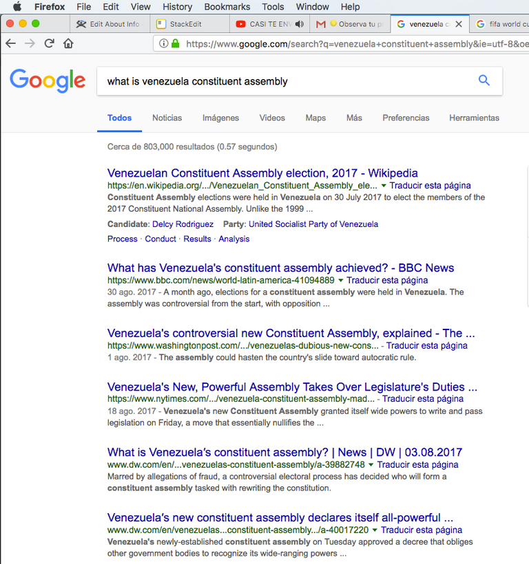
Research on the subject you want to speak about, look through reasonable sources that you will feel comfortable backing up your message, try not to stick to wikipedia, go deeper!
2. RESUME & SKETCH
The less words you use, the more chances you get to have a super comprehensible infographic, I always sketch my infographics before puting them together, that gives me an excellent workflow.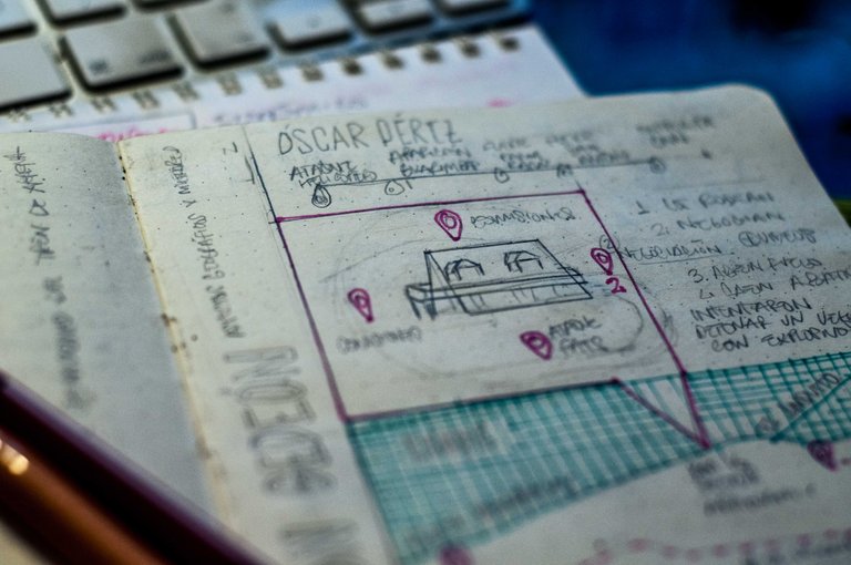
3. FIND YOUR GRAPHICS
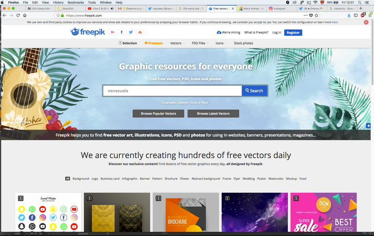
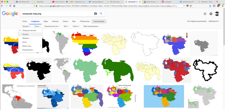
Try to find simple images, symbols or icons, avoid using too much photos or complicated images. Vectors are way beter than pixel files when it comes to infographics, if you´re not a designer try looking for .pngfiles on google images. When Im on a schedule I download vectors and icons from great free sites such as freepik.
4. PUT THEM TOGETHER
Now is time to put the pieces together, my recommendations here are:
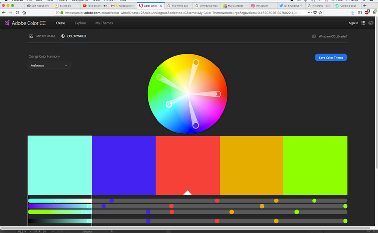
-Stick to a color scheme
Here is where designers would use color theory, if you´re not a designer, I highly recommend cheking out Adobe Color, there you can check other user´s schemes or create your own using the color wheel, in this case you can take a screenshot of your scheme and paste it to your file to have some guidance. (don´t forget to delete it)
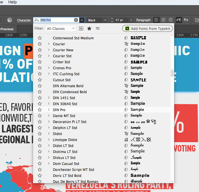
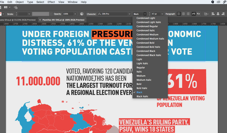
-Typography
Stick to a two characters, instead play with their families
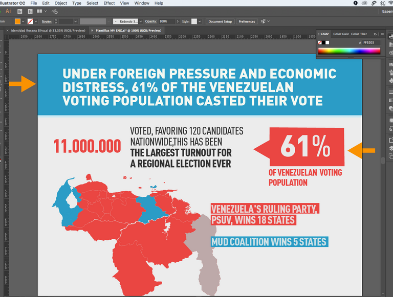
-Hierarchy
Arrange your items depending on their importance, use bold typography families, color and contrast to order visually your items.
That´s all folks, please don´t forget to comment, share and follow, I´ll be glad to help you or answer any questions, until next post.
Nauseas.