안녕하세요, @khm489입니다.
지난 번 포스팅 이후로 정말 많이 뜸했습니다.
사실 인생 방향에 대해 좀 회의감을 갖고 생각을 하다보니 이제야 왔습니다.
아직 고민은 끝나지 않은 상태지만, 진행하던 디자인은 마무리 하자고 생각했습니다.
오래 기다려주신 @gogumacat님 정말 감사드립니다 :)
Hi, this is @khm489.
It is really long time no see from the last posting.
I have had a agony about life
Actually my agony doesn't finished yet, but I thought to finish design in progress.
I want to say thank you for @gogumacat about his long time waiting.
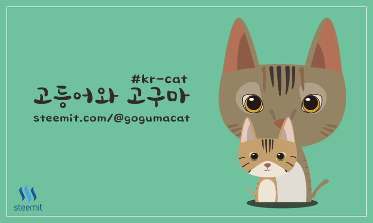
바로 디자인 결과물을 보도록 합시다!
Let's see the result of design!
지난 포스팅에서 저는 다음과 같은 세 가지 가이드라인을 제시했습니다.
At last posting, I suggested three guidelines for designing thumbnail image as follows.
- 용도에 맞는 사이즈, 비율을 확실히 지킬 것
Be sure to adjust the size and ratio of the image - 강조할 것이 실제 사용시에 강조될 것
Highlight the things that should be highlighted in real use - 사용자의 특색을 드러내며, 그가 만족할만한 디자인을 할 것
Express characteristics of user, and satisfy him(her).
어떤가요? 여러분이 보시기에 제 디자인이 가이드라인을 잘 따른 것 같나요?
다음 시간에는 @gogumacat님의 피드백을 받아 최종 이미지와 함께 돌아오겠습니다.
감사합니다 :)
Do you think my design follows guidelines well?
I'll come back with final image modified based on @gogumacat 's feedback.
Thanks :)
냐옹이 그림 마음에 쏙 듭니다 ㅋㅋ
kr-cat에서 앞으로 잘쓸거 같네요~~