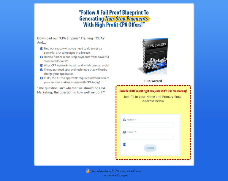
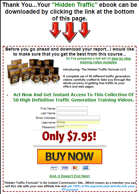
Landing pages are an extremely critical component of lead generation in inbound marketing. Does the anatomy of your landing pages include all of the following crucial elements? If not, its high time you start using the right elements listed above on your landing page.
Headline: As the first thing your visitors will likely see when they 'land' on your landing page, having a clear and concise headline is critical. Use your headline to sum up your offer as clearly as possible. If it's an eBook, say it's an eBook. If it's a webinar, say it's a webinar. What kind of eBook or webinar is it? What will visitors who convert on your page receive?
Hidden Top/Side Navigation: Reduce friction as well as your landing page's bounce rate and increase the chances your visitors will stay on your page by hiding any top and side navigation bars from your page. The last thing you want is for something else to catch their eye and distract them from completing the form.
Context: Below your main headline, consider using a sub-header to provide a little bit of information about the benefits and value. If your visitor decided not to read further, would it be enough to entice them to complete the form anyway? Next, add some context to your offer. Why should this offer be valuable to your visitor? In our example above, visitors discover that landing pages are effective for 94% of B2B and B2C companies. This should help them to understand why they are important and why they should learn how to build effective landing pages, setting them up nicely for the eBook
 offer.
Value: In many cases, your sub-header and context won't be quite enough to motivate your visitor he or she should download/register/sign up for your offer. Use the rest of the text on your landing page to explain the value of your offer clearly and simply. Use bullet points to demonstrate clear takeaways and break up large blocks of text, and keep it brief and to-the-point. What will the person get out of your offer? Will they learn how to do something? Become more knowledgeable about a specific topic? How will the information be presented to them? In our example, visitors will receive a "26-page guide." No question about it!
Image: It's always wise to include a relevant image on your landing page. Try to match that image with the offer. For example, if you're offering an eBook or a webinar, show a cover of the eBook or a screenshot of the webinar's presentation cover slide. This will give your landing page visitors a tangible idea of what they'll receive: "If I complete this form, I'll get a 26-page guide that looks like that." Images can also make a landing page much more visually appealing.
Lead-Capture Form: This is the element your landing page simply cannot function without. Your lead-capture form is the place where your page visitors will supply information in exchange for your offer. It's also what converts those visitors into precious little sales leads. As a best practice, only ask for information you need from your leads in order to effectively follow up with and/or qualify them. It's ultimately up to you to decide how many or how few form fields to include. Generally, longer forms will result in fewer but more qualified leads, and shorter forms will result in more but less qualified leads. Determine what works best for your business by testing and solving for your specific lead generation goals. Just keep in mind: visitors are very protective of their contact information, so the more form fields you require, the less likely people will convert.
Privacy Policy Link: Include a link to your business' privacy policy on your landing page or directly within your lead-capture form to give your visitors peace of mind. As we just mentioned, visitors are protective of their personal information. Providing them with information about your company's privacy policy will help to quell any fears that you're not a trustworthy source or that you'll sell their information to other vendors. This should positively impact the performance of your landing page.
'Submit' Button: At the bottom of your lead-capture form (and as the call-to-action at the top of your form as well), use specific action words so your visitors clearly understand what they have to do to obtain the offer you're presenting. On the button they click to submit their information, avoid using a general word like 'submit.' Eliminate any vagueness, and instead indicate exactly what action your visitors must take. If they're going to receive an ebook, use a word like 'download.' If visitors are signing up to attend a live webinar, use a word like 'register.' Will they be receiving a free product trial? Try using the phrase 'sign up.'
Social Sharing Buttons/Links: Enable visitors to easily share your landing page with their connections, too by including social media sharing links or buttons for social networks like Facebook, LinkedIn, and Twitter! Don't miss out on this simple opportunity to extend the reach of your landing page and the content it offers beyond your direct network and reach. More visibility will lead to more landing page traffic and, ultimately, more leads!
One Single Call-to-Action: It's important to understand that your landing page should be focused around one single offer. Including calls-to-action for other offers on your landing page is a sure-fire way to confuse and distract landing page visitors from completing your form.

The Offer Itself: Once your visitor submits their form information, they should be redirected to a thank-you page that explains the next step. If you were offering an eBook, the thank-you page should include a link to the eBook or provide instructions on how they'll be receiving their eBook copy (perhaps you'll be emailing it to them, for example). If it's a webinar they registered for, maybe you will present them with login information. Either way, never leave them hanging. You need to make good on the promise you made by requesting their information. Make the process as simple and easy as possible for your new lead.
More Social Sharing Links: Just as you did on the landing page, slap some social sharing links/buttons on your thank-you page, too! Just be sure the link you give them to share directs other visitors to the landing page, not the thank-you page. Otherwise, you'll miss out on some precious leads.
Social Media Follow Links: In addition to social sharing links, consider also including social media follow links to boost your social following. These links will encourage leads to follow you via your social media accounts on such networks as Facebook, LinkedIn, and Twitter. The thank-page is a great place for this, since people who end up there were already convinced your offer was worth the form submission in the first place. There's a good chance then, that they might want to be informed about some of your other offers via other channels, too.
Middle-of-the-Funnel CTA: If you're regularly offering top-of-the-funnel, educational content such as ebooks or webinars, there's a chance you'll have some repeat downloaders. If someone has downloaded ebook after ebook from you, perhaps they're a little bit further down your sales funnel than the average bear. Consider adding a more middle-of-the-funnel offer like a free trial or product-focused offer to capture those leads who might be ready for that stage in the game.
Other Important Landing Page Factors to Consider
While all of the above elements are extremely critical to the success of your landing page, there are a few other factors to consider during your quest for landing page domination.
Testing: In marketing, there's never a one-size-fits-all approach to things. While the above anatomy highlights important elements, the best way to create the best-optimized landing pages for your business is to test these various elements. Perhaps one layout (form on the left vs. the right) works better for you than another. Test every variable possible to help you come up with the best solution for your particular business.
Analytics: Always consult your analytics during testing to evaluate results as well as in general to determine the effectiveness of your landing page overall. Refer to metrics such as bounce rate, traffic, visitor-to-lead conversion rate, and overall leads. Use the information you gather from your analytics to make decisions about how to structure your page or tweak certain elements to make them more effective. For example, if your page is generating tons of traffic but just a small number of leads, you likely have a conversion problem. Perhaps you need to shorten your form or make your messaging clearer.
Promotion: How are people ending up on your landing page? Which sources are generating the most traffic, and where are you lacking traffic? The only way to generate traffic to your landing pages is to promote them! Optimize it with keywords so it gets found in search, share it in social media, create calls-to-actions for it to use on other web pages and blog articles, and link to the landing page in paid marketing efforts such as in display ads.
Message Consistency: As you're promoting your landing pages through these other channels, make sure your messaging aligns with the messaging on your landing page. The best way to confuse the heck out your readers is to send them to your landing page expecting something different. Be consistent in your language, tone, and expectations.
Hi! I am a robot. I just upvoted you! I found similar content that readers might be interested in:
https://blog.hubspot.com/blog/tabid/6307/bid/28080/The-Ultimate-Cheat-Sheet-for-Creating-Awesome-Landing-Pages.aspx
Alright ..... thanks for the upvote
I really appreciated that