This chart, created by a Reddit user, has been going around after the Great American Eclipse.
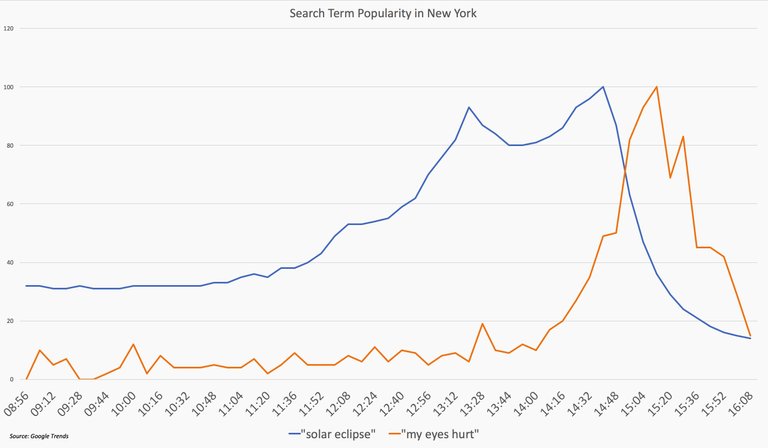
After looking at this chart all I can say is: my eyes hurt. It is a good example of how, when data are not presented carefully, people can believe that some conclusion is “real” or “backed by data” when in fact, it is not.
Look at the chart and consider the following statement: “After the eclipse, people searched for ‘my eyes hurt’ just as much as they had previously been searching for ‘solar eclipse.'” The chart suggests that this statement is true.
It is easy enough to get the original data from Google Trends, which shows the popularity of a given search term over time. If I search for both “solar eclipse” and “my eyes hurt” on Google Trends, this is the result I get:
Popularity of search terms in New York, on the same scale
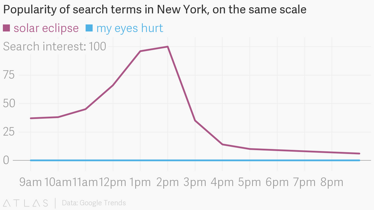
What once looked like a fascinating trend (“my eyes hurt” overtook “solar eclipse”) now seems to be a complete non-result. In this second chart, “my eyes hurt” remains completely flat while “solar eclipse” peaks around the time of the eclipse (in New York). What’s going on here
The answer lies in how Google measures what it calls “search interest.” This is the term used by Google Trends, and it means essentially this: For the given period of time, take the highest volume of searches, and call that “100 search interest;” every other amount of searches in that time period will then be relative to this peak of 100. So in my chart above, for example, “solar eclipse” was about half as popular around 11am as it was at 2pm. (The eclipse peaked in New York at 2:44 pm.)
The first chart made the mistake of not pointing out this relative indexing. It did not label the Y axis, giving us no indication of what those numbers represent. That made it seem like the actual number of searches was the same, as opposed to searches relative to the peak for each term.
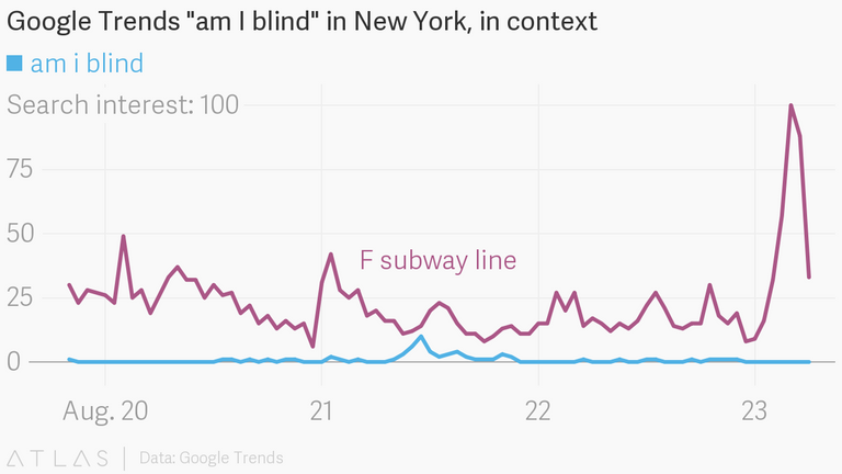
That reveals another problem with the “search interest” metric: it tells us nothing about the number of searches. That means that showing one search term’s interest over time is virtually meaningless. A post on Digg, for example, looks at related eye-strain terms on Trends, like “am I blind,” “retina,” and “what happens if you stare at the sun.” Here is one such chart taken from that post:
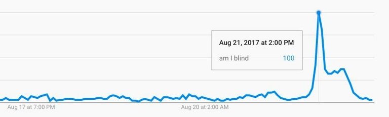
So it’s true that “am I blind” rose right after the eclipse. But as far as we know, that peak could represent 5 million searches or 500—the former we might legitimately call a “trend,” the latter, “a blip.” This is where context does not just help, but is necessary. Turns out that in absolute numbers, even at the peak of “am I blind,” more New Yorkers were interested in searching for information on the F subway line.
That is not to say, though, that the original chart has nothing to say. It is true that search interest in “my eyes hurt,” “am I blind,” and so on, increased right after the eclipse. But that first chart’s presentation made that spike seem much larger than it actually was. It is possible to make a chart that shows this interesting trend, while also providing the necessary context.
All we have to do is explain ourselves.

Sort: Trending