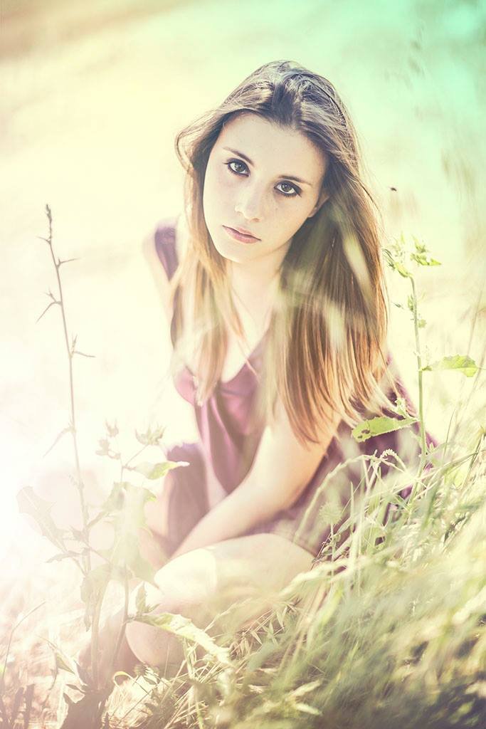
Canon EOS 6D & EF 50 f/1.2L
Today I would like to share some thoughts about vintage grading of portraits.
It's all about faking the optical, mechanical and chimical errors of past photography equipment!
Here are the steps the almost original image with skin corrections applied (left) went through:
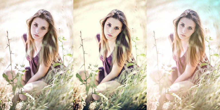
Middle: General color correction with wrong colors and contrast
Right: Fake lights applied and fake vintage haze (lens errors!)
The result it's the opening image.
Another example:
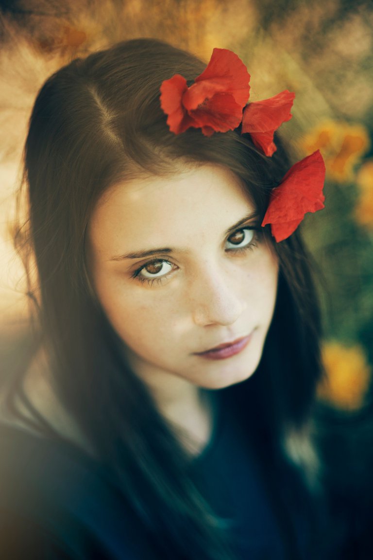
Canon EOS 6D & EF 85 f/1.2L
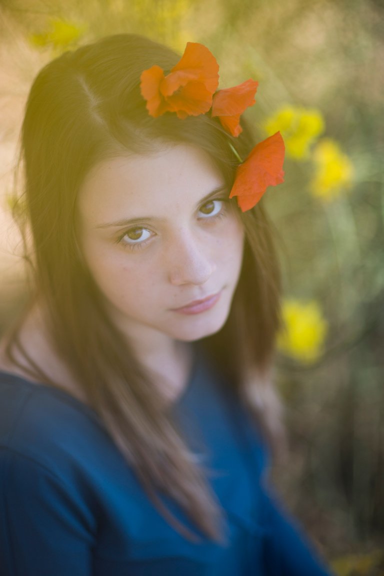
with similar corrections, some cropping and heavy contrast. Here is the original:
Lovely - I think you definitely nailed the effect through your this variety of corrections. I think that is is great you helped to explain the "Why" behind the technique you were trying to achieve - a lot of people who are not familiar with older, film based cameras, don't realize that it WAS a technical flaw in the equipment that typically caused these effects that we now perceive as super dreamy! Its just really interesting - thank you for sharing!
yes i am totally agree with u he captured a art photo which is simple and made it real beauty
thanks j-vo! maybe instead of "corrections" we should call them "de-corrections"... :)
Yeah! I like that - let's call it that :)
what are the best setting for capture closer look photo
You need to have a nice standard-medium tele lens with a wide opening like a f/1.4 or f/1.8. Then you use lowest ISO on available light (100 if sunny / 1600 if dark) and use the aperture priority on the camera. Focus on the closest eye and you are good to go!
less aperture camera click more precise photo