Placing ballerinas in a grudge location for a nice shot is a cliché theme at this point. Obviously, it creates a contrast between a bright, fragile, beautiful person and a dark, dirty, obsolete environment. But don’t get fooled by her beauty, she is one of the strongest people I know. In both physical and mental states. This is why we went for a more of a black swan outfit.
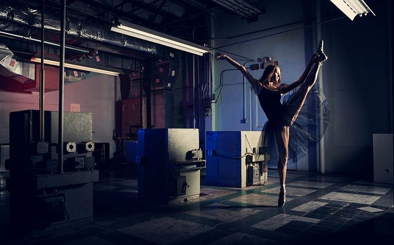
I love using color gels on my lights and sometimes I even add them to scenes they don’t belong in. But I thought the red and blue colors would add to the composition here. The red pull out that factory warning alert look while the blue soothes the scene and calms the nerves when your eye falls onto the subject.
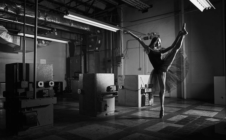
Of course with shots like these, where there are plenty of dark areas and the whole setting is industrial, black and white versions often work just as well. But I like the color version more. What do you think?
I placed the main light at my model’s side to outline her figure and give the whole scene a more dramatic light-out-of-an-open-door look. Coincidentally, this type of lighting setup is my most favorite technique.
By the way, this place was just demolished and this lot will now feature luxury condominiums, so in a way this image portrays more themes than one (you know, the whole phoenix rising out of the ashes and such). I wasn’t thinking of that when I was composing the shot. We were mostly concerned with getting her facial emotion and pose captured just right. Which I think we nailed but I would love to hear your opinion as well.
| Type | Setting |
|---|---|
| Camera | Canon 5D II |
| Lens | 24-70mm f/2.8L |
| Focal length | 30mm |
| Shutter | 1/125s |
| Aperture | f/5.6 |
| ISO | 100 |
Congratulations @nace! You have completed some achievement on Steemit and have been rewarded with new badge(s) :
Click on any badge to view your own Board of Honor on SteemitBoard.
For more information about SteemitBoard, click here
If you no longer want to receive notifications, reply to this comment with the word
STOPI'm the sort of guy who defaults to black and white, and I only go color if the color adds something (like helping to separate elements). I agree with you on this one; the color definitely adds something here. The b/w is still amazing, though.
thank you