Hello!
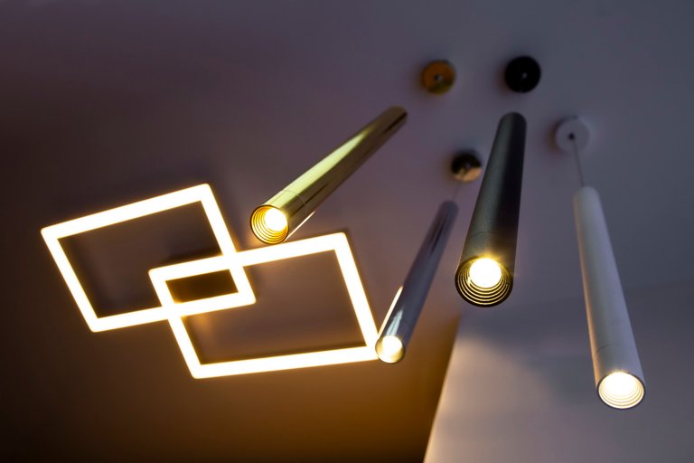
Usually I don't post my product photography, because I feel it's not relevant. I don't exactly know what makes me like this photo as much as I do, but anyway, I finding worthy to be on my blog. i like the perspective, the angle, but beside these more technical sides, it has a feeling that usually is not presented in product photography.
What do you like about this shot and what could I have done to make it better?
Congratulations @sina-adventure! You have completed the following achievement on the Hive blockchain and have been rewarded with new badge(s) :
You can view your badges on your board And compare to others on the Ranking
If you no longer want to receive notifications, reply to this comment with the word
STOPDo not miss the last post from @hivebuzz:
Support the HiveBuzz project. Vote for our proposal!
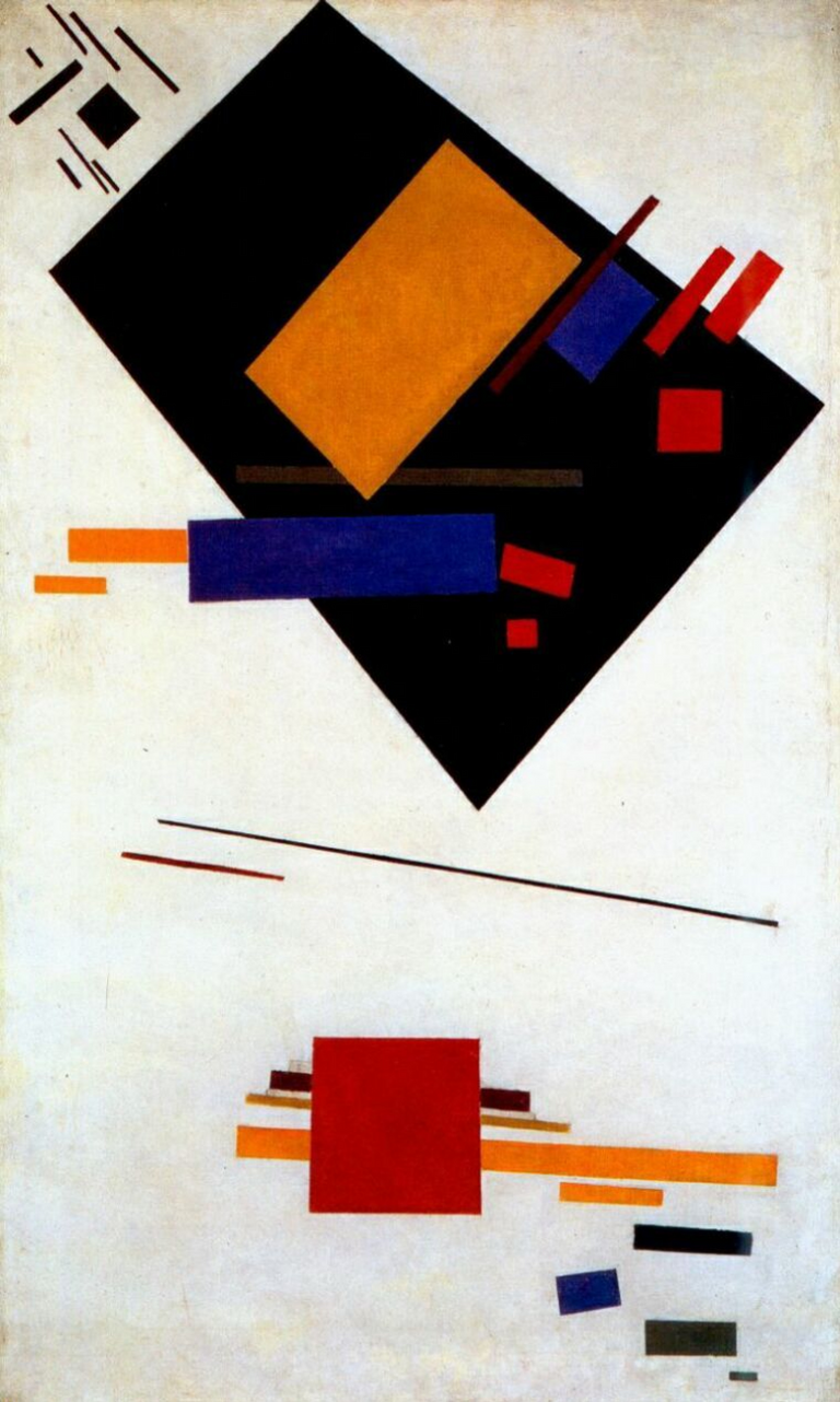
I don't know why it reminds me of a Malevich
 .
.
Also an attempt at lighting up the darkness?
It is groovy how as products they don't seem to be hanging properly at all: depth is deceptive and the angles are "off", with the golden one especially, which seems to bend unnaturally. This forces us to look more closely, which is always a good thing in photography.
It feels like they're both showing the same angle. I have the same feeling about it.
So... my photos is not a good "product" photo...(?)