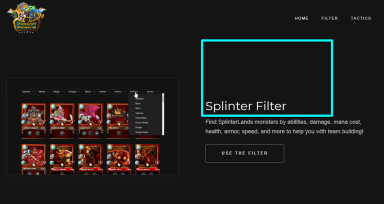
Hi @shenan I'm the creator of Splinter Filter and would like to say a big thank you for creating our new logo and favicon, you can now see them live on our site! splinterfilter.com (clear your cache if you don't see the changes)
You are viewing a single comment's thread from:
Great!
I also have some other propositions:
maybe on the main page there is a good way also to arrange the more big image logo in front of
(but it's IMHO, I wanna you to ask some more users for their opinions, will it suits there);
I want to see the filters of "Edition" and "Rarity", so the user may think how to upgrade anything he wants, but, for example, not including Legendary Card, or vice versa;
I think it's good to place at the bottom also the welcome-to-the-game-your-affiliate-link - who knows, from where the user may come to the Splinterfilter in the perspective ;)
@shenan Thank you for the further considerations to the design and functionality of the filter. Please be advised that we have already been working on the "edition" and "rarity" filters, they should actually be active now with a clear of the cache.
In our next update post (tomorrow) we will ask our audience the question about the logo placement, I personally like the idea although it's nice to get the communities thoughts.
(please note: there may be a few errors on the edition and rarity filters as we've not fully tested every card yet).
I decided to do more accurate favicon,
please, look at this new one:
https://i.imgur.com/eLxRlh8.png
Hi there @shenan, is there any chance you could create the favicon in the image dimensions 256px by 256px with a transparent bg?
We are looking to use the favicon as icon for android and apple and the image must be a minimum of 256px square for it to work without becoming distorted on some devices.
Thanks,
@gringo211985
Ehm, what the original image do you have?
'cos I just made from the @splinterlands avatar
for your 256px by 256px
only this one:
https://i.imgur.com/KPY7GSe.png
Thanks, this works better for the favicon as it's clearly a different coloured background so noticing which tab is which in the browser should be much easier now. Thanks for your help with everything, much appreciated.