
Welcome to my daily analytical report about Steemit.
All the information presented in this report are based on the data collected from the blockchain until 2017-07-03 midnight UTC time. The goal of this report is to provide you with a clear view on what is happening daily on Steemit.
1. New users
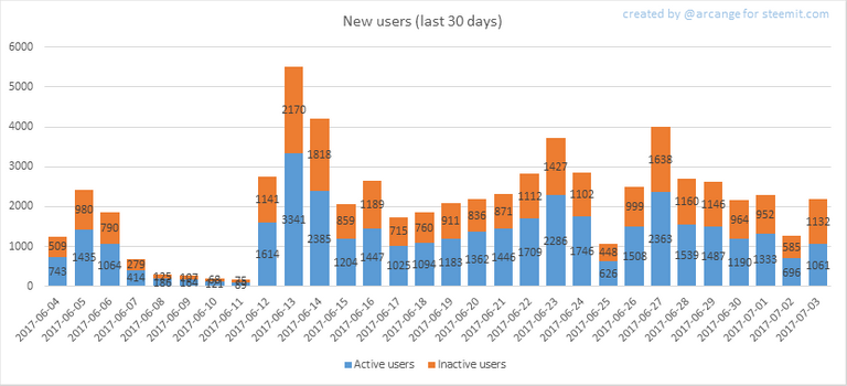
This chart shows the number of newly registered users on Steemit and how many of them became active. We see that a lot of accounts are registered, but never used.
Warning: this graphic is kind of dynamic! A user can register one day and become a few days later. Therefore, the number of active users on a specific date may change from day to day.
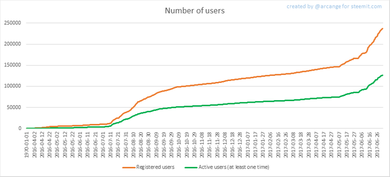
In this graph, the orange line shows the total number of registered accounts.
The green line shows how many of them have been active at least once (by active, I mean those who made at least one post, comment or upvote). They are included even if they become inactive later.
2. Post and comments
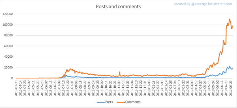
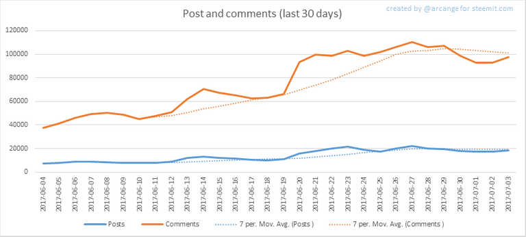
These graphs show the evolution of posts and comments for the whole blockchain lifetime and for the last 30 days.
3. Curation
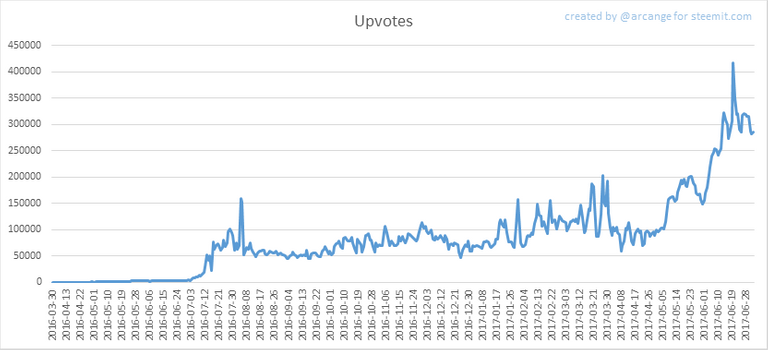
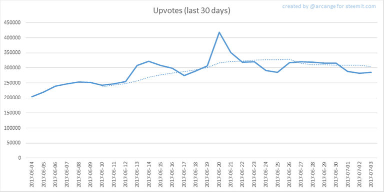
These graphs show the evolution of curation (upvotes) for the whole blockchain lifetime and for the last 30 days
4. Active users
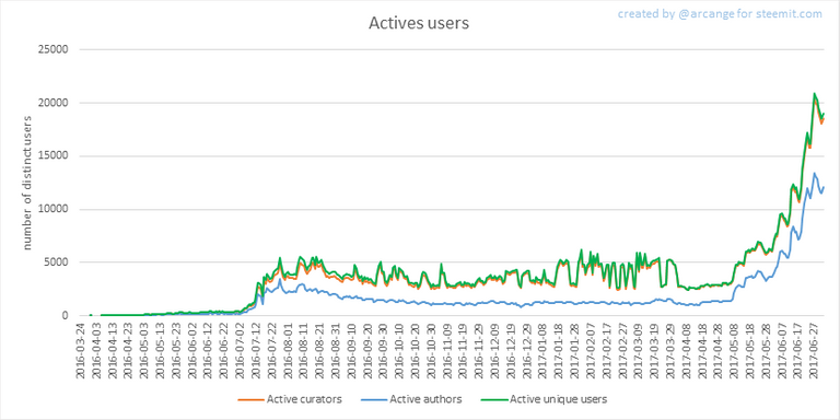
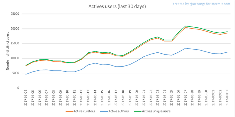
These graphs show the activity of users over time and in more details for the last 30 days.
5. Daily transactions
![]()
This graph shows the number of daily transactions. This give you an idea of the whole activity on the blockchain.
6. Categories
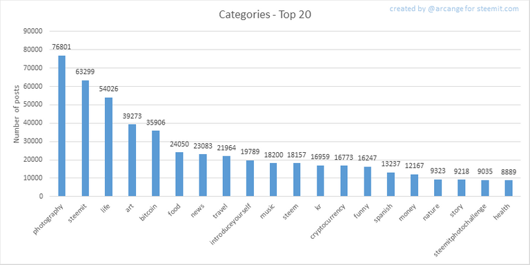
This graph shows the tag has been the most used for publishing posts for the whole blockchain lifetime.
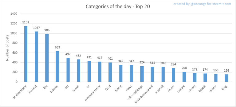
This graph shows the tag has been the most used for publishing posts last day.
7. Distribution
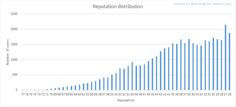
This graph shows the distribution of the reputation among users. Accounts with a reputation lower than 25 have been removed to keep the graph readable.
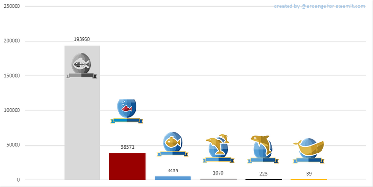
This graph shows the distribution of the voting power (it now includes the new "Inactive" and "Red Fish" levels - check @steemitboard blog for more info about this).
8. Payout evolution
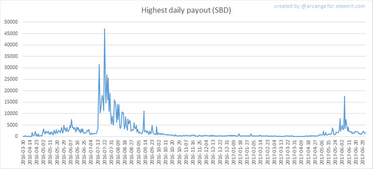
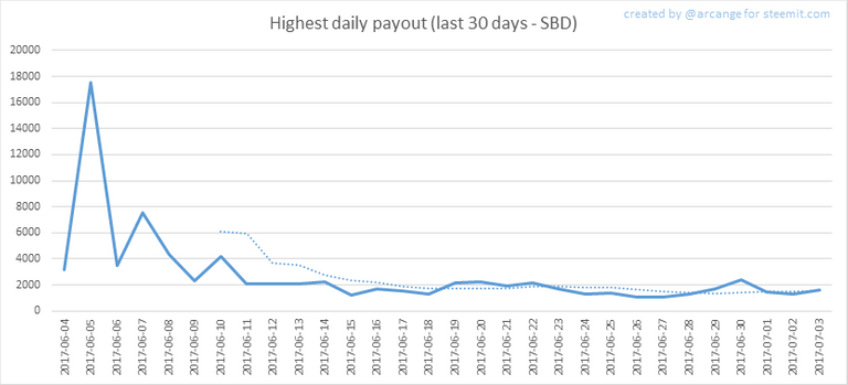
These graphs show the maximum reward paid on a post (or comment) for each day (whole blockchain life and last 30 days).
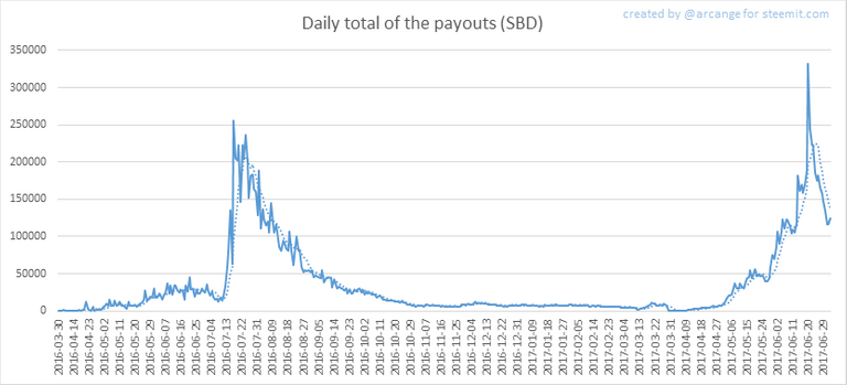
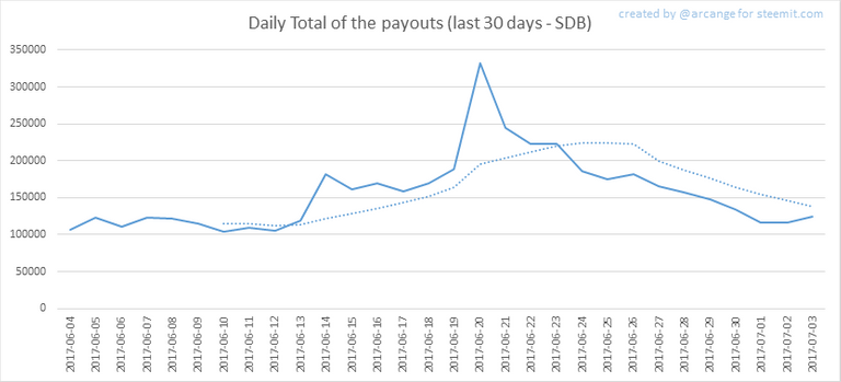
These graphs show the total of the distributed payout (posts and comments) for each day.
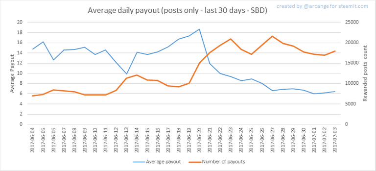
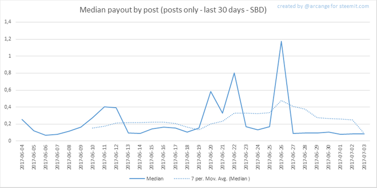
These graphs show the average and median payout per post for the last 30 days.
The last one indicates that if yesterday you got the latest value shown on this chart for your post, you should be happy because there are as much people that have earned more than you than people that have earned less than you.
I hope you find those stats useful. If you would like to see different stats, feel free to drop me a comment. Your feedback is more than welcome.
Thanks for reading.
Happy Birthday, Steemians! Read more here...

footer created with steemitboard - click any award to see my board of honor
Support my work as a witness by voting for me here! 
Like these kinds of updates, but your post is most informative I've seen so far. I hope there will be more if them in the future in my feed ;-)
Hi @arcange, do you recon if these statistics you kindly provide would be too hard to implement using something like grafana? I think it would be amazing to have access to something like that.
Très intéressant !! Merci pour l'article
Upvoted !!
Tellement utile merci beaucoup !!!
Avec plaisir ! Merci pour votre vote !
Of how many percent of accounts are inactive?
And can I tell you where to get the info from?
All the info are collected from the underlying blockchain.
I use SteemSQL to compute them.
Thank you for the information
Upvoted, I can tell you put a huge amount of effort into this and it's certainly appreciated. Awesome to see the whole platform essentially broken down into data like this, well done
Thanks you!
Thank you so much for a great website that helps us grow and get a better understanding of steemit
Nice report! Good to see Steem growing.
Great post, very useful information, I'm happy to meet you