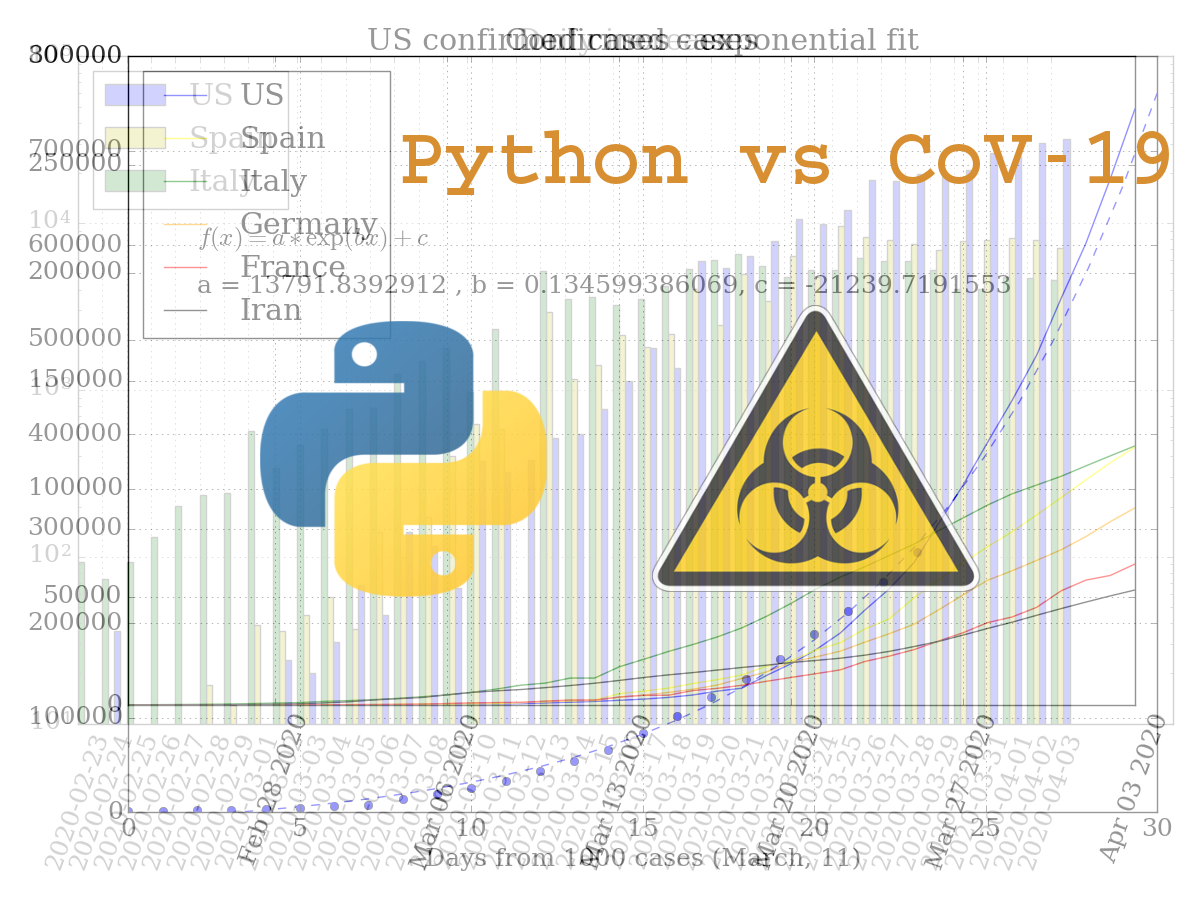
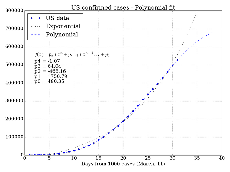
US covid-19 cases curve switched to polynomial growth from exponential.
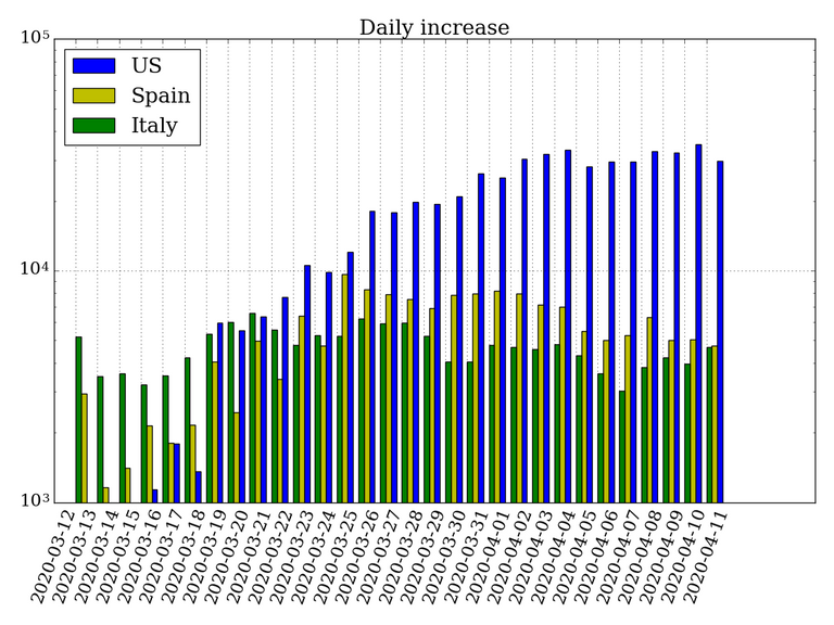
Rates of growth for new case are slightly declines in Spain and Italy.
Python code:
# Pylynomial fit
coeff = np.polyfit(xdata, US1000, deg=4)
poly = np.poly1d(coeff)

plt.plot(xdata, US1000, "bo", label="US data")
plt.plot(func(xdata7, *popt), "k-.", label="Exponential")
plt.plot(xdata7, poly(xdata7), "b--", label='Polynomial')
plt.title("US confirmed cases - Polynomial fit")
plt.xlabel("Days from 1000 cases (March, 11)")
plt.ylim(0, 800000)
txt = "p4 = %.2f \np3 = %.2f \np2 = %.2f \np1 = %.2f\np0 = %.2f" % tuple(coeff)
plt.text(2, 550000, r'$f(x) = p_n * x^n + p_{n-1} * x^{n-1}... + p_0$')
plt.text(2, 400000, txt)
plt.legend(loc=2)
plt.tight_layout()