It's been quite a few months since the last Columns for Steem update in March, but I've started working on it again after Open Sourcing it two days ago, so here is the first new small update.
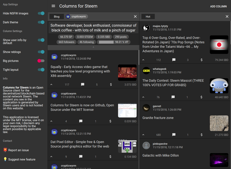
As you can probably see if you used Columns for Steem before, the design is slightly changed. I wanted a more minimalist design, the old design wasted too much space. You can however get the old design back nearly completely with the new "Tight layout" setting which is enabled by default. Turn it off, and there will be margins around columns again.
There are however no longer margins around posts, I think that just wasted too much space and didn't look particularly good. If you really did like the way posts looked before though, tell me, if there's enough demand I can always make it a setting, but only if there really is demand, too many settings aren't good either :)
Another design change is the background of posts in the dark theme, it's a bit darker now. And in Chrome based web browsers, the scrollbars are now custom to fit better into the design of the app and use up less space. Firefox doesn't support custom scrollbars right now, the feature has been requested 12 years ago but they only started working on it recently, so hopefully it will be possible in the future. There are workarounds by using custom elements but I'd rather not use hacky solutions like that.
The info section in the settings sidebar on the left now also reflects the recent Open Sourcing of the app and links to the Issue Tracker on Github where you can report bugs or suggest enhancements / request features.
Shut up and let me help!
If you're an actual designer and not a Programmer-Who-Has-To-Also-Design-Even-Though-He-Should-Not like me, you're also very welcome to help improve the design of Columns for Steem going forward, now that it is Open Source.
The CSS design is for the most part inline written directly in ClojureScript (that's the ReactJS way of doing things, horrifying to some, but super powerful), but you don't need to know ClojureScript to change the design. It's just a different format but still the normal CSS you already know. An example:
CSS:
border: 1px solid black;
color: red;
ClojureScript:
:border "1px solid black"
:color "red"
I've been thinking about changing that. Inline styles are about twice as slow than stylesheets. Would make the settings and dark and light theme code more complicated, but could be worth it since it would also make it easier for web designers to work with.
I'm also thinking about getting rid of Material-UI, a React library for Google's Material Design that the app makes use of. It's been a bit clunky to work with and the ClojureScript version of it hasn't been updated in a year, so switching over to something better going forward before I add too many new features would be sensible, to limit the amount of code I need to update.