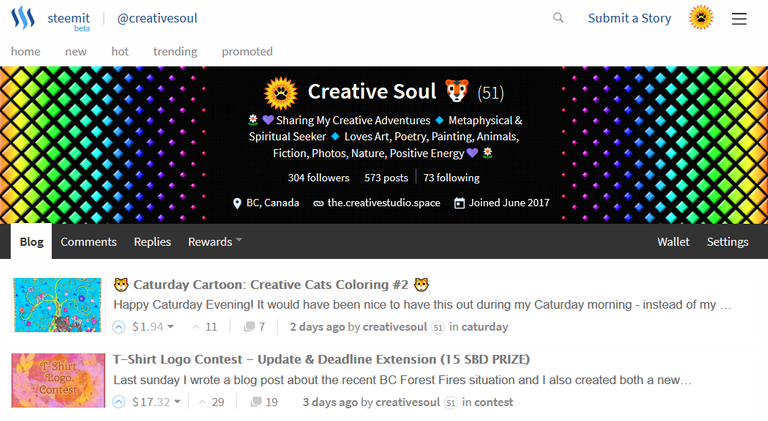
The sizing was difficult...a lot of people that I have seen used 1920 x 700 - but I found this too pixelated and 'zoomed in'. The larger the image the more that it can center and spreads out better visually. 2500 x 1200 achieved the look that I was going for on desktop. <3
hey, you did fine.
I am going to take your advice too, and make a new one.
but, what about the mobile phone, How did it render?
have you seen it?
On mobile phone...portrait...it shows up black in the middle and first two rows of pink...and the whole banner in landscape...just the black space is smaller and words run over into the rainbow. I can live with that. I tried putting my blog feed into a few of those online responsive design testers but it just shows up blank. Probably a good reason for that. I can check your layout on mobile if you want though. <3
I test it my scrinching up the window on the computer.
If you make chrome tall and narrow, it gives you a mobile-like view
I really wanted to do a tree, is that over? I can't remember how long you were holding that open?
Scrinching the screen up does not produce exactly the same result. Even if the website does not have a mobile version the coding usually compacts the content differently. The tree contest deadline is still near the top of my blog - and it ends this sunday.
Trippppppyyyy I like it!