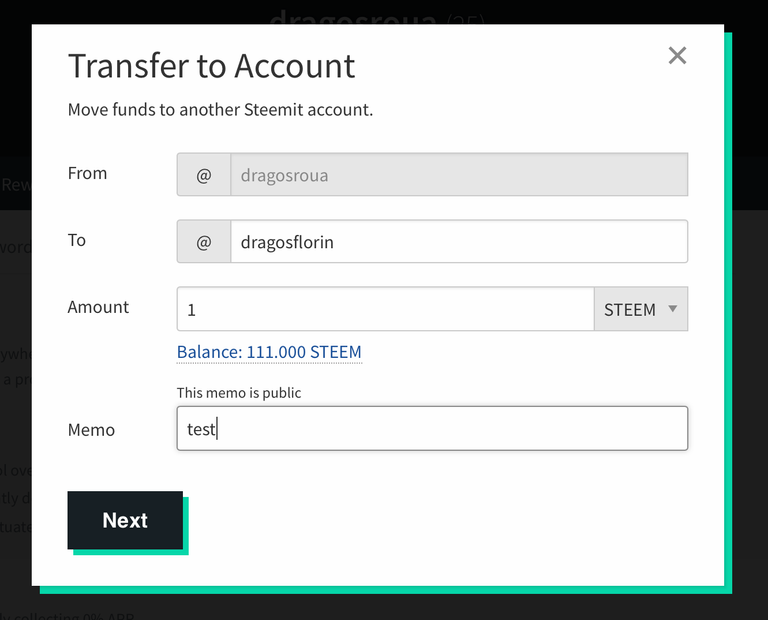
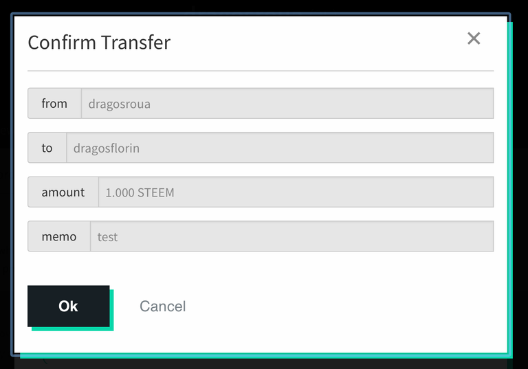
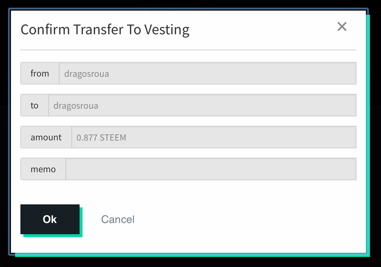
I was pleasantly surprised to see this morning that the UI related to funds transfers in Steemit got a revamp. It's now refactored as a wizard, in which you set up the components of the transfer (being it a transfer to another account / exchange, or a power up, which is called now "transfer to vesting") and then a second step in which you can confirm / infirm the transfer.
Here's how it looks for regular transfers:


And here's how the power up confirmation message looks

All in all, I find this useful. It's not something revolutionary, but it is something that makes the user experience better and it streamlines the whole interaction process, and Steemit still needs improvements in this area quite badly.
Steem on!
I'm a serial entrepreneur, blogger and ultrarunner. You can find me mainly on my blog at Dragos Roua where I write about productivity, business, relationships and running. Here on Steemit you may stay updated by following me @dragosroua.

Wanna know when you're getting paid?

|
I know the feeling. That's why I created steem.supply, an easy to use and accurate tool for calculating your Steemit rewards |
Indeed a very useful feature...
I wonder how many people understand what vesting is. They may think they are sending funds to a user of that name :)
:))
I agree with you; there are probably lots of new users who have no idea what vesting it. It would probably be better to change the title of this to "Confirm Power Up" or something like that.
If you think about it, this is exactly what they are doing :))
Oh, I've lost SBDs by sending them to the wrong person, like min instead of minnowbooster and such. This will surely be helpful to avoid those quick-to-notice blunders.
Ouch, I'm sorry to hear about your loss. But you're right; this will eliminate lots of these typo mistakes.
I do not like the change. :(
Oh this is very useful. And it will help ease things out more for new users. I guess the steemit app is coming together afterall, thats if there will ever be an official app
I think this is very good improvement , i had a case few weeks ago which i sent some Sbd in wrong way the extra confirmation screen can avoid those cases
Now there are steps asking permission more than once, its really cool.
I made transfer now and I noticed it.
It is some sort of confirmation just Incase you’ve inputted some incorrect details I guess
Steemit is getting better and better from day to day nice to see those guys working hard and loading new stuff
Its a nice improvement i would say, i still believe a lots has to be done on steemit GUI to make it more interactive and fun
I had a friend submit this and I am happy to see the work done as it will eliminate some of the problems of transfer funds.
I remember one incident where a person I know asked for help to have his SBD returned by the user @bui as he sent it to this person instead of buildawhale and after over a week of commenting and finally threatening to report and start flagging that the person finally relented and gave back the SBD.
Step by step they are making it better!
Was surprised about the change but probably will get used to it fast!
Now you know how to transfer some money to me :)
it is really a good improvement.
remarkable transfer @dragosroua, because it's easier to split steem or SBD, I agree with the easy way.
This is so nice..
loving this improvement.
Great analysis about User interface (UI).It's really a crucial part for a websites or a application.
nice improvement its cool
sir, I think this is very good post many people understand what vesting . I also transfer now and I noticed so.
I also became surprised to see it.I think about it few days ago but it was added now.So happy.
good system for improbment.
that looks easy thanks for the share
cool sir this is something new to me. you guys are really doing great for the community. i really learn something new every day from greatly experienced steemians out there like you ...
This is a great update! At least now no one can complain that they didn't get a confirmation before they made a transfer mistake. Hopefully this will allow for fewer cases where people send the Steem/SBD to the wrong account.
Took notice too, wondered if it was part of other changes/updates
When are we forking forking !! (-: ??
It happened to me two or three times. I send money to the wrong person and didn't get that back. The confirmation system is great.
But, why did they remove the number of views from the posts?
An UI improvement, no matter how small, gets a big thumbs up from me.
I guess if you're going to make improvements, you've got to start somewhere, and the transfer funds window is as good a place as any. Are you aware of whether or not that's just the very tippy-top of the iceberg as far as Steemit UI changes to come? I mean, besides getting rid of the pageview counter? :)
Nice little changes the steemit team does great to know about it
I agree with @steevc on this one.
The terminology around this means something to devs and power users. But everyone else will wonder what this all means.
And the answer - read the whitepaper - doesn't fly. Did anyone read Facebook's white paper? Or Reddit's? Or Twitter's?
It's not what people do. So it is up to the people building the UI to make the UI work for the people sing the system, not just them.
I'm not coming from a disgruntled user perspective (I'm not at all disgruntled) but from the perspective that this is what I do in my day job.
And it sucks when I see something that should be really good, just miss the mark because the UI is not user centric.
The 'U' in UI stand for user. That's US. It does not stand for Dev.
And we are still in Beta doesn't fly either. I've built any number of sites and apps that spend a month in beta and then go live. And they are not all that simple either!
My point is that getting the UI right isn't difficult, and a lot more effort needs to be put in to get this working right to retain the users we already have.
Great to see all these minor improvements being done. Slow and steady we are headed for success