Hello Steemit. I am Josh. I like designing. Here is a new UI for Steemit.
New Steemit Interface - Mockup.
First lets take a look:
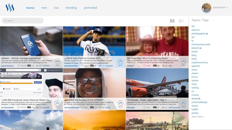
This is what I am calling the grid view. A 3 post wide look that is very image based. The row view can still be used
I made this gif of how scrolling would work, its not perfect, as I would make the site bar fixed. It still gives a good idea of how it would work.
Break down.
Lets look at all the changes. Note that this is just an idea and not official.
Where is the reputation?
In this mockup I removed it becouse:
- It was really hard to fit.
- Reputation is not a good way of seeing if a user is good. Spam bots have high rep because of the amount of comments they make. Reputation would still be on the profile.
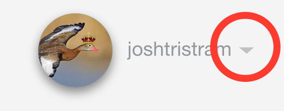
Where is the submit button?
In the drop, reveled when you click the arrow next to the profile. When I mockup the menu I will change the title as "Submit a Story" is not really fitting all the different type of posts on the platform now.
Whats the Steem logo doing next to topics.
This is meant to show that its a trending topic. I don't like the current use of the steem logo next to 100% steem power post and think it can be better used to show what's trending.
Conclusion
I want to keep working on this mockup and making a working version that was more pages like profiles and posts. This is only the first version and would really like it if you left a comment with your thoughts.
If you like it please show your support for this community project but leaving an upvote and resteeming.
The posts and images used in the mockup belong to their respective owners.


So what does a post look like that doesn't include a photo?
There is a new version out. But this has not been designed. I will do it in version 3
Exc idea and the best is that you designed it to show us, this is great. T best way to predict the future is by designing it. Keep up the great work.

@originalworks
@OriginalWorks Mention Bot activated by @joshtristram. The @OriginalWorks bot has determined this post by @joshtristram to be original material and upvoted it!
To call @OriginalWorks, simply reply to any post with @originalworks or !originalworks in your message!
For more information, Click Here!
no.
it violates KISS
Whats KISS?
"Keep It Simple Stupid"
It's a design principle which things should be kept so stupidly simple that anybody can understand how to use it.
I think they said it violates it cause most of the changes you made either add a lot of options (an option to change a layout that while cool looking isn't really needed, plus the topic icon) or hide stuff making it harder to find (like moving the Submit button under the menu), both things which add complexity.
wow
Pretty slick work here, I'd love to see some more alternative views like this implemented. I wouldn't be for this becoming the default view, but more options couldn't hurt :)
KISS = Keep It Simple Stupid
Keep It Simple Silly.
Yes. I'v got it now.
Well the topics we currently see on the side ARE the trending topics on steemit. The steem logo i think would be redundant.
Also reputation is a bit more complicated than that and is a great source of worth on the platform. Its unlikely that anyone who "spams" has a high rep.
I would love to have a grid option however, and a dropdown submit a story.
Indeed. Reputation number easily go down if the spam user is red flagged by the people.
Grid looks better, thanks for the idea, hope they will consider it.
Congratulations! This post has been upvoted from the communal account, @minnowsupport, by joshtristram from the Minnow Support Project. It's a witness project run by aggroed, ausbitbank, teamsteem, theprophet0, someguy123, neoxian, followbtcnews/crimsonclad, and netuoso. The goal is to help Steemit grow by supporting Minnows and creating a social network. Please find us in the Peace, Abundance, and Liberty Network (PALnet) Discord Channel. It's a completely public and open space to all members of the Steemit community who voluntarily choose to be there.
This post has received a 0.63 % upvote from @drotto thanks to: @banjo.
The mockup looks nice and as they say, the first impression is the last impression. Visitors will tend to stay on a site that looks good.
On the flip side this look is getting very common and a site needs to stand out with its looks by being different. At the same time it should be easy to navigate.
I will take this into account with the next edit of the mockup :) Thanks
It is nice that you have taken time to suggest something new. However, I have to say I wouldn't want steemit to look so cluttered. This kind of 3x3 matrix can work for videos or something, but isn't the best choice for them either. The main problem with it is, that many of the articles would get lost due to human attention. It is much harder to browse through a list which goes left to right and left to right than it is a list that goes down.
Just my two cents. :)
Thanks, I will keep this in mind when I made my nexy vertion.
Would be great if you can add more windows instead of just 3 seems so cluttered none the less well done great work.
@rogerblu
Thank you. A few people have said its a bit clutted. I will change this is vertion 2. Keep an eye out for it.
Comments are disputed
looking good!!
Looks good. I'm really looking forward to a new UI