Steemit New UI/UX
Steemit new interface brought a lot of changes with improved User Experience I could easily navigate the website.
I will make this review very short but point out all I observe about the new UI/UX
Blog
the font family has been changed, more energy has been added to the blue color
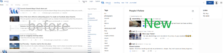
Layout
The previous layout has two column, while the current one is three column, which is one of the changes I like the most.
the left column which lists the Tags dynamically change the second column (Feed) to show the equivalent tag posts
Feed
currently, steemit feeds could be looking strange to some people, at the same time looking very familiar to what we use regularly (Twitter, Instagram etc ) after clicking the new layout switch menu which enables us to switch between Card or List, the post image, title and first two line enable to quickly decide whether to view the post or not, We should spend more time deciding the picture we use as the post thumbnail because it means a lot, " a picture contains a thousand words " use wisely..
Speed
with the few hours have spent on Steemit today, i believe they did one or two on the site speed
Conclusion
This update is really nice, and it definately inprove the User Experience.
it will be very great if there is a kind of walkthrough for ** New Steemians**