
Making responsive web layouts with frameworks such as Bootstrap or the latest front-end library can be daunting and complicated. Your code is littered with nested
tags, and it is easy to get lost in the heirarchy.Luckily, CSS has finally caught up with the need for responsive web layouts and made crafting layouts super easy and far less complicated.
We will be designing three basic web layouts. One for phones, one for tablets, and one for full desktop with just a simple index.html page and a style.css page, and all with a relatively small amount of code!
Creating our HTML document
Load up your favorite text editor (my favorite at the moment is Atom) and create your index.html file. Many text editors such as Notepad, still require you to change the file type from .txt to "All files", and make sure your file has the .html extension. Once that is done, type out the code below.
This is not intended to cover the basics of HTML, so I will be covering the topics and code that is related to this lesson. The first line that I would like to point out is the meta tag on line 5 which tells the browser to stretch the document across the width of the entire viewport. This is necessary in order to enable our page to be responsive to the viewport (aka screen size). Next on line 6, we link in our style.css page which is where all the code to determine our layout grid dimensions will live.
Inside the body we wrap all of our sectional divs inside a single div with the class of "grid". For those who are new to HTML, a div is an html element that creates a division which can adapt its size to fit the content contained inside. Okay so now that we have our HTML written, we will get started on our CSS stylesheet.
Creating our CSS document
Inside the same directory as your index.html document, create another document and save it as "style.css". As before with our HTML file, make sure you save your CSS document with the .css extension. Lets start by applying zero margin and zero padding to our entire document by adding this code:
* {
margin: 0;
padding: 0;
}
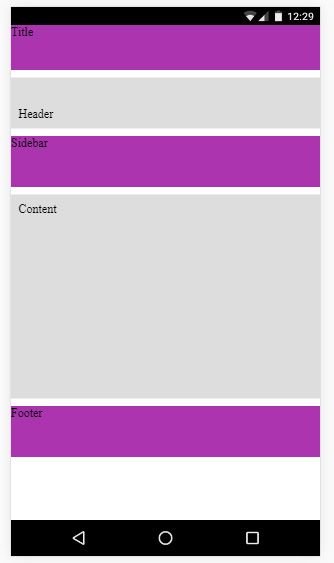
Phone Layout
Now, it is good practice when building responsive sites, to start with the smallest screen and work your way up, so we will start by developing for the phone first. Our phone layout will end up looking like this:
Here I am going to throw the CSS for the grid class at you and then explain what's going on.
.grid {
display: grid;
grid-template-columns: 1fr 1fr;
grid-template-rows: 60px 1fr 1fr 4fr 1fr;
grid-template-areas:
"title title"
"header header"
"sidebar sidebar"
"content content"
"footer footer";
grid-gap: 10px;
}
The first line "display: grid;" tells the browser that we want to display the content inside the div wrapper, with the class "grid", in grid format. The next line, "grid-template-columns", sets up the number of vertical columns we would like in our grid. Since I have set that attribute to "1fr 1fr;", that will setup two columns with equal fraction of the grid width (same thing as 50% 50%). Next line we set up our horizontal rows within the grid, and you can see that the first value is "60px". Here we see that we can mix different units of measurement within our grid columns and rows. Since the first row will contain a title or a navigation bar, we will never need the size of that row to be larger than about 60 pixels. The next value of 1fr is for the "header" div, 1fr for our "sidebar" (I know its not a sidebar yet), 4fr for the content, and 1fr for the footer.
The next line, "grid-template-areas" will take values for our different sections based on the column and row values that we set in the previous two lines. You will notice that each line in the areas has two values because we set our number of columns two by setting grid-template-columns: 1fr 1fr;. We have set each row to span both column fractions, and notice we have 5 total rows. The last line for grid gap sets a gap of 10 pixels for each section.
Under the styles for our grid class, we declare the classes for each child div of the grid like this:
.title {
grid-area: title;
}
.header {
grid-area: header;
}
.sidebar {
grid-area: sidebar;
}
.content {
grid-area: content;
}
.footer {
grid-area: footer;
}

This links our grid template areas to these classes. Next, so we can better differentiate between each div element, add this:

.grid div:nth-child(even) {
background-color: #ddd;
}
.grid div:nth-child(odd) {
background-color:  #ab34af;
}

This sets our even number divs inside the grid wrapper to a background color of a light gray, and our odd divs to a lovely purple color.
Tablet layout
Okay so far we have created the layout for our lowest level screen size which is for phones. Now we are going to implement the layout for tablets by use of media queries.
Back to our style.css file we add the code below to set our tablet layout for any screen size above 501 pixels. This is just an approximation of the width of a tablet screen width. You can test different widths if you like, and if anyone has any advice about the best width to use, please comment below :).

@media screen and (min-width: 501px) {
.grid {
display: grid;
grid-template-columns: 1fr 2fr;
grid-template-rows: 100px 0.2fr 1fr 100px;
grid-template-areas:
"title title"
"header header"
"sidebar content"
"footer footer";
grid-gap: 0px;
}
}

You'll notice that our grid-template-columns attribute has changed from 1fr  1fr; to 1fr 2fr; This is so that the sidebar that will sit next to our content section will be half the size of the content.
Our grid-template-rows has changed slightly to allow the title section for 100px instead of 60px because we are afforded a little more screen size with the tablet layout. Our "header" section now has 0.2 fr.  Yes, you can use decimals of grid fractions!  Our sidebar and content sections take up 1fr, and our footer has been changed to 100px to match our title section. Feel free to experiment with your own values.
For the grid-template-areas, you'll notice we have adapted down to four rows instead of five which the phone layout uses. This is because we have moved the sidebar alongside the content section, and we have gotten rid of the grid-gap by setting its attribute to 0px. Lets add some text to the content section by grabbing some Lorem Ipsum. I've added this code to our index.html page:

The code at the top of the index file is cutoff due to my screen size limitation, but it's still there, just add everything within the paragraph tags <p>
Your new tablet layout should now look like this:

Desktop Layout
Finally, we get to our big boy, the full desktop experience!
Just like before, all we need to do is create another media query inside our style.css file like so:

@media screen and (min-width: 1024px) {
.grid {
display: grid;
grid-template-columns: .5fr 3fr 3fr .5fr;
grid-template-rows: 100px 0.2fr 1fr 100px;
grid-template-areas:
". title title ."
". header header ."
". sidebar content ."
". footer footer .";
grid-gap: 0px;
}
}

Not a whole lot has changed here but now we have expanded our column count from two to four with .5 fr on either side. These are just going to be used as page margins on the left and right side of the screen. Nothing has changed for our row setup here. Notice though in the grid-template-areas each row now has a period (or dot) to indicate a null value for the left and right side columns.  These just declare that for those columns or rows, you don't want anything there and the space will be taken up by...nothing. Again, grid-gap is 0px.
And your final desktop layout should look like...:

I hope the aspiring web designers and developers out here on Steemit can take this lesson and use it to develop your own beautifully simple and elegant layouts :).
Thanks to everyone who made it this far. Peace and love,
OOO Web Design
helpful and informative! upvoted!
Seems to me super interesting and educational, but I do not really know anything about scripts.
Great info! Upvoted
Thanks so much! :)