Hello Steemians!
As a person who is always on the go and never have much time to sit down and create content every time, I decided that I would look into the eSteem application that was released on the App Store for steemit and allows users to have a mobile version of the hit website. Though I was skeptical at first, the app was a good start and heading into a great direction for users who want a covinient way to access steem without the hassle of being their laptop or desktop with them everywhere they go.

In the picture above, I like how simple they kept the app, not having too much side tabs, and keeping everything minimal as possible while keeping the most crucial parts in the application. While also including schedule and draft tab, something the mainsite did not have as options for their Laptop/desktop users. While Also adding a add account feature it allows users with multiple steemit accounts to have the accessibility to login into their other account with ease and no issues.

Moving on to the Profile view of the application, Again they kept every as close to the main-site as possible , showing users the current information that is needed to know ( Follower count, # of posts , People who followed back etc.) . One con of this view is the large upvote icon to indicate that a user has upvoted the post on their own behalf,I suggest that this be resized to something smaller to make the post comfortable on the user screen instead of attacking and competing with the post for spacing on the users screen. Aside from that pros is that they made sure to have a picture preview of pictures in the post, which is very great in terms of keeping it just like the main-site. Including at the bottom of the page access to the blog, wallet, comments and replies, I personally feel that it could be implemented to the side tab from the earlier picture in this post so that users can find easier access and reach to those areas that maybe crucial to user as well.
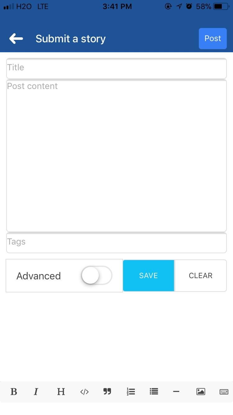
Moving on to the Post/Submit a Story area, simple and nothing overdone. Similar to the main-site , everything is well planned out on this page, with added features like a blogging site would have ( the bold, italic , heading icons for usage as well as insert pictures, bullets and a few other useful things that maybe useful or crucial to the user as they make or type content from their phone.
So as I come to my review on the Steemit/eSteem It app on the App Store part 1. So far everything isn’t as bad. I can give it so far 4 stars on everything I have reviewed in this post so far. Stay tune for Part 2 of my Steemit/eSteem app review.
Want to give insite on the app itself? Have you used the app as well? What is the pros and cons of what I’ve reviewed earlier for you? Comment in the comment below and tell us a little bit about your experience with the application.
Application: eSteem Mobile by Feruz Muradov