A strong and recognizable brand can help a business be more successful, which is why creating an effective brand identity is so important. When you create a brand identity, you're essentially applying your brand values to any visual elements that will be used to promote your business. This means that a brand identity is more than just a logo, and consists of a variety of marketing materials. From your business cards to your signages and other print materials. A brand identity is so important because it gives your business its own personality and a consistency across all of your marketing materials.

(Photo from Google Search)
Skipping the part about conceptualizing a logo from scratch, (you can find examples here to inspire you on your own logo), lets proceed to whats this post is all about!
How to turn your Logo sketch to a digital asset through the process of vectoring?
Vectoring is the process of tracing or creating a digital composite of an image using the pen tool through a combination of different lines and shapes.
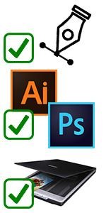
Things we'll need:
- A basic knowledge about vectoring and the pen tool
- Adobe Photoshop or Illustrator
- A scanned copy of your sketched logo
Tracing your Sketch
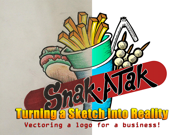
As for my example for this post, here is a recent project I have made for a client. The Logo is for a food business that my client was opening and he asked if I could make a digital render of his own sketch.
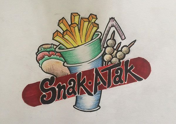
Open up Adobe Photoshop or Illustrator and open your scanned sketch file. Reduce the Opacity of the sketch to around 20-50% so that its easier and visible to trace it.
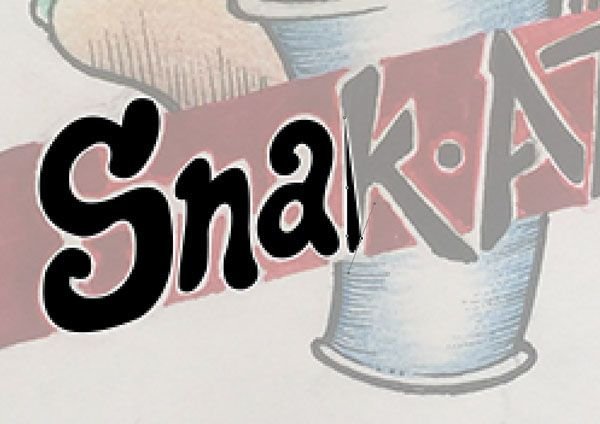
We'll start the tracing process by doing the texts first using the pen tool (please see the tutorial that I've linked for using the pen tool). I do believe that doing this in a systematical procedure starting from the text, then the black outline, followed by the fill in colors would make the process easier and a lot organized.

I then followed up with the red background of the text using the rounded rectangle tool and adjusting the radius to make the corners more rounded. Remember, when doing a vector, we are not limited to only using the pen tool, we can use the shape tools as well.

At this point, I started with the black outline of the sketch, again using the pen tool. This is important as the black outline gives the strong personality to the logo, and to make it pop more.
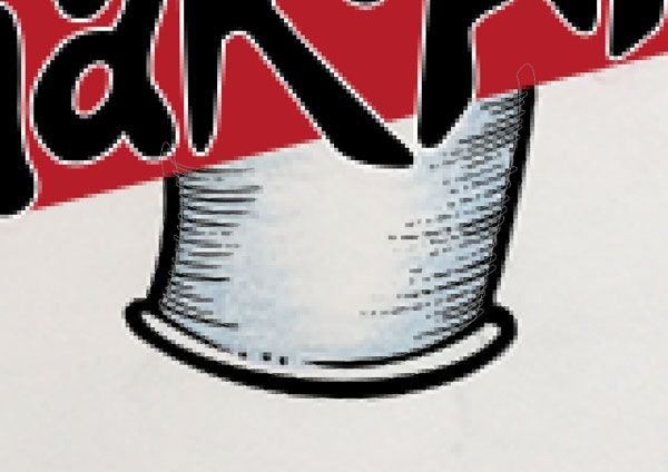
I then added, the small details like the shading, you'd have to be patient with this one as these kinds of details are very frustrating to finish.
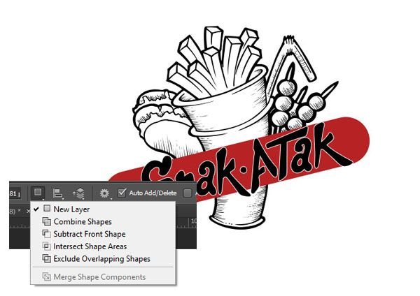
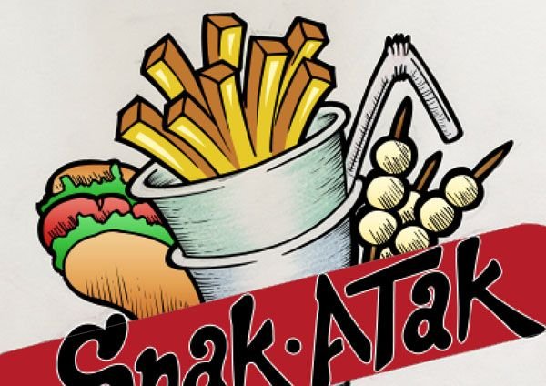
Here is the complete outline after tracing it for over 2 hrs. A tip, you can use the combine shape and subtract front shape when doing this kinds of outlines so that you won't have as much layers on your project. For this, I managed to use just one layer for the outline.
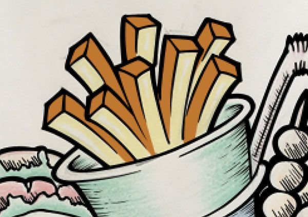
On to coloring our logo! I always start with the shadows first, then the base color and lastly the highlights. Using the pen tool again after picking the desired color, I then traced the shadows of the french fries first. You can be slouchy on this part because everything is going to be covered by the outline layer anyway.
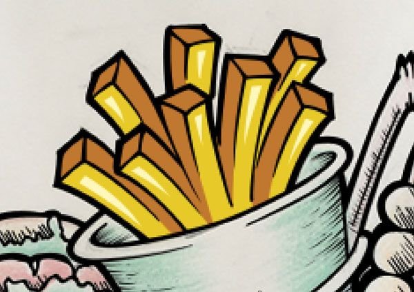
I then filled the rest of it with our base color and then added some highlights. Another tip when doing vector art, and well in everything that regards in other editing applications, the upper most layer on your project will always be the one that shows. Everything under it, or covered by it will most likely be hidden or covered.
Filling out everything with colors. I used the gradient effect here to mimic the lighting effect of the sketch to make it realistic and to add depth to the logo.
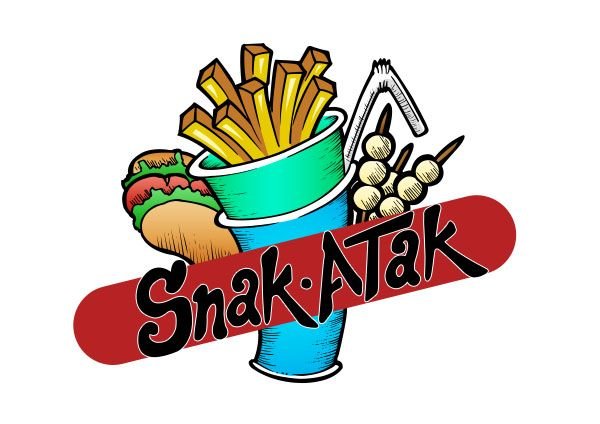
And after 5 hrs of work! Here is the final outcome! All these techniques combined really bring the initial pencil sketch to life. The key features to remember are the variations in line weight and the simple shading. Without these additions the illustration looks flat and lifeless.
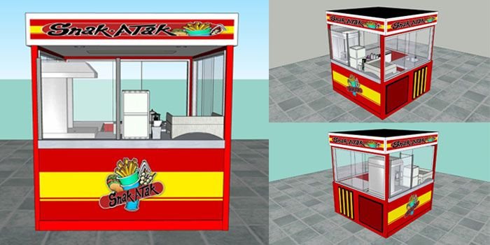
Here are some 3D renders by my buddy @ninjace so that we can see how our new logo would look like in action on a food cart.
If you enjoyed this post, don't forget to upvote👍, follow 👀 @oppaniayu & resteem ↱