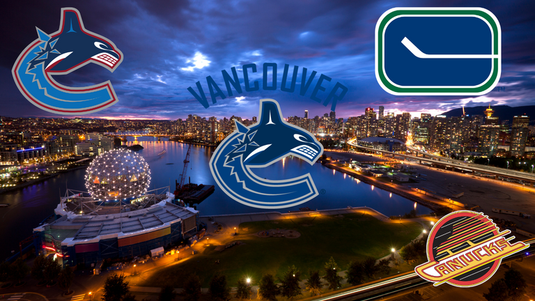
The Vancouver Canucks was a big brand to be recognized in the world of Hockey. This sports team of the National Hockey League (NHL) have been around since 1970. They represent the community of Vancouver, located on the West Coast in the lower mainland of British Colombia (BC). With the famous attractions of parks, bays and mountainous terrain, this paradise is simply a perfect scenery to establish the brand of Vancouver Canucks.
Started in 1970, they shown their pride on how to portray their brand by using blue/green colors to represent the blue of the ocean and the green of the mountains/Vancouver parks. Also, it includes a rounded oval which represents a hockey rink and the stick represents the sports of hockey. The stick breaks the oval to make a letter C for Canucks. My opinion on this branding was just simple and cool colors were evident.
By 1978, Canucks owners felt a new "modern fresh" approach was needed for the team, so a rebrand was ordered. The first iteration of the new design was black, orange and yellow V's down the front. A new logo was also designed and featured a "pop art" skate speeding over the word "Canucks." This new design shows a little bit of aggressiveness including a positive attributes of "movement and style." and with the use of warm colors its feels more upbeat.
Over the next six years, local fans were generally unhappy and fans league-wide ridiculed this"70s style" branding and by 1984, the organization simplified the branding. The pop art skate logo moved to the front and gone is the overwhelming colored V's that were visually distracting. This changes however, will only last for another 13 years and a new era of branding comes to the board.
In 1997, they decided to rebrand, this time with more traditional colors. With new owners, Orca Bay Sports and Entertainment, the team decided to return to the blue/white background and to completely remake the logo. The Canucks unveiled a new logo, in which a Haida style orca whale breaking out of a patch of ice forms a stylized “C”. I find this make over a more stylish and powerful from their previous logo.
Finally in 2008 the Vancouver Canucks decide on a slight adjustment to the brand. They kept the orca whale logo, but changed the team’s colors to match the original look from 1970 – 1971. In addition, the word-mark “VANCOUVER” was added to the chest area above the orca. In supplementary branding, the original green color was added to the uniform, website, print material, banners, flags, and social media accounts. This was so far the best design they have branded their team after all the changes over the years.
Moreover, whether it be from the website, to banners, to flags, to posters, to hockey cards, consistency of the brand remains paramount. It's very important to be consistent to keep your identity known and brand versatility should always been present to maintain your position.
In conclusion, Vancouver Canucks are considered one of the recognizable Hockey Sports team for the National Hockey League (NHL) and the fan based of its own is over a million followers for their social media account such as facebook and twitter. For people who love the hockey sport, their brand identity is known for a long time and they will continue to innovate for future generations.
If you wish to be updated with Vancouver Canucks, please follow their social media platforms at Facebook and Twitter.

The rewards earned on this comment will go directly to the people( @zasktrader ) sharing the post on Twitter as long as they are registered with @poshtoken. Sign up at https://hiveposh.com.