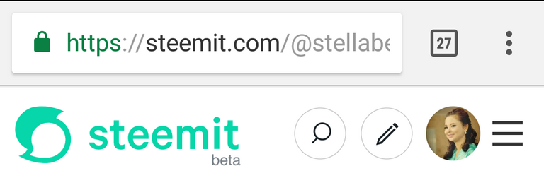
I think it is the logo. There is a beta word below the steemit word and the search and pencil are closer to each other and there is a circular form on it.
The pencil is also in a smaller icon and the search icon is pointed on the right.
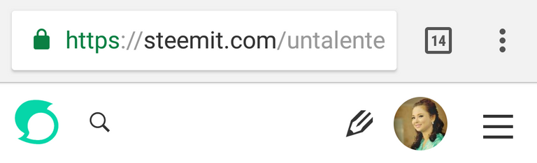
See the difference here. The 1st picture is the older one and the 2nd pic is the new interface.
And also last night I happened to noticed that one of the cover photo of fellow steemians was like twinkling, meaning it is in gif form. I don't know if that was new or it is possible before.
You are viewing a single comment's thread from: