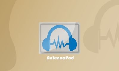
Details
As I browse Google Playstore, I find a very interesting Open Source app to play or play video and video editing. However, the lack of the application is in the logo section. This time I will try to create a new logo to progress the application.
I opted for the Antenna Pod app because of too many enthusiasts to use the app. Unfortunately if the application as good as Antenna Pod has a logo that is less interesting. I am inspired in the development of this application to be more advanced with the development of the logo section.
But most importantly: Download, stream or queue episodes and enjoy them the way you like with adjustable playback speeds, chapter support and a sleep timer. You can even show your love to the content creators with Flattr integration.
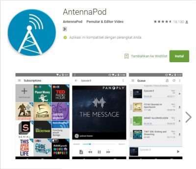
Original Logo
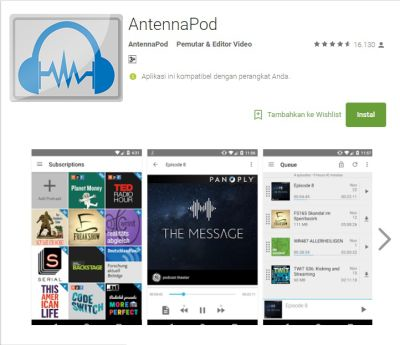
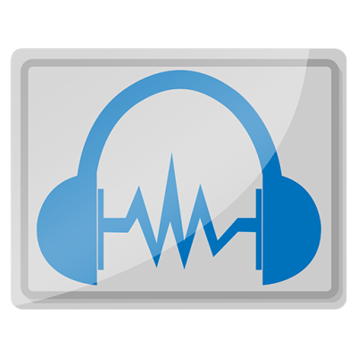
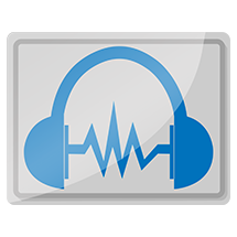
Proposal Logo
Logo Color Variations
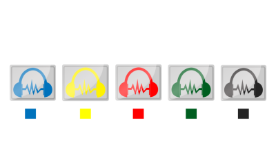
Color Code to Create Logo Variations
- [CIRCLE] -cccccc - a1a1a1 [LOGO] - 0072bc
- [CIRCLE] -cccccc - a1a1a1 [LOGO] - ffff00
- [CIRCLE] -cccccc - a1a1a1 [LOGO] - ff0000
- [CIRCLE] -cccccc - a1a1a1 [LOGO] - 005e20
- [CIRCLE] -cccccc - a1a1a1 [LOGO] - 252525
In my contribution, I chose the first choice color of blue and gray, I chose this color because I think the color blue and gray more elegant and very suitable for logo AntennaPod. I also have provided a variety of colors that can be directly selected by the application developer.
different variations
512px
215px
144px
Font Used
I used bauhaus 93 fonts you can download it : Download
Benefits / Improvements
The idea I got when designing the AntennaPod logo is when I think that a useful application for listening and recording sounds represents the sound system or Headset or other music listening device, But here I use the Headset emblem because I think the headset is useful for listening to music and often used by other users to listen to music.
And on the second symbol is the symbol of spectrum meaning digital signal or tone of voice / music, with this logo symbol better known by the music listener and of course most people will interpret this symbol is symbol of music listener application.
Hopefully my contriusi can be utilized by many people especially Antenna Pod application developers, and if I may be ready to help to progress Opensource applications to be the best.
Tools
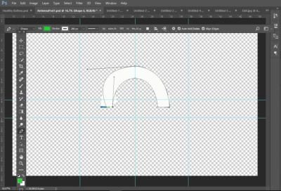
When I want to design something I always use Adop Phothoshop CC application, because by using Adop Photoshop CC I feel comfortable when designing something, and this time I also use Adop Photoshop CC application to design logo AntennaPod APK.
Proof Work

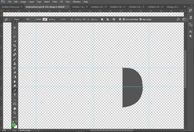

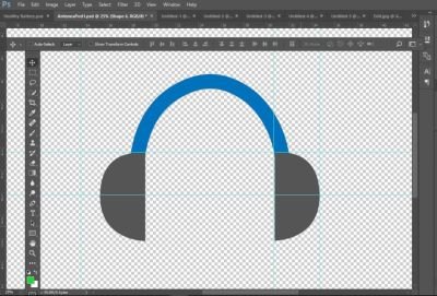
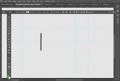
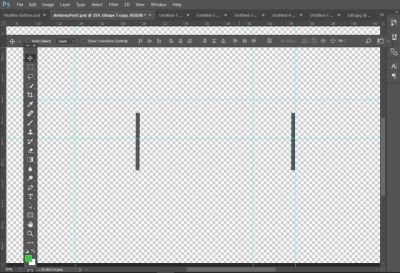
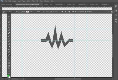
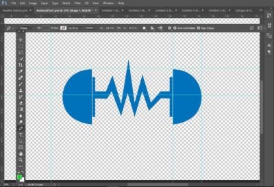


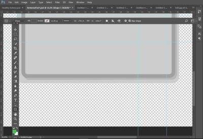

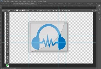
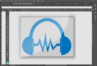
Original and New Comparison

FILE
Google Drive: Donwload
Posted on Utopian.io - Rewarding Open Source Contributors

A logo should never be created in photoshop. A logo should be vector, in that way they can crop and make the logo bigger when they need to. That aint possible with a bitmap image.
https://vector-conversions.com/vectorizing/raster_vs_vector.html
sini oom cium, dimana ciumnya?
hahahha...sini om
Like your contribution, upvote.
Good work @ath-allsave
thank you bro @zikril04
thank you so much @steemitstas
it's best verywell!
ehhh dude @rijal10
mantap kawan, lanjutkan karyamu demi masa depanmu yang lebih indah
hahhahaha,,,
mau aym geprek lek??
Please remove the grey frame and merge the sound wave with headphones. Gap between them should be bigger on none at all.
Then it might be approved.
okay now I will fix it @andrejcibik
Sir, im not clear with "Gap between them should be bigger on none at all.", would you explain more about that? @andrejcibik
Sir, im not clear with "Gap between them should be bigger on none at all.", would you explain more about that? @andrejcibik
This gap
Sir, i'ved fix it. You can check it in EPS, and PDF Folders. @andrejcibik
I see none
@ath-allsave The flow of the tone will feel very hard, rock \m/
Your contribution cannot be approved because it does not follow the Utopian Rules.
You can contact us on Discord.
[utopian-moderator]