Details
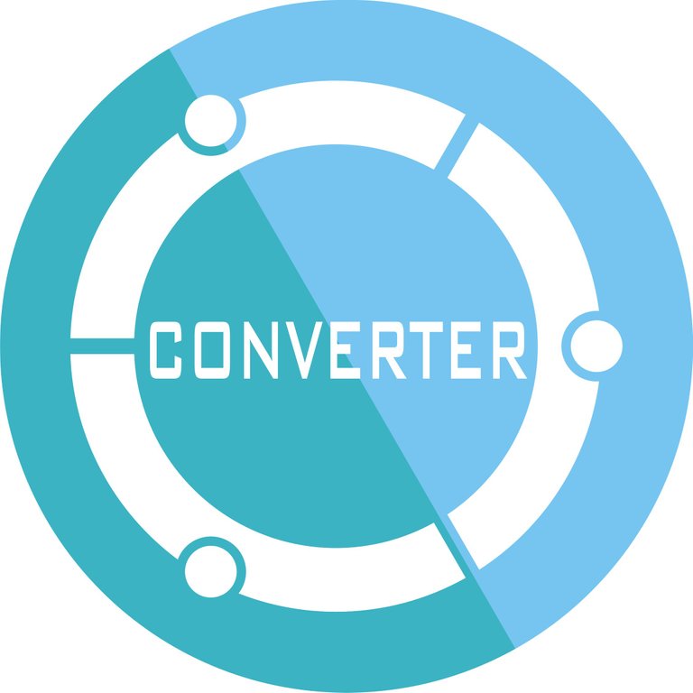
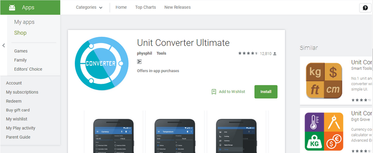
Unit Converter Ultimate is android application commonly used to convert something like unit, or the other. Icon this application looks very simple, so I think to make an icon that looks more attractive with a variety of color choices, thus making the users who want this application to be more interested.
Benefits / Improvements
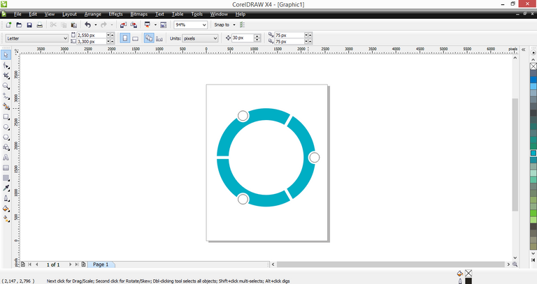
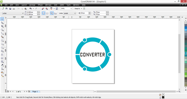
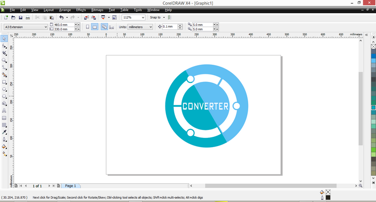
On the previous icon of the application looks very simple, which is only seen 2 pieces of arrows and the dominant blue. but on the icon I designed, I tried to make a few changes by removing the arrows and replacing them with a more modern looking circle. In addition to this I tried to make the color icon becomes more variation by making 2 colors as the dominant color.
Tools
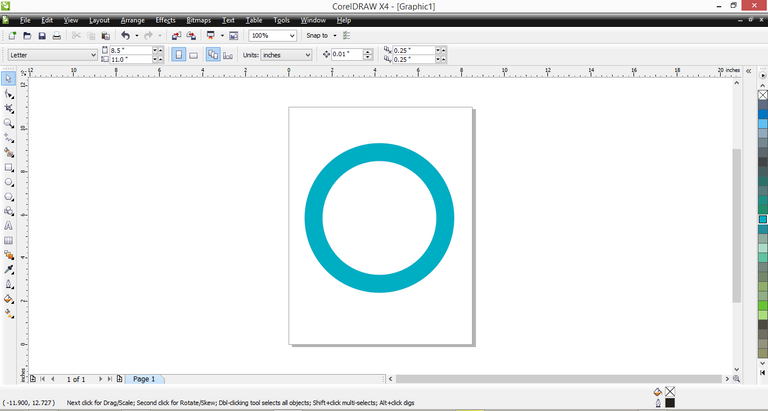
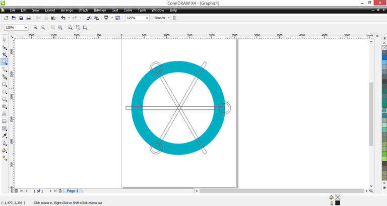
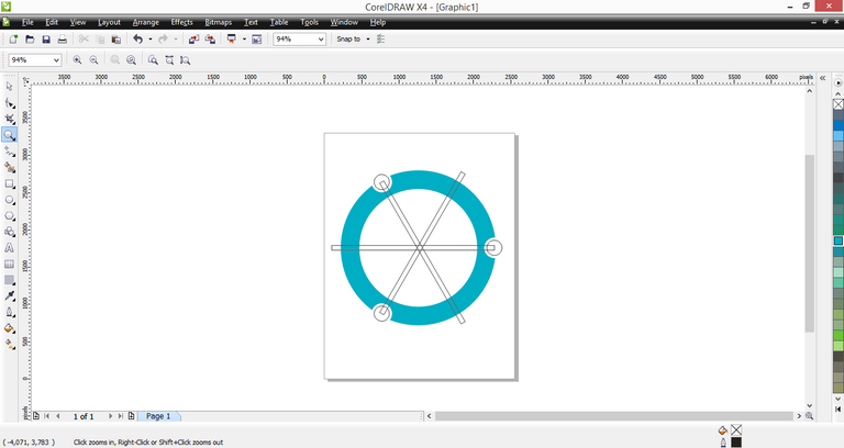
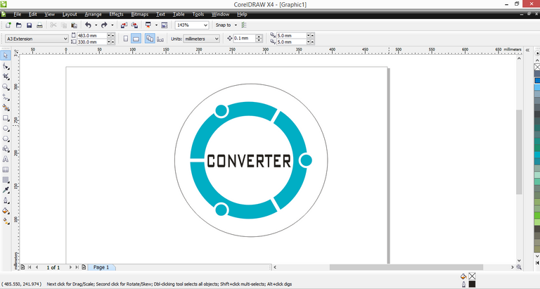
The tool I use to design this logo is CorelDRAW X4
Proof of Works


LOOK ON GOOGLE PLAYSTORE

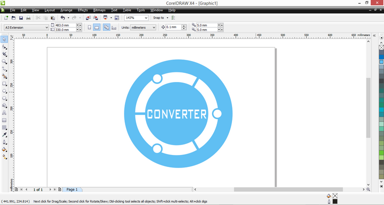
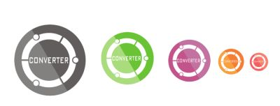
COLORS VARIATION
Original files
Posted on Utopian.io - Rewarding Open Source Contributors
Your contribution cannot be approved because it does not follow the Utopian Rules.
You can contact us on Discord.
[utopian-moderator]
folback @zefriadi12 and upvote
ok