
Details
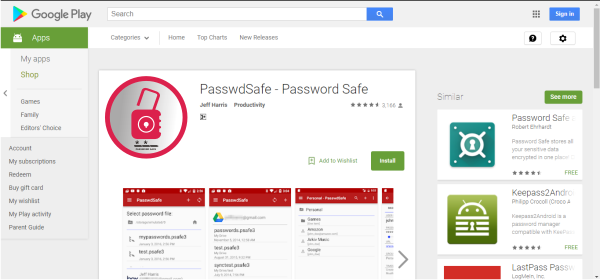
Password Safe is an application that helps you in securing data. with this app you can easily create a very secure password. this application can be downloaded via android and iOS users
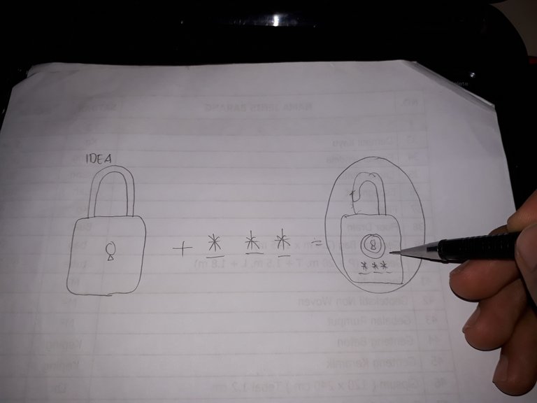
Idea
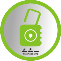
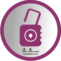
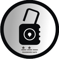
colors variation

Benefits / Improvements
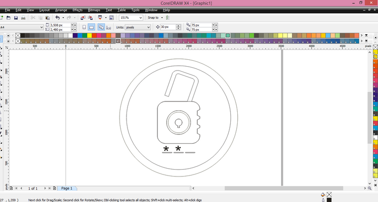
This logo I designed with the aim to facilitate its users more recognize this application.
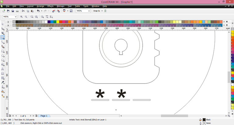
the shape of the design is inspired from the padlock, which means locked,
I'm trying to make this app look modern with some supportive color variations.
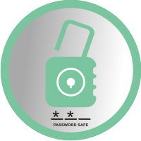
Before
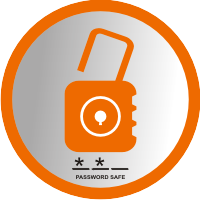
After
Sizes
 150 px
 100 px
 50 px
50 px
 48 px
48 px

32 px
Tools
CorelDRAW
Work


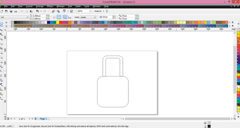
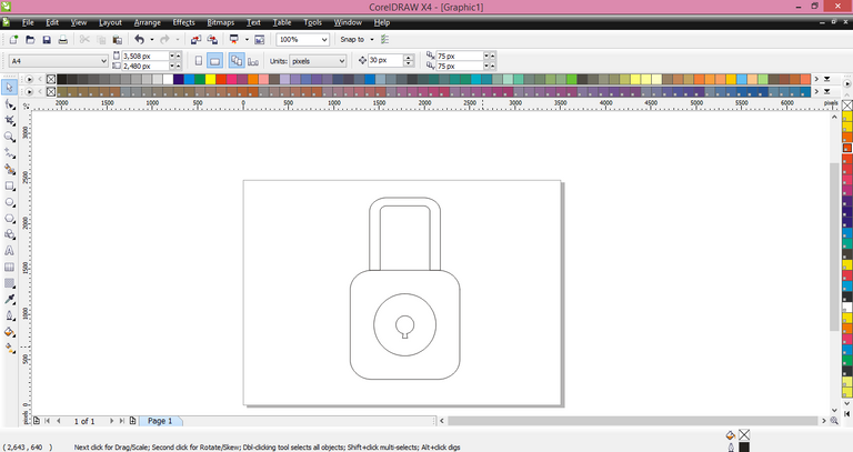
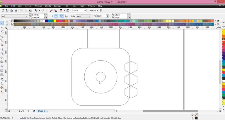


Original files
Posted on Utopian.io - Rewarding Open Source Contributors
Congratulations @azliadi! You have completed some achievement on Steemit and have been rewarded with new badge(s) :
Click on any badge to view your own Board of Honor on SteemitBoard.
For more information about SteemitBoard, click here
If you no longer want to receive notifications, reply to this comment with the word
STOPYour contribution cannot be approved because it does not follow the Utopian Rules.
Hard rules broken
Suggestion
You can contact us on Discord.
[utopian-moderator]
Thanks for your suggest. Next time I will try it
You're welcome