Hey @anharismail ,
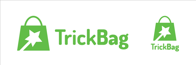
Thank you for the contribution. It is good to see that you worked together with project owner and arrived to succeed. Actually, I am agree with the po, not sure about the typeface but I mostly liked that variation as an icon.
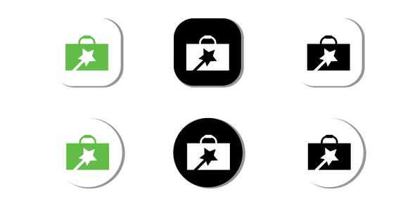
It can be better if you make smoother the drop shadows, in my opinion it looks too sharp and looks weird.
You explained everything in detail but I wanted to know your thoughts behind the typeface. Because elements on the logo design has sharp edges but your typeface has curvy and smooth corners. I think serif font would be more suitable according to icon you created. Next time, please clarify your thoughts and reasons about the color and typeface choices, so your presentation and ideas behind the design can be more understandable.
Your contribution has been evaluated according to Utopian policies and guidelines, as well as a predefined set of questions pertaining to the category.
To view those questions and the relevant answers related to your post, click here.
Need help? Chat with us on Discord.
Thank you for your review, @baranpirincal! Keep up the good work!
Thanks for the suggestion and moderation @baranpirincal