Details
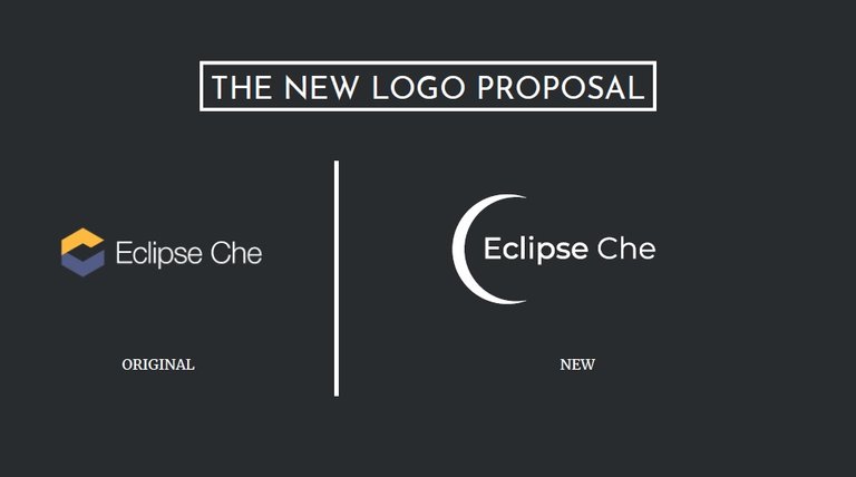
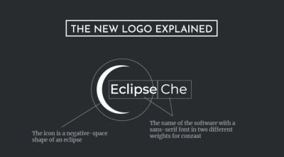
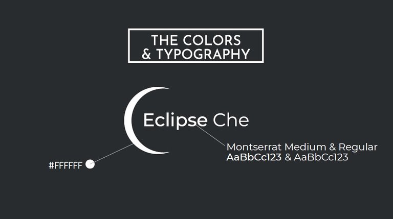
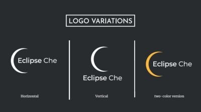
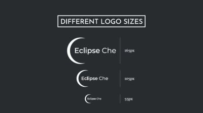
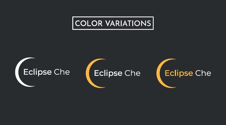
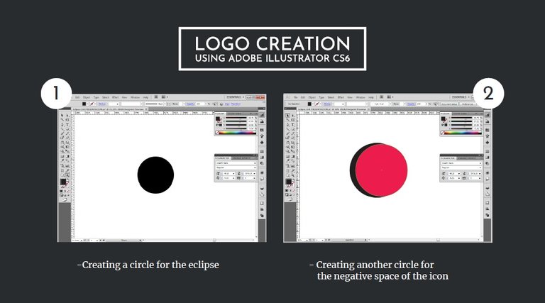
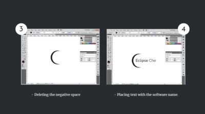
This proposal seeks to integrate in a simple and fresh way a more representative logo to the name of the application so that it can be identified more easily by the users. The icon is a negative-space shape of an eclipse and The name of the software with a sans -serif font in two different weights for conrast...
Benefits / Improvements
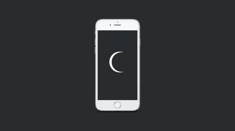
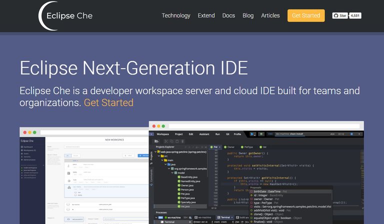
With this new minimalist logo it is possible to identify in a more representative way the name of the application, using the shape of an eclipse, the users will identify effectively with the logo of the project.
- All the fonts used are from the Google Fonts library and are available for commercial use.
- The mock-ups used are available for Commercial use.
Tools
For the creation of this design Adobe Illustrator CC
Original files
PDF - SVG BLACK - SVG WHITE - PNG - IA BLACK - IA WHITE
Posted on Utopian.io - Rewarding Open Source Contributors
They have no reason for not approving it as for its look is concerned....i guess
It looks cool, I like your minimalist style! great job :)
Simple design,but its look so prime
hi bro.. nice design and color but is it so generic? isnt it?
Your contribution cannot be approved because it does not follow the Utopian Rules.
Hard rules broken:
Suggestion
You can contact us on Discord.
[utopian-moderator]