Details
I noticed there was no logo for Starhack and I designed a new logo.
LOGO


Differences between old and new logo


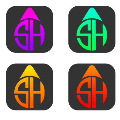
New logo different colors
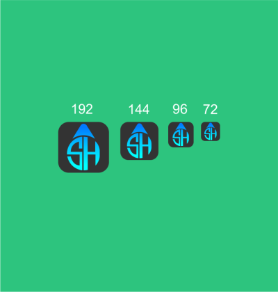
New logo different sizes
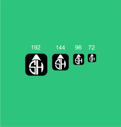
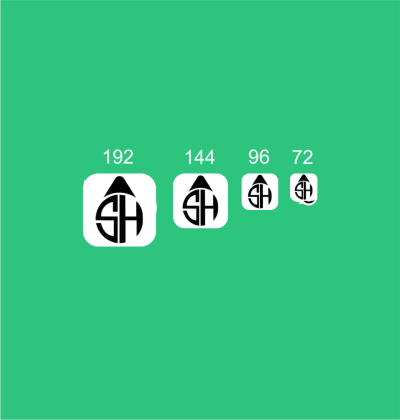
New logo different backrounds

One Color


Inspiration
Benefits
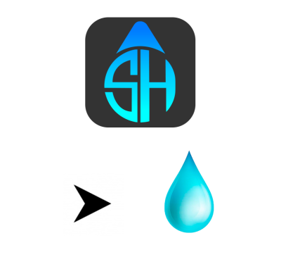
When designing the logo for Starhack, I wanted to give a constantly rising and naive style.So I combined the arrow and the water drop.The water drop is pure and plain arrows reflect forward thrust and elevation.
Stages


Tools
I used the illustrator and photoshop to design the logo.
Original files
WebSite : StarHack
Github : Link
Google Driver : Link
Font : 1
Posted on Utopian.io - Rewarding Open Source Contributors
Nice
Thanks :)
Nice idea !! I like its shape like a water drop and its color from dark to light! Well designed!
:D Thank you
Your contribution cannot be approved because it does not follow the Utopian Rules.
There is no connection between, waterdrop being pure and the application itself
You've also misspelled their name, it's StarHackIt

You can contact us on Discord.
[utopian-moderator]