What Will I Learn?
- JAVASCRIPT SYSTEM AND BOOTSTRAP
- MODAL.JS
- DIMENSIONS OF OPENED MODAL BINDINGS
- DROPDOWN.JS
- SCROLLSPY.JS
- TAB.JS
- ADD TABLE ON PANEL BOX
Requirements
Notepad++
Difficulty
- Intermediate
JAVASCRIPT SYSTEM AND BOOTSTRAP
You understand how we can make our web pages easier. We were able to create pages that fully compatible with browsers and mobile devices that bootstrap can offer both in elemental and structurally diverse ways.
In the topic we are currently discussing, we will discuss the JavaScript system that comes with Bootstrap.
With JavaScript, we can make many actions on our web page. If you do not have a lot of knowledge about JavaScript in particular, you can use Bootstrap's library to create pages faster.
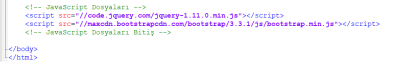
In order to use the JavaScript library that comes with Bootstrap, we first need to include the JavaScript library code that we have already learned in my page.
The required codes are as follows:
<script src="//code.jquery.com/jquery-1.11.0.min.js"></script>
<script src="//maxcdn.bootstrapcdn.com/bootstrap/3.3.1/js/bootstrap.min.js"></script>
You can add the two pieces of code here between your </ body> tags in your HTML page. In particular, one line remains at the end of the "body" tag, so if you add the </ body> tag on a line, it will be more successful. This insertion method is a mode of use supported by Bootstrap, which is thought to boot faster.
MODAL.JS
Bootstrap has the JavaScript libraries it has brought with it and named itself. We will examine Modal.JS, the first sub-library under this heading.
Modal.JS is a sublibrary where we can easily do a lot of the basic things you want to do. When you use it, you can do it by assigning classes only on the HTML side without writing JavaScript code.
Thanks to Modal.JS, you can easily open another page when it is clicked on a button. In addition, this is a process that can be turned off instantly, that is, the page to be opened is hidden in the button. No redirection to the additional page.
Our code for using the example Modal.JS is as follows:
<button class="btn btn-danger btn-sm" data-toggle="modal" data-target="#myModal">
Modal.JS Examples
</button>
<div class="modal fade" id="myModal" tabindex="-1" role="dialog" aria-labelledby="myModalLabel" aria-hidden="true">
<div class="modal-dialog">
<div class="modal-content">
<div class="modal-header">
<button type="button" class="close" data-dismiss="modal"><span aria-hidden="true">×</span><span class="sr-only">Close</span></button>
<h4 class="modal-title" id="myModalLabel">Modal.JS Examples</h4>
</div>
<div class="modal-body">
Lorem ipsum dolor sit amet, consectetur adipisicing elit. Sapiente doloremque quo vitae ratione voluptatibus quas quod amet, velit neque vero quam adipisci aut facere sunt saepe a, iure, consequatur illum.
</div>
<div class="modal-footer">
<button type="button" class="btn btn-danger btn-sm" data-dismiss="modal">Close</button>
<button type="button" class="btn btn-warning btn-sm">Accept</button>
</div>
</div>
</div>
</div>
We did our operations using classes as shown in our code.
Modal.JS example of our output:

As you can see in the picture, only one button is displayed at the moment. But when we click on it, you will get a different box.
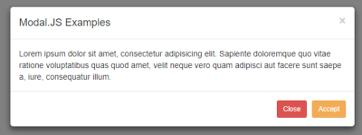
Now, as you can see in the picture, when we clicked on the buton now, we came across a different box. We created this box with the codes that I gave earlier.
However, when we click on this box, it becomes active.At the same time you can easily switch off using the cross icon or the "Close" button. Also, when this box comes in, the background is covered with a gray color, on which only the box is focused.
The full view of our box is as follows:
It is opened to the page of our canvas exactly as it appears in the picture.
DIMENSIONS OF OPENED MODAL BINDINGS
we will click on the button and we will learn how to change the dimensions of the opposing modal boxes under this heading .
The default size is not suitable for everyone, so we will resize it with a very easy operation.
Our required codes are as follows:
<button class="btn btn-warning btn-lg" data-toggle="modal" data-target=".bs-example-modal-lg">Large Modal Button</button>
<div class="modal fade bs-example-modal-lg" tabindex="-1" role="dialog" aria-labelledby="myLargeModalLabel" aria-hidden="true">
    <div class="modal-dialog modal-lg">
        <div class="modal-content">
            Lorem ipsum dolor sit amet, consectetur adipisicing elit. Tempore ducimus, aut fugiat nemo quas hic perferendis commodi nihil deleniti sed, distinctio odio dolores suscipit, doloribus facilis tenetur cupiditate atque ad!
        </div>
    </div>
</div>

<button class="btn btn-warning btn-lg" data-toggle="modal" data-target=".bs-example-modal-sm">Small Modal Button</button>
<div class="modal fade bs-example-modal-sm" tabindex="-1" role="dialog" aria-labelledby="mySmallModalLabel" aria-hidden="true">
    <div class="modal-dialog modal-sm">
        <div class="modal-content">
            Lorem ipsum dolor sit amet, consectetur adipisicing elit. Recusandae qui animi sunt, esse sit praesentium vitae possimus consequuntur, iste voluptas, accusamus, ab obcaecati maxime quam natus eveniet sed reiciendis ullam!
        </div>
    </div>
</div>
As you can see from the areas I have highlighted, there are "sm" and "lg" structures we have used in many places. We have easily resized using these constructions.
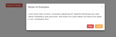
The outputs will be as follows:

It is a modal box with the size of "Large" in the picture.
If it is a small size box, the output will be as follows:

As you can see, our cannon was both in appearance and structurally shrunk.
These boxes open with a small and pleasant effect when opened. If this effect is not suitable for you, you can easily turn off the effect with the code below.
<div class="modal" tabindex="-1" role="dialog" aria-labelledby="" aria-hidden="true">..................</div>
As you can see, here is my div ethics. You can prevent the box from being inserted between these codes and opening the effect. All we have to do is to refer to this div tag when we write the codes.
You can also use other JavaScript code located on the Bootstrap page if you want to do more. I do not want to enter these additional functions because it appeals to more specialized users, otherwise you will have a lot of confusion with your JavaScript.
You can build more functional libraries by reviewing all the Events and Methods code on Bootstrap's own page.
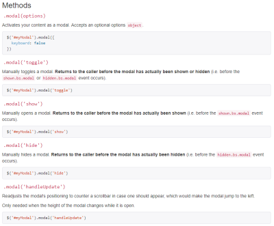
As you can see in the picture, Bootstrap gives you other methods that you can implement, as well as a page in Events like this.
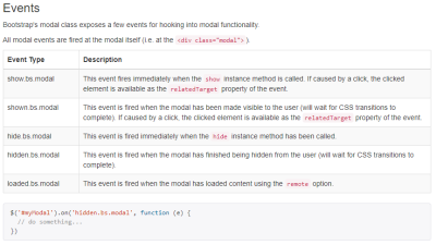
The part that appears in the picture is the Events section mentioned in the title.
DROPDOWN.JS
This JS library has been developed to make popup menus understandable by name. With Dropdown.JS, you can easily create pop-up menus in navigation and pill menus.
We have already seen the drop-down menu in detail on other pages. So I decided to explain just the same thing again in this section. You can obtain the necessary information for this section from other pages.
We talked about how to make a drop-down menu when we are talking about navigation menus. But here I would like to give the table for the extra Events and Methods events that Bootstrap has done.

With this extra table you can apply more options.
SCROLLSPY.JS
Under this heading we will examine the ScrollSpy.JS library which comes with Bootstrap. We can describe this library with the best pictures because it gives us a lot of respect in terms of user experience compared to other sites.
With this library you can switch between menus in the navigation menu. As already understood from its name, the Scroll term is due to this feature.
Now let's look at how we can use it. Our sample code for use is as follows:
<div class="container-fluid" style="width: 700px;">
<nav id="navbar-example" class="navbar navbar-default navbar-inverse" role="navigation">
    <div class="navbar-header">
        <button class="navbar-toggle" data-toggle="collapse" type="button" data-target=".bs-js-navbar-scrollspy">
            <span class="icon-bar"></span>
            <span class="icon-bar"></span>
            <span class="icon-bar"></span>
        </button>
        <a class="navbar-brand" href="#">ScrollSpy.JS Example</a>
    </div>
    <div class="collapse navbar-collapse bs-js-navbar-scrollspy">
        <ul class="nav navbar-nav">
            <li><a href="#lorem">1. Step</a></li>
            <li><a href="#ipsum">2. Step</a></li>
            <ul class="dropdown-menu" role="menu"></ul>
            </li>
        </ul>
    </div>
</nav>

<div data-spy="scroll" data-target="#navbar-example" data-offset="0" style="height:200px;overflow:auto; position: relative;">
    <h4 id="lorem">Lorem</h4>
    <p>Lorem ipsum dolor sit amet, consectetur adipisicing elit. Rem illo esse consequuntur, ducimus praesentium quisquam, quae veritatis. Sint ex molestiae, consectetur, quibusdam doloremque, fugit est, omnis magnam doloribus qui vel!</p>

    <h4 id="ipsum">Ipsum</h4>
    <p>Lorem ipsum dolor sit amet, consectetur adipisicing elit. Maxime numquam assumenda maiores dolorem nobis similique aperiam! Architecto asperiores obcaecati quisquam, recusandae assumenda odio dolorem explicabo aspernatur velit hic ab adipisci?</p>

    <h4 id="sit">Sit</h4>
    <p>Lorem ipsum dolor sit amet, consectetur adipisicing elit. Soluta non quod explicabo blanditiis esse doloribus, vero id in laboriosam, nesciunt, ratione quibusdam minus incidunt placeat velit quis suscipit tempore rem.</p>

    <h4 id="dolor">Dolor</h4>
    <p>Lorem ipsum dolor sit amet, consectetur adipisicing elit. Cupiditate consequuntur incidunt nemo architecto aliquam esse vel blanditiis necessitatibus libero explicabo, dolorum nam totam voluptatem sapiente voluptatum. Alias debitis doloremque numquam.</p>

    <h4 id="amet">Amet</h4>
    <p>Lorem ipsum dolor sit amet, consectetur adipisicing elit. Blanditiis mollitia id libero, molestias exercitationem ipsa aspernatur harum eius laudantium? Eius quae nobis, ut esse, voluptas minima rem debitis recusandae itaque.</p>
</div>
Our codes are really long, as you can see, but there is not much that can be done in this matter. If we were going to examine our code, we used our classes and codes like datatoggle in many lines. A separate point to note in this section is to write the codes correctly. Because there is a lot of code. Letter mistakes may prevent you from working.
Here is a code that we need to add to the tag, except for those codes. Adding this code is an important issue.
<body style="position: relative; padding:30px;" data-spy="scroll" data-target=".navbar-example">
As you can see, we made extra attachments to the body tag. Thanks to these additives, it will work more smoothly. Of course, the most important thing is that JavaScript files are included in the project. Otherwise, no action will be taken.
Yes, now what kind of output does it see.
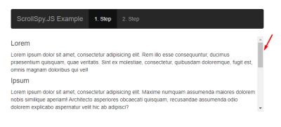
There is a field in the picture with an arrow mark. This area is our scrollbar area and we are doing the sliding process through this area. If you want to scroll with the bar you can do with the help of the mouse. As you can see, we have more of our scripts, so the scrollbar looks full. When we go down to this section, the navigation menu automatically switches itself to the second part. In this way, the user can understand which part he is in.
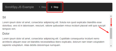
As you can see in the picture, when we make a downward stroke, the 2nd section of the navigation menu is set. So now our upper part is completely based on the scroll process. Especially here I made the navigation bar inverse so that it can be understood better by making it black.
In short, the event I would like to describe is as follows:
As you can see in the picture, we added our codes on a line.
TAB.JS
Under this heading we will learn how to work with tabbed structures with tabstrips using Bootstrap and Tab.JS.
Tab.JS is a library made for the tab system as understood. With this system, you can work as you would in a scanner. When we associate Tab.JS library with the real time, it works on the same system as browsers and you can use it easily because it came directly with Bootstrap.
The code for our sample Tab.JS is as follows:
<div class="bs-example bs-example-tabs">

    <ul id="myTab" class="nav nav-tabs" role="tablist">
        <li class="active"><a href="#first" role="tab" data-toggle="tab">1. Step</a></li>
        <li class=""><a href="#second" role="tab" data-toggle="tab">2. Step</a></li>
        <li class=""><a href="#third" role="tab" data-toggle="tab">3. Step</a></li>
    </ul>

    <div id="myTabContent" class="tab-content">

        <div class="tab-pane fade active in" id="first">
            <p>Lorem ipsum dolor sit amet, consectetur adipisicing elit. Repellat iusto placeat temporibus optio necessitatibus consequatur ex qui, amet laudantium, maiores nobis eligendi aliquid, soluta enim! Possimus ipsam dolor, voluptatem dolorem.</p>
        </div>

        <div class="tab-pane fade" id="second">
            <p>Lorem ipsum dolor sit amet, consectetur adipisicing elit. Vitae excepturi, consectetur rem deserunt cumque. Quas accusantium ex nemo alias repellendus dolorem corporis asperiores sequi maiores quam eligendi, atque, dicta maxime.</p>
        </div>

        <div class="tab-pane fade" id="third">
            <p>Lorem ipsum dolor sit amet, consectetur adipisicing elit. Nemo laborum, suscipit. Omnis id temporibus ducimus odio a, atque saepe cupiditate adipisci aspernatur pariatur eos rem autem dolor dignissimos minus, reprehenderit.</p>
        </div>

    </div>

</div>
As you can see, we are faced with long lines again, but I can say that it is easier to use Tab.JS. The point to note here is that the value in the href and the value in the id are the same, as seen in places where I have emphasized. If it is the same, it will not be a problem.
Our output will be as follows:
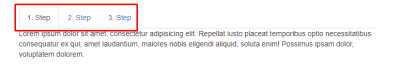
The picture reminds us of web browsers. That's why it's called tab anyway. Here we see the tab system in Web browsers. You can add as many tabs as you like.
As you can see in our example, there are three parts, you can easily switch between them by clicking on these parts.
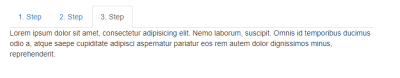
If you look carefully at the remainder, we have shifted to the third part. However, our text content has changed.
We also have a term called "Fade Active In" in our codes. This term applies an effect called "Fade" when switching between the tabs. If you want to remove this effect, it will be enough to delete the code.
You can also browse the Bootstrap web page if you want to work more with the JavaScript side. As I said, you can look at other methods if your JavaScript knowledge is advanced.
Posted on Utopian.io - Rewarding Open Source Contributors
Thank you for the contribution. It has been approved.
You can contact us on Discord.
[utopian-moderator]
Hey @manishmike10, I just gave you a tip for your hard work on moderation. Upvote this comment to support the utopian moderators and increase your future rewards!
Hey @codings I am @utopian-io. I have just upvoted you!
Achievements
Suggestions
Get Noticed!
Community-Driven Witness!
I am the first and only Steem Community-Driven Witness. Participate on Discord. Lets GROW TOGETHER!
Up-vote this comment to grow my power and help Open Source contributions like this one. Want to chat? Join me on Discord https://discord.gg/Pc8HG9x
Congratulations @codings! You received a personal award!
Click here to view your Board
Congratulations @codings! You received a personal award!
You can view your badges on your Steem Board and compare to others on the Steem Ranking
Vote for @Steemitboard as a witness to get one more award and increased upvotes!