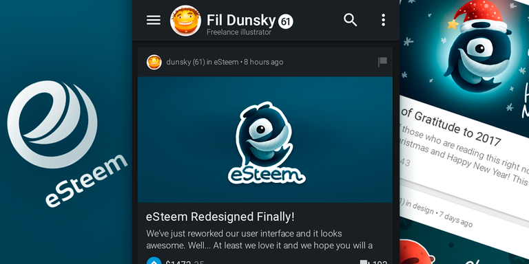
We’ve just reworked our user interface and it looks awesome. Well... At least we love it and we hope you will accept these changes.
I wish I could start like that but actually this is only my fantasy and here I propose early sketches of eSteem UI redesign.
My name is Fil Dunsky, I am freelancing as an illustrator for last ten years. I had graphic design education in university though I am not an UI designer and never had an experience in that but still I would like to try because of my passion to improve everything. I had been using @eSteemapp for a while and found it's current interface is not as good as it can be. It is heavy and old.
If you are a Pro in user interfaces or you see any mistakes here or have any comments how together we can make it better please let me know. If you are not an expert anyway you are welcome to critique and comment since maybe you are the future user of eSteem mobile client so this is for you.
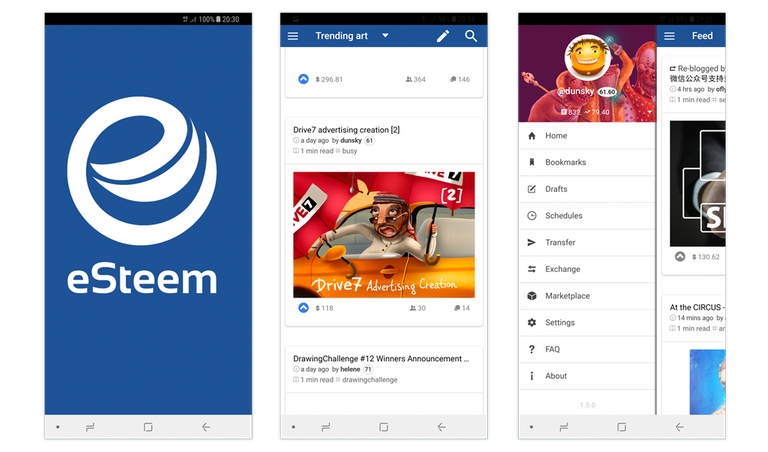
Searching process
While I was searching for one of the solutions I've got some middle variants. I don't like them too much but put them here just to show you some more of my mistakes. For example, square previews will mess with 99% of existing blockchain previews which all the Steemians uploaded already. So it have to be standard or close to that dimentions.
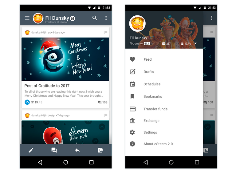
Light Theme
I like dark interfaces because they are really cool looking, more battery friendly for AMOLED screens, they looks different itself and maybe because I am using dark Photoshop theme. But here is the light variant as well and I suppose there could be an option in the application to switch themes.
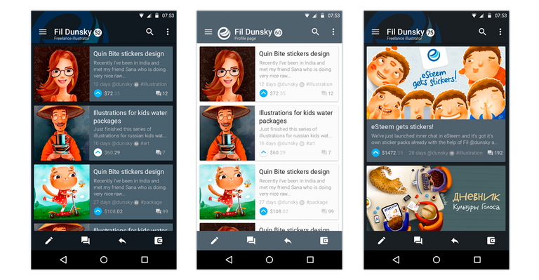
Existing eSteem UI
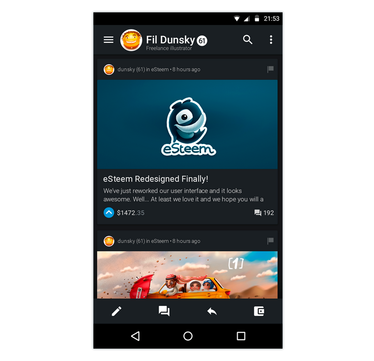
This is just to compare for those who never seen existing eSteem user interface. Too big logo in the Splash Screen, overwhelming lines, disproportions between free space and other UI elements.
Proof of Work
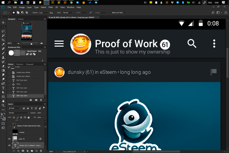
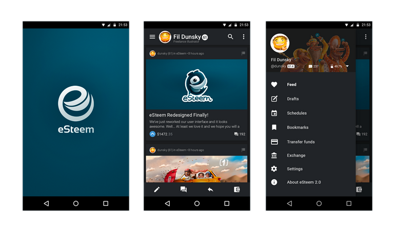
I've used official Android Material Design Guidelines and icons which are available for everyone. For me it is much easier to design or do something if there is a guideance and I like Material Design concept so it was easy to start and I am ready to continue.
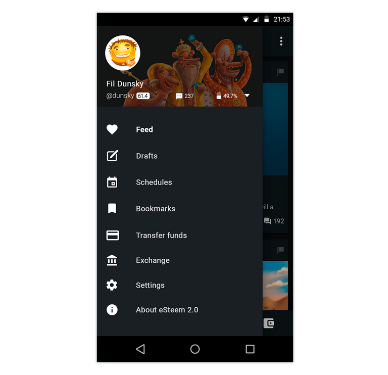
I would be glad to contribute my free time adding all the necessary screens like login page, wallet, friends feed, comment section and others, if you think it is good and I shall go on.
All the sources in Photoshop .PSD format are uploaded here.


Posted on Utopian.io - Rewarding Open Source Contributors
Hey @dunsky I am @utopian-io. I have just upvoted you!
Achievements
Community-Driven Witness!
I am the first and only Steem Community-Driven Witness. Participate on Discord. Lets GROW TOGETHER!
Up-vote this comment to grow my power and help Open Source contributions like this one. Want to chat? Join me on Discord https://discord.gg/Pc8HG9x
Wow! :)
I think this is looking great! I definitely prefer the card style feed over the square version.
I prefer the dark version that's at the top of the post compared to the mid-grey tones around the light theme as I feel it adds an unecessary level of visual noise and inhibits accessibility.
Overall though the designs look great and would love to see this implemented in the eSteem app.
Great, thanks a lot for your review! Now I see a bit more logic in my own work done :) I mean I think now I understand more why I do that things the way they've done.
This is really great!! I've been using esteem for some time and have been wondering why the UI still looked so cumbersome, this would be a great upgrade, I think this would really help a lot with getting more people to use and depend on the app!! Congratulations for such good, solid work my friend!! :D
Thanks a lot! Yes, let's hope so!

The results of your work are nothing less than totally freaking awesome. Top notch contribution to the app UI. Many many thanks!
Haha :) Thank you for you oppinion!
The name of the user is vertically centered but it feels down because of the description under it. I think they both should be centered together. Or better, dont desiplay the description there. There is not that much space. Display it on profile page. Its a nice concept.
Thanks a lot for good logical comment, Andrej!
wow amazing. i was paint esteem logos to various colour. just for fun, but i hope this proposal can be aprove for steemit team @dunsky. nice job broooo ^_^
Yes, we will definitely work together further on that!
yeah... that so amazing @dunsky
I use the Esteem App quite frequently, on a daily basis.
I do agree, the current version for the user interface is quite bulky and blehh..
I like what you have presented here as an option.. but who is in charge anyway?
Thank you :) we are in touch with the main developer so it can be implemented in future releases if it will get support of community.
@originalworks
The @OriginalWorks bot has determined this post by @dunsky to be original material and upvoted it!
To call @OriginalWorks, simply reply to any post with @originalworks or !originalworks in your message!
Looking great
Thank you :)
Looks pretty cool actually, better than the current theme.
Thank you very much!
This would be like OH YEAH!
Haha :)
Great..
Thanks :)
Yupsss
In my Opinion this Looks Very good, i will learn it.
thansk.
Thanks!
That what I mean,,,
Awesome pal,,,
Yeah, I mean that too (I guess)
beautiful post, I like, stop by my account and upvote
Wow!
This ia really nice.for me it's captivating. .stuffs like this needs to be attractive..and this is 99% acctractive.so nice job and keep it up..great job..I also love the lighting. .It is matured.
Thank you very much!
Good @dunsky
Thank you!
Ok @dunsky
Great post proposal...
Nice idea..
I like...
Thank
you
very
much! :)
Nice article and loved it @dunsky
Thanks, I love it too!
Great Illustrations that should capture a new audience...even promote tweet or facebook like interface.
Thank you! I hope so!
Upvoted and resteemed because this is indeed a very good proposal! A genius idea to improve our way of interacting here in the steemit community! Kudos to you @dunsky! 😊
great work
big thanks
Good
this theme seems smoother than the current one, i love it
Thanks!
Looks pretty cool When will this project be alive ?
Thank you :) It will be implemented soon! Next year - 2018 :)
Great post there, keep up good work !
This replay was created using STEEMER.NET Alpha ( support STEEMER.NET / Wallet / Exchange Project here: https://steemit.com/investors-group/@cryptomonitor/steemer-net-steem-blockchain-transactor-for-windows-android-app-funding-update-243-1200-sbd-28-12-2017 )
Thank you! You have very nice project as well!
Good post
I completely agree with you :P
wow. awesome.. like it. but, Your contribution cannot be approved yet. See the Utopian Rules. Please edit your contribution to reapply for approval. change your repository. esteem repository. https://github.com/eSteemApp/esteem
You may edit your post here, as shown below:
You can contact us on Discord.
[utopian-moderator]
Oops, sorry! This is my first contribution. Just changed it to corrected one. Please check it again. Thank you so much! @podanrj
Hi Your design is Great! but...
Your contribution cannot be approved yet. See the Utopian Rules. Please edit your contribution to reapply for approval.
You may edit your post here, as shown below:

You can contact us on Discord.
[utopian-moderator]
@julastamban thanks a lot for your comments! I've added what you've asked. Please, review.
Your Post Has Been Featured on @Resteemable!
Feature any Steemit post using resteemit.com!
How It Works:
1. Take Any Steemit URL
2. Erase
https://3. Type
reGet Featured Instantly – Featured Posts are voted every 2.4hrs
Join the Curation Team Here
This is great work
Good proposal
Thank you very much!
very nice job!!!! youa have the powerr :)
Thank you! I hope to hame some Steem Power as well soon! :)
you are a authentic machine .. what you propose you will get it . and them i see you with a lot SP ..
:)
blessings
you know, let me wish you the very best!!! I use eSteem as well but I have found it very unfriendly and old-school as you said... Please try to make a Patch as soon as possible... Please let ud know when this is available
Thank you. Yes, let's hope new design will be released as soon as possible!
i love this design, some people like you will make great impact and inspiration for me for better design
Haha, thanks a lot, Aulia! I can tell exactly same to you! By the way, I want to ask how did you manage to do such a UI design preview in perspective like they are all layin on the surface? Is there any hint for that? Some Photoshop action?
i can give you my template, you can put such screen you like by clicking at the layer, the layers are being smart object, do you know how to make a mock up for presentation ? it is the same, maybe little adjustment between the edges makes the shape looks like laying on the surface.
i like all of your work with 3d design, that's amazing
I would appreciate that! Please send me to look into it :) Thanks a lot! This is my main duty to draw illustrations...
https://drive.google.com/drive/folders/1gVgk9Un35Dn0haYvf1AtBa-z6SRowmPe?usp=sharing
you can download here ;)
great, so who is the main person who responsibility for creating good UX and UI in eSteem?
Thank you for the contribution. It has been approved.
You can contact us on Discord.
[utopian-moderator]
Hurray! Thank you so much for your patience. I've edited my post few times to make it suitable for the platform :)
Nice article.. Great job bro
Thanks
this looks amazing..
hope to see it happening soon!!
Thanks a lot! Yeah, me too!
This is just incredible. I will update my esteem app right after this comment and give it another try. the version i am currently using is slow to response and cannot connect to my steemit account to give updates. I hope this new one changes that for me.
This is only a concept. Let's hope together it will be implemented next year as soon as possible.
Simplemente se ve genial, espero que pronto pueda ser implementada, saludos.
Muchas gracias!
Согласна, так намного веселее. Классная работа!
Но светлый вариант тоже неплохо бы оставить, чтоб была возможность выбора.
Спасибо большое! Да, конечно! Я очень хочу его доработать, светлый должен остаться как номер 1, а тёмный - опционально.
I the designs are very well put together. It would seem that you have an understand of the Google Material design principals.
I would suggest that you take a look at the app called Sketch. It has really improved my workflow regarding design apps, something that Photoshop was never really design for but evolved into. It is very light on your graphics processors. Stops the nightmare of mega massive working files.
Thank you! I will try it on my wife's machine. Cause I have only Windows PCs and she is on MacBook Pro.
Nice post @dunsky
Thanks edyfaisal
Stellar work @dunsky! The designing of the interface to make look more and more like an interactive RPG video game, or even a sim is very impressive. The work is sweet, keep it sir!
Haha :) yeah, thank you so much!
minta upvote.... :)
I just installed the eSteem app for the first time and tried looking for the place to change the profile cover photo overlay from pink to anything else, but I never found out where... so I'm pretty glad to see this redesign has a different overlay.
Overall, it looks great! Can't wait for it to come out!
I think you should add some costum avatars smileys and some differnt themes.
Wow amazing article
I
Like
It
So
Much
Good post
Nice post @goodkarma ,please help me @goodkarma🙏
tutorial memindahkan teks di kertas ke hp
https://steemit.com/aceh/@gurusosiologi/cara-mengcopy-tulisan-di-kertas-buku-ke-ponsel-how-to-copy-write-in-paper-book-to-phone