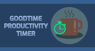
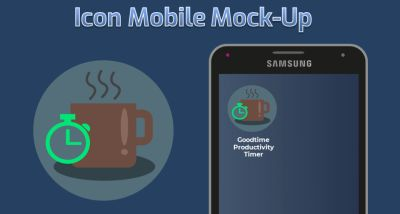
Good day. This is my new icon design for "Goodtime Productivity Timer" app.
DESCRIPTION
Get rid of procrastination and get your work done with Goodtime Pomodoro Timer.
Goodtime will help you use the Pomodoro™ technique:
• split your work into 25 minute sessions of focus and then reward yourself with 5 minutes of break
• after 4 sessions of work, take a longer break
Features:
• ad-free and open-source
• battery friendly
• configurable work and break duration
• pausable timer
• sound and vibration notifications
• works in the background
• disable sound and internet connection during the work sessions
• resettable finished work sessions counter
• AMOLED-friendly user interface
Source
DESIGN CONCEPT

BLACK ON WHITE AND WHITE ON BLACK LOGO VERSION

COLOR VARIATIONS

COMPARISON OF ORIGINAL ICON VS MY DESIGN
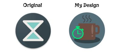
Source of photo: Smart Phone
ICON SIZES
-192px

-144px

GITHUB REPOSITORY
Link
PROOF OF WORK


BENEFITS/IMPROVEMENT
Goodtime Productivity Timer app is a timer that uses the "pomodoro technique". Pomodoro technique is a time management method that helps you make intervals or a short break time in your work. I used that feature in my design. I draw a cup of coffee to represent the break time and then mixed it up with a timer. This made the design more modern and more recognizable.
TOOLS
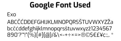
I used Adobe Illustrator CC 2017 in designing this new proposed icon and Microsoft PowerPoint for the presentation.
ORIGINAL FILES
You can download all the files i used in the link below.
Original Files
Posted on Utopian.io - Rewarding Open Source Contributors
Your contribution cannot be approved because it does not follow the Utopian Rules.
You can contact us on Discord.
[utopian-moderator]