You will learn how to create some cool buttons for your website using open source software: Brackets by Adobe.
Difficulty: Medium.
Languages: HTML, CSS3.
First create and set your files.
We will need index.html and style.css. Save them in the same folder and open it in Brackets.
Add the appropiate code in both files to start:
Index.html

syle.css

Create your first button.
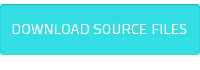
For example a Donwload button. Buttons are usually made with <a> tag. And add a class to it to differenciate it from other <a> tags. This is the right code:
<a class="button1">Download</a>
And it should look like this in the HTML file:

If we test the file in the browser it will look like this:

Very simple.
CSS
First we will set the basics at CSS, like font size and general appearance of the button:

Now our button looks like this:

Import better font
We will import the font Lato from Google fonts with the following code in our CSS:
@import url('https://fonts.googleapis.com/css?family=Lato');
Now we can use the font:

Our first :hover effect
At the CSS add the code:

All the style we write here will affect the button when the cursor is over it. We can change the color of the font or background and much more.
Sample after changing the background:

Making it more interesting
We will add more style:

The magic touch
We will add the line: transition: all .5s to our button1 style.

Now you can see the color change is smooth!
This is our CSS this far:
@charset "utf-8";
@import url('https://fonts.googleapis.com/css?family=Lato');
a{cursor: pointer;}
.button1{
    display: inline-block;
    font-size: 11px;
    background: #32dde3;
    color:#fff;
    padding: 5px;
    font-family: 'Lato';
    text-transform: uppercase;
    border-radius: 5px;
    transition: all .5s;
}
.button1:hover{
 background: #23c3ca;
}
Now we will make more buttons with real cool effects
To change color and grow:
.button2{
    display: inline-block;
    font-size: 11px;
    background: #ff5b5b;
    color:#fff;
    padding: 5px;
    font-family: 'Lato';
    text-transform: uppercase;
    border-radius: 5px;
    transition: all .5s;
}
.button2:hover{
    background: #cc2121;
    padding:20px;
}

You might have noticed we have repeated code in both styles button1 and button2. It is time to optimize our CSS making a new style: button. Here we will set the code that will be present in each button:

This is our optimized CSS

This is how we should change our HTML to have now 2 styles in each button
Cool inner shadow effect made flat
.button3{
    background:#bf3ef4;
    box-shadow: 0 -5px 0 #9f26d1 inset;
}
.button3:hover{
    box-shadow: 0 -15px 0 #9f26d1 inset;
}

Another one with inner shadow:
.button4{
    background:#abff67;
    box-shadow: 0 0 5px 0 #77ce31 inset;
}
.button4:hover{
    box-shadow: 0 0 50px 5px #77ce31 inset;
}

Last one

.button5{
    background:#6b6b6b;
    box-shadow: -3px 3px 0 #343434;
}
.button5:hover{
    box-shadow: -10px 10px 3px #343434;
}
Google drive folder with HTML and CSS.
This is all for now, I hope you find this usefull and help you make your next website have cooler buttons. Remember you can play with styles all you want!
Just remember to add the trick: transition:all .5s. You can actually change "all" for the style you want to add a transition to, in case you don't want it in all the styles; and you can change the time to 1s , 2s, etc.
Leave any doubt in the comments and suggestions for a next tutorial if you want.
I am a professional graphic designer
You can find me here {  |
|  |
|  }
}
Posted on Utopian.io - Rewarding Open Source Contributors
Hey @fabiyama ! Well done, your first code tutorial!!! 100% upvoted! XD ! :-)
PS: your code example however contains a small error you might want to fix ;-)
--> it's in the section "Create your first button". The code you have now (and its image) is:
<a class="button1">Download</a>However, because the
ahyperlink ("anchor") element is missing itshref=""attribute, the textDownloaddisplays inside the browser as text instead of a regular hyperlink.You can fix this (and maybe update the picture as well?) like so:
<a class="button1" href="">Download</a>But anyway, much work done, let's continue this! Looking forward to more of your coding tuts!!!!
Oh! You are right! I focused so much in the CSS so I didn't consider xD I think it's not allowed to modify an accepted post at utopian so I will upvote your comment for visibility. Just fix my username please n.n it's missing "da" :P
I am glad you will follow this series bc you will help me improve too, ok?xD i will follow your tuts too!
nice, i love tutorials like these; I've messed around with CSS some but I have a lot to learn, but these are the ways I do!
There is a lot to learn and to create!:D
Very nice! Perfect to start learning CSS 🙂
Thanks! I hope this is usefull for you!
We didn't start the fire, it was always burning since the world's been turning.
gamasacre!
Amazing!!, with the css3 you can create great animations in the buttons, you have become great example buttons in gifs :D
Thank you! :D
That Looks cool!!! I started Learning CSS and I covered 60 % then I have to leave due to academic activities I will start soon!
That is great! CSS world is so cool n_n
Hey @fabiyamada I am @utopian-io. I have just upvoted you!
Achievements
Suggestions
Get Noticed!
Community-Driven Witness!
I am the first and only Steem Community-Driven Witness. Participate on Discord. Lets GROW TOGETHER!
Up-vote this comment to grow my power and help Open Source contributions like this one. Want to chat? Join me on Discord https://discord.gg/Pc8HG9x
Thank you for the contribution. It has been approved.
You can contact us on Discord.
[utopian-moderator]
Good training!
Thanks!