DETAILS
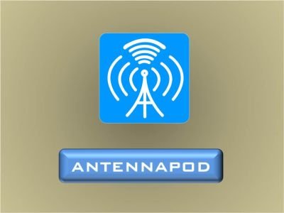
AntennaPod is a podcast manager and player that gives you instant access to millions of free and paid podcasts, from independent podcasters to large publishing houses such as the BBC, NPR and CNN. AntennaPod is free in all senses of the word: open source, no costs, no ads.
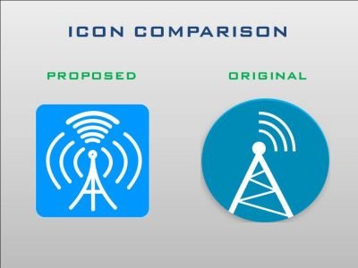
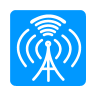
PROPOSED VS ORIGINAL ICON
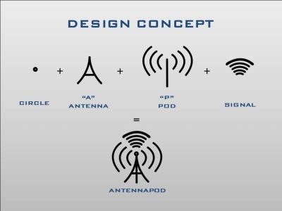
DESIGN CONCEPT
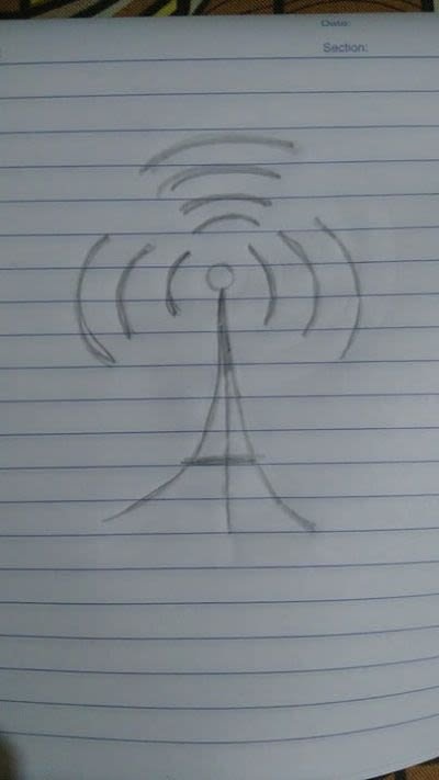
I used a simple concept for my proposed icon. Letter "A" (Antenna) to represent the tower, and P (Pod) as signal.
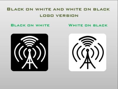
BLACK ON WHITE AND WHITE ON BLACK LOGO VARIATION
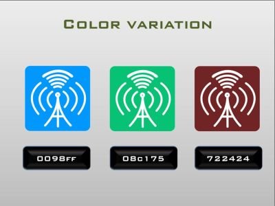
COLOR VARIATIONS
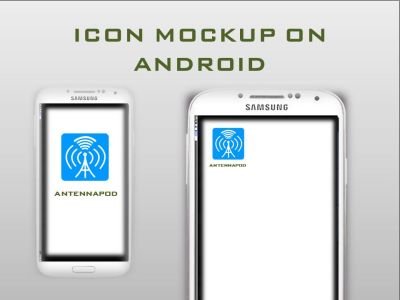
ICON MOBILE MOCK-UP
ICON SIZES
-192px
-144px

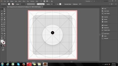
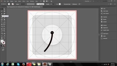
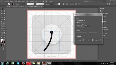
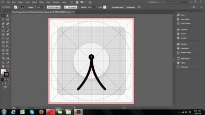
PROOF OF WORK


BENEFITS/IMPROVEMENT
My new proposed designed icon is an enhancement of an existing graphic icon. As you can see i used the name AntennaPod (A and P) so the user can easily remember the name and function of the application.
TOOLS
I used the following:
- Adobe Illustrator 2017 CC - creating my proposed icon
- Paint - for my proof of work and github screenshot
- Power Point - for my presentation
ORIGINAL FILES
You can download the original, editable and other related files in this Link
Posted on Utopian.io - Rewarding Open Source Contributors
that a nice and cool concept :)
Your contribution cannot be approved because it does not follow the Utopian Rules.
You can contact us on Discord.
[utopian-moderator]