Bootstrap
Build responsive, mobile-first projects on the web with the world's most popular front-end component library. Bootstrap is an open source toolkit for developing with HTML, CSS, and JS. Quickly prototype your ideas or build your entire app with our Sass variables and mixins, responsive grid system, extensive prebuilt components, and powerful plugins built on jQuery.

Image Source
| What Will I Learn? |
|---|
| - We will be informed about Bootstrap's Card feature. |
| - We will code our Blog section appropriately to our design. |
| Requirements |
|---|
| - Brackets (Website) |
| - Intermediate code knowledge |
| - Basic HTML and CSS knowledge |
| Difficulty |
|---|
| - Intermediate |
Curriculum
Part 1: Bootstrap One-Page Web Design #Part1 [Turkish Tutorial]
Part 2: Bootstrap One-Page Web Design #Part2 [Turkish Tutorial]
Part 3: Bootstrap One-Page Web Design #Part3 [Turkish Tutorial]
Part 4: Bootstrap One-Page Web Design #Part4 [Turkish Tutorial]
Part 5: Bootstrap One-Page Web Design #Part5 [Turkish Tutorial]
Part 6: Bootstrap One-Page Web Design #Part6 [Turkish Tutorial]
Part 7: Bootstrap One-Page Web Design #Part7 [Turkish Tutorial]
Part 8: Bootstrap One-Page Web Design #Part8 [Tutorial]
Part 9: Bootstrap One-Page Web Design #Part9 [Tutorial]
Part 10: You are now here.
Tutorial Contents
In our previous lesson, we coded our Services section. The Services section consisted of two parts. The first part included title and subtitle. In the other part, a row is divided into three columns. And, equivalently, we were coded by adding content. In this lesson we will add a blog section. We will do this using the Bootstrap's Card feature.
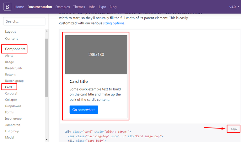
Go to Bootstrap's Documentation page and follow the Components>>Card path. In the page that opens, you will see the basic card codes as shown in the photo. Using these codes, we will display the latest blog posts on our web page.
Let's start by coding our index.html page.
Create a section tag containing our Blog section.
<section id="blog">
</section>
Here we have defined the blog id. As we talked in our previous lesson, with this id, we will link the Blog section to the navigation menu.
Keep coding. Now we have to create a container inside the section tag.
<section id="blog">
      <div class="container">
      </div>
</section>
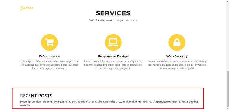
The blog section will consist of two parts, just like the Services section. The first part will contain a title and a subtitle. Let's code them first.
<section id="blog">
        <div class="container">
            <div class="blog-top">
                <h3>RECENT POSTS</h3>
                <p>Lorem ipsum dolor sit amet, consectetur adipiscing elit. Phasellus viverra ultricies arcu, in bibendum ex mollis ut. Suspendisse et tellus et turpis dapibus convallis.</p>
         </div>
   </div>
</section>
Here we have created the first part. We have added a header and a paragraph into the blog-top class.
Let's save our codes and check our page.
Let's coding the second part of our Blog section.
We will start by creating a div class called blog-content and define a row class inside it. We will split a row into three equal columns and fill each column with our blog contents.
<section id="blog">
      <div class="container">
          <div class="blog-top">
                <h3>RECENT POSTS</h3>
                <p>Lorem ipsum dolor sit amet, consectetur adipiscing elit. Phasellus viverra ultricies arcu, in bibendum ex mollis ut. Suspendisse et tellus et turpis dapibus convallis.</p>
           </div>
          <div class="blog-content">
                <div class="row">
                </div>
           </div>
      </div>
</section>
We have created our row class. Using the information we learned in our previous lessons, we will divide a row into three columns. You know that, a row in Bootstrap consists of twelve columns. We will use the col-md-4 class for the three columns we want. (12/3 = 4)
<section id="blog">
      <div class="container">
          <div class="blog-top">
                <h3>RECENT POSTS</h3>
                <p>Lorem ipsum dolor sit amet, consectetur adipiscing elit. Phasellus viverra ultricies arcu, in bibendum ex mollis ut. Suspendisse et tellus et turpis dapibus convallis.</p>
           </div>
          <div class="blog-content">
                <div class="row">
                      <div class="col-md-4">
                      </div>
                      <div class="col-md-4">
                      </div>
                      <div class="col-md-4">
                      </div>
                </div>
           </div>
      </div>
</section>
Our general code structure was formed. Now let's get our content. Above, we copied the simple card codes from Bootstrap's Documentation page. Our codes were like this:
<div class="card" style="width: 18rem;">
  <img class="card-img-top" src="..." alt="Card image cap">
  <div class="card-body">
    <h5 class="card-title">Card title</h5>
    <p class="card-text">Some quick example text to build on the card title and make up the bulk of the card's content.</p>
    <a href="#" class="btn btn-primary">Go somewhere</a>
  </div>
</div>
Our card codes consist of a photograph, a title, a paragraph and a button. This is the most basic card codes. We can get different looks by customizing these codes. In this and next lessons, we will try to fully understand Bootstrap's card feature by experimenting with different variations.
Now place these codes we have copied into our column codes. The final version of our codes should be as follows:
<section id="blog">
      <div class="container">
          <div class="blog-top">
                <h3>RECENT POSTS</h3>
                <p>Lorem ipsum dolor sit amet, consectetur adipiscing elit. Phasellus viverra ultricies arcu, in bibendum ex mollis ut. Suspendisse et tellus et turpis dapibus convallis.</p>
           </div>
          <div class="blog-content">
                <div class="row">
                      <div class="col-md-4">
                         <div class="card" style="width: 18rem;">
                              <img class="card-img-top" src="..." alt="Card image cap">
                              <div class="card-body">
                                   <h5 class="card-title">Card title</h5>
                                   <p class="card-text">Some quick example text to build on the card title and make up the bulk of the card's content.</p>
                                   <a href="#" class="btn btn-primary">Go somewhere</a>
                                </div>
                          </div>
                      </div>
                </div>
           </div>
      </div>
</section>
Let's save our codes and check our page.
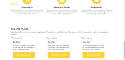
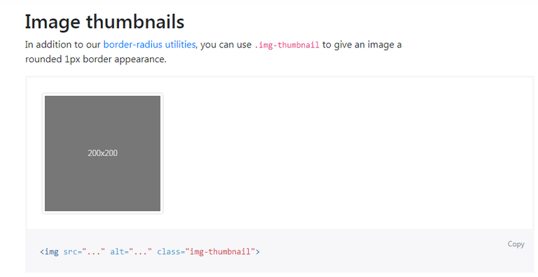
Our cards have been added. Now let's edit our codes. I will select and link the photos from the photos we used earlier on our slide. And I will center the content with the text-center class. With the img-thumbnail class we will give the following view to the photos.
The edited version of our code should look like this:
 <section id="blog">
        <div class="container text-center">
            <div class="blog-top">
                <h3>RECENT POSTS</h3>
                <p>Lorem ipsum dolor sit amet, consectetur adipiscing elit. Phasellus viverra ultricies arcu, in bibendum ex mollis ut. Suspendisse et tellus et turpis dapibus convallis.</p>
            </div>
            <div class="blog-content">
              <div class="row">
                <div class="col-md-4">
                    <div class="card" style="width: 18rem;">
                      <img class="card-img-top img-thumbnail" src="images/slide/slide0.jpg" alt="Card image cap">
                      <div class="card-body">
                        <h5 class="card-title">Card title</h5>
                        <p class="card-text">Some quick example text to build on the card title and make up the bulk of the card's content.</p>
                        <a href="#" class="btn btn-primary">Go somewhere</a>
                      </div>
                    </div>
                </div>

                <div class="col-md-4">
                    <div class="card" style="width: 18rem;">
                      <img class="card-img-top img-thumbnail" src="images/slide/slide1.jpg" alt="Card image cap">
                      <div class="card-body">
                        <h5 class="card-title">Card title</h5>
                        <p class="card-text">Some quick example text to build on the card title and make up the bulk of the card's content.</p>
                        <a href="#" class="btn btn-primary">Go somewhere</a>
                      </div>
                    </div>
                </div>

                <div class="col-md-4">
                    <div class="card" style="width: 18rem;">
                      <img class="card-img-top img-thumbnail" src="images/slide/slide2.jpg" alt="Card image cap">
                      <div class="card-body">
                        <h5 class="card-title">Card title</h5>
                        <p class="card-text">Some quick example text to build on the card title and make up the bulk of the card's content.</p>
                        <a href="#" class="btn btn-primary">Go somewhere</a>
                      </div>
                    </div>
                </div>
            </div>
          </div>
        </div>
      </section>
Let's save our codes and check our page.
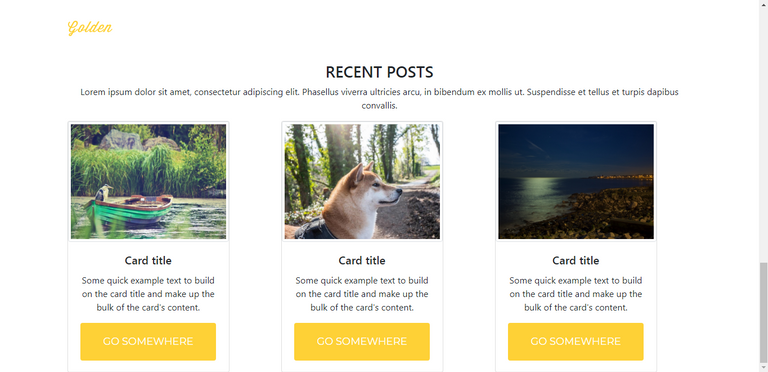
Seems nice. Now open main.css file. We will write our codes first and then explain each one.
#blog {
    background-color: #f7f7f7;
    padding-top: 120px;
    padding-bottom: 70px;
}
We set our blog section's background color to #f7f7f7. We defined the value of padding as 120 pixel from top and 70 pixel from bottom.
.blog-top h3 {
    font-family: 'Montserrat', sans-serif;
    font-size: 40px;
    font-weight: 700;
}
We set the font of the header h3tag in the blog-top class as Montserrat. We set the font size to 40 pixel and set the font to bold.
.blog-top p {
    font-family: 'Droid Serif', serif;
    font-size: 16px;
    font-style: italic;
    color: #777;
    margin-bottom: 70px;
}
We set the font of the paragraph p tag in the blog-top class as Droid Serif. We set the font size to 16 pixel and set the font color to #777. Margin-bottom has set to 70 pixel. And also font style is italic.
.card {
    border-style: none;
}
We removed the borders from each card.
.blog-content .row {
    margin-bottom: 50px;
}
Margin-bottom has set to 50 pixel for row class on the blog-content class.
.blog-content .card-title {
    font-family: 'Montserrat', sans-serif;
    font-size: 18px;
    font-weight: 700;
}
We set the font of the card-title class in the blog-content class as Montserrat. We set the font size to 18 pixel and set the font to bold.
.blog-content .card-text {
    font-family: 'Droid Serif', serif;
    font-size: 14px;
}
We set the font of the card-text class in the blog-content class as Droid Serif. We set the font size to 14 pixel.
Now change the button class to btn-success from btn-primary.
Let's save our codes and check our page.

Now let's edit our blog entries. First, I'll add category headers. We want to add an icon and category name for the category. We will use font awesome again for this.
Just add the following code just below the card-bodyclass.
<a href="">
 <h6 class="mb-3 mt-4">
<i class="fas fa-map fa-x"></i>
<strong> Adventure</strong>
</h6>
 </a>
If we need to explain; we have defined the category name in h6 tag. We've bolded it with the <strong> </ strong> tag.
mb-3 = margin bottom 3 spacing units
mt-4 = margin top 4 spacing units
Our icon is in the i tag.
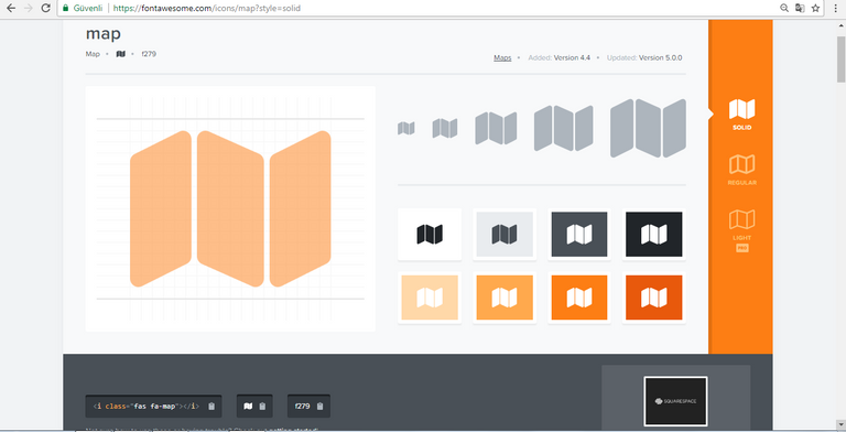
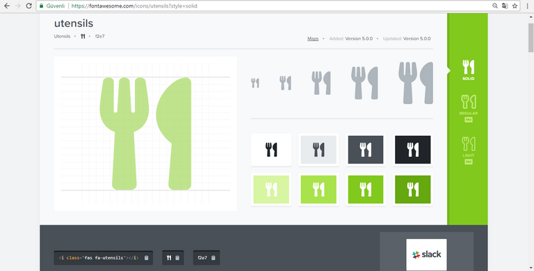
The codes for other blog posts are as follows:
<a href="">
 <h6 class="mb-3 mt-4">
<i class="fas fa-utensils fa-x"></i>
<strong> Food</strong>
</h6>
</a>
The only difference in our codes is our icon code.
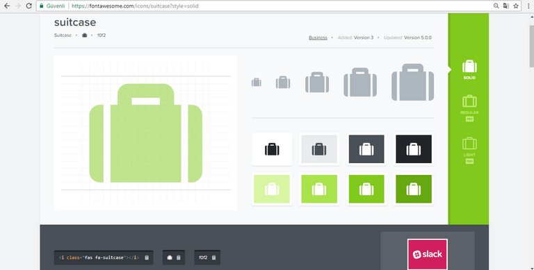
And finally:
<a href="">
<h6 class="mb-3 mt-4">
<i class="fas fa-suitcase fa-x"></i>
<strong> Travel</strong>
</h6>
 </a>
Now let's add these codes below the summary of the blog post.
<p>by<a href=""><strong> neokuduk</strong></a>, 11/02/2018</p>
Here we have added the name of the author and the publication date.
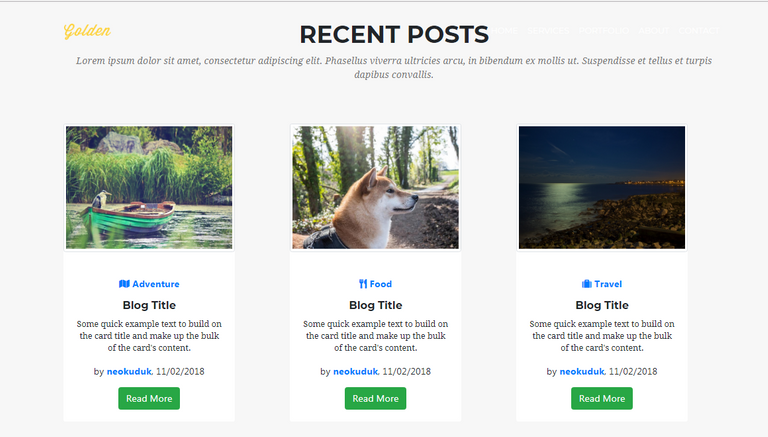
Finally we change the text of our button to "Read More" and save all the codes. The final version of our codes should look like this:
<section id="blog">
        <div class="container text-center">
            <div class="blog-top">
                <h3>RECENT POSTS</h3>
                <p>Lorem ipsum dolor sit amet, consectetur adipiscing elit. Phasellus viverra ultricies arcu, in bibendum ex mollis ut. Suspendisse et tellus et turpis dapibus convallis.</p>
            </div>
            <div class="blog-content">
              <div class="row">
                <div class="col-md-4">
                    <div class="card" style="width: 18rem;">
                      <img class="card-img-top img-thumbnail" src="images/slide/slide0.jpg" alt="Card image cap">
                      <div class="card-body">
                        <a href="">
                        <h6 class="mb-3 mt-4">
                            <i class="fas fa-map fa-x"></i>
                            <strong> Adventure</strong>
                        </h6>
                        </a>
                        <h5 class="card-title">Blog Title</h5>
                        <p class="card-text">Some quick example text to build on the card title and make up the bulk of the card's content.</p>
                        <p>by<a href=""><strong> neokuduk</strong></a>, 11/02/2018</p>
                        <a href="#" class="btn btn-success">Read More</a>
                      </div>
                    </div>
                </div>

                <div class="col-md-4">
                    <div class="card" style="width: 18rem;">
                      <img class="card-img-top img-thumbnail" src="images/slide/slide1.jpg" alt="Card image cap">
                      <div class="card-body">
                        <a href="">
                        <h6 class="mb-3 mt-4">
                            <i class="fas fa-utensils fa-x"></i>
                            <strong> Food</strong>
                        </h6>
                        </a>
                        <h5 class="card-title">Blog Title</h5>
                        <p class="card-text">Some quick example text to build on the card title and make up the bulk of the card's content.</p>
                        <p>by<a href=""><strong> neokuduk</strong></a>, 11/02/2018</p>
                        <a href="#" class="btn btn-success">Read More</a>
                      </div>
                    </div>
                </div>

                <div class="col-md-4">
                    <div class="card" style="width: 18rem;">
                      <img class="card-img-top img-thumbnail" src="images/slide/slide2.jpg" alt="Card image cap">
                      <div class="card-body">
                        <a href="">
                        <h6 class="mb-3 mt-4">
                            <i class="fas fa-suitcase fa-x"></i>
                            <strong> Travel</strong>
                        </h6>
                        </a>
                        <h5 class="card-title">Blog Title</h5>
                        <p class="card-text">Some quick example text to build on the card title and make up the bulk of the card's content.</p>
                        <p>by<a href=""><strong> neokuduk</strong></a>, 11/02/2018</p>
                        <a href="#" class="btn btn-success">Read More</a>
                      </div>
                    </div>
                </div>
            </div>
          </div>
        </div>
      </section>
Let's save our codes and check our page.
It looks pretty good. Let's look at the Responsive feature. Reduce the screen size.
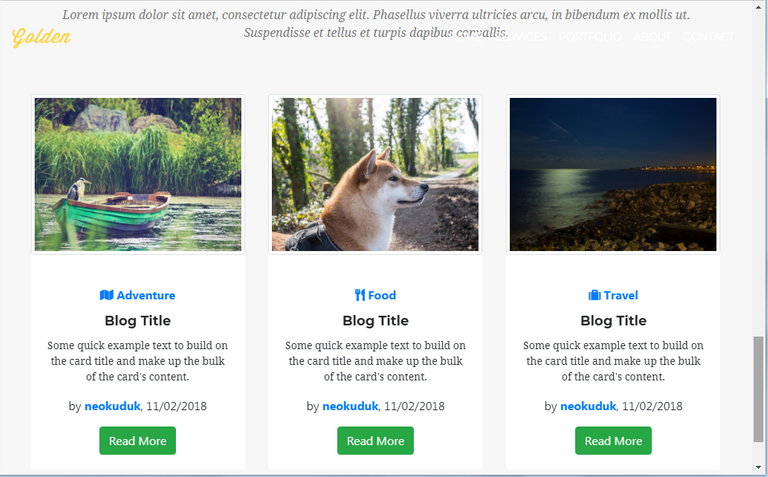
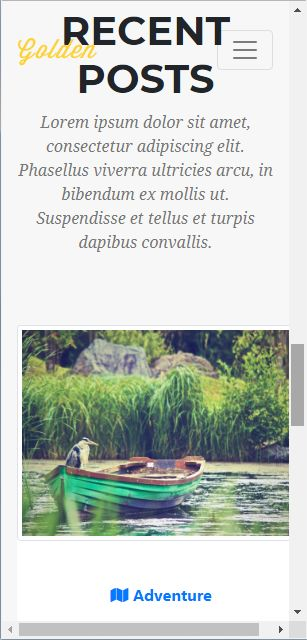
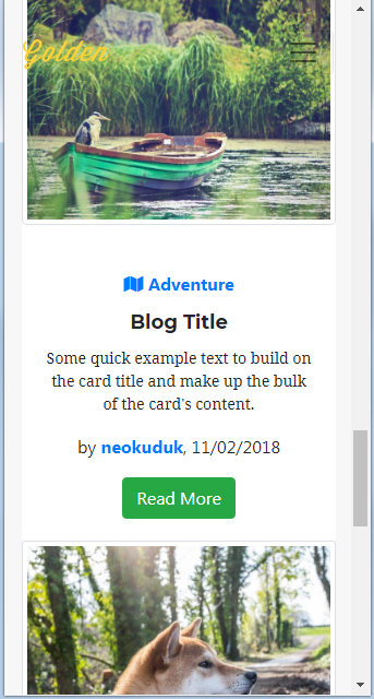
We will arrange our responsive features in the following lessons, but even now it looks good. We came to the end of this part of our education. Thank you for your interest.
Posted on Utopian.io - Rewarding Open Source Contributors
Thank you for the contribution. It has been approved.
You can contact us on Discord.
[utopian-moderator]
Thank you.
Hey @neokuduk I am @utopian-io. I have just upvoted you!
Achievements
Suggestions
Get Noticed!
Community-Driven Witness!
I am the first and only Steem Community-Driven Witness. Participate on Discord. Lets GROW TOGETHER!
Up-vote this comment to grow my power and help Open Source contributions like this one. Want to chat? Join me on Discord https://discord.gg/Pc8HG9x