infestor is a cross platform CLI app to claim and create discounted accounts on the STEEM blockchain.
Developed by emrebeyler, after HF20 allowed steem users to claim accounts with their resource credits.
It's a CLI app, but he have plans to create a web interface for it, so he asked me to design a logo for it.
| Repo | Issue | Commit |
|---|---|---|
| emre/infestor | issues/2 | 7021d69 |
Request came from Emre from discord directly, but I asked him to open an issue on GitHub and he kindly did it.
https://github.com/emre/infestor/issues/2
As can be seen in the issue, the name infestor comes from infest, also an ascription to a unit in a game called StarCraft.
https://liquipedia.net/starcraft2/Infestor_(Legacy_of_the_Void)
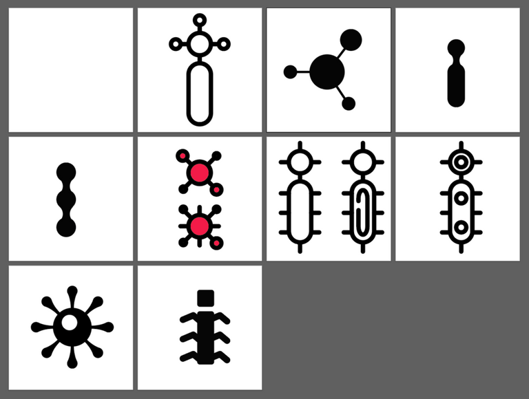
So my initial thought about the design was to express an idea about segmentation, a bigger power creates his own smaller powers. Here are the initial propositions of my ideas. Which are highly inspired by baranpirincal's style, I was admiring his work lately, the thick strokes, kinda pastel colors creates some modern looking icon/logos.
Most of the ideas visually looking like a virus segmentation, however Emre liked the last one as it looks like a larvae. So I focus on that one and tried some alternatives.
 |  |
|---|
| Color and Size Alternatives | |
|---|---|
 |  |
| Applications | |
|---|---|
 |  |
 | This work is licensed under a Creative Commons Attribution 4.0 International License. |
|---|---|
| Tools | Adobe Illustrator |
| Files | google-drive:download |
| Font | Montserrat |
| Profile | github/anilkilic |


Hi @oups, thank you for your contribution.
First i would like to mention how relieved i am seeing your presentation, organizing all the links and even the logo variations in tables is a really great idea as it make your post more compact yet still contained all the necessary stuff. I also really appreciate how you did your research and asked project owner to make a github issue so your conversation is open for public.
The design itself is on point, i really like it. one thing that i think need a little tweak is the one color variation, it lost too much details and made the segmentation concept kinda lost too, i tried to tweak it and think adding some offset did help the details lost.
Your contribution has been evaluated according to Utopian policies and guidelines, as well as a predefined set of questions pertaining to the category.
To view those questions and the relevant answers related to your post, click here.
Need help? Write a ticket on https://support.utopian.io/.
Chat with us on Discord.
[utopian-moderator]
Thanks a lot for your kind words. It’s the first time I was trying this style. And definetely one color version should be like how you tweaked.
Thank you for your review, @nilfanif! Keep up the good work!
I like the final output @oups , but i like this version of yours better. :)
haha thanks, sometimes slack ones look nice as well. :)
This is the MS Paint Version for @emrebeyler ;)
wow, those straight lines with ms paint? 👏
we should collaborate next time.
Lol.. Yeah, but I wasn't aware that he requested a icon for his investor investation
:)
Hey, @oups!
Thanks for contributing on Utopian.
We’re already looking forward to your next contribution!
Get higher incentives and support Utopian.io!
Simply set @utopian.pay as a 5% (or higher) payout beneficiary on your contribution post (via SteemPlus or Steeditor).
Want to chat? Join us on Discord https://discord.gg/h52nFrV.
Vote for Utopian Witness!
Hi, we are holding a close logo design contest with grand prize of 50 STEEM and each participant will get instant 1 STEEM as gift(applicable to first 10 submission).
If you are interested please come and join us in our private Discord channel: https://discord.gg/N5JVChk