Details
This is my proposed icon design for Odyssey Music Player.

Odyssey Music Player is an application that focuses on creating a music player that is optimized for speed. It also features a fast music library (artist, album, file browser).
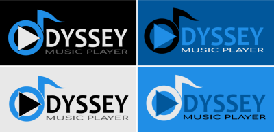
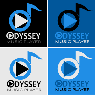
Icon Comparison

Design Concept
My design concept is to combine the letter "O" which represents the initial of the app, "Odyssey" and the play icon and music note which represent music player. I also used the original color of the existing logo for my new proposed icon.

Color Variations and Color Codes

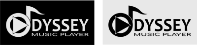
Icon with Text
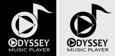
One Color Variation
Icon Sizes
- 192 x 192 pixels

- 144 x 144 pixels

- 96 x 96 pixels

- 72 x 72pixels

- 48 x 48 pixels

Mock -Up on Mobile Device

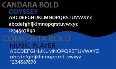
Font Used
Benefits / Improvements
My new proposed icon is an improvement to the original icon. I created a more modern, creative and appealing display but maintained the original logo's color scheme.
Tools
I used Adobe Illustrator CC 2017 in creating this design and in the presentation. Below are screenshots of my design process.


Original files
You can download all the files here : Google Drive Link
Posted on Utopian.io - Rewarding Open Source Contributors
Your contribution cannot be approved because it does not follow the Utopian Rules.
You can contact us on Discord.
[utopian-moderator]
Hey @andrejcibik, I just gave you a tip for your hard work on moderation. Upvote this comment to support the utopian moderators and increase your future rewards!
Okay Sir. Thanks for reviewing it anyway. :)
That is not much to proof of work.
What do you mean Sir @podanrj?
I would say proof of work is good enough, the problem is the logo is too generic and very similar to other logos using the same symbols.
for me i think its good enough to be rewarded. And its better than the existing icon which is hard to recognize