Details
Tutorial about: Flexible Box Hover Effect With CSS&HTML codes. ( Turkish Video Tutorial)
Video Language : Turkish Language
Githup link: You can download all files --> CSS Education
Cascading Style Sheets (CSS) is a simple mechanism for adding style (e.g., fonts, colors, spacing) to Web documents. CSS More Information
What We Can Learn?
We going to learn how to create flexible box hover effect with CSS& and how to call images , container , box and how to add background images, text,transform, , margin,padding value with CSS&HTML codes in this video.
We Learn About
- Opacity
- Flex Grow
- Line Height
- Border
- Hover
- Transition
- Transform
- Text Transform
- Uppercase
Requirements
1- ATOM Program
2- Basic ATOM, usage information.
3- Basic CSS code knowledge.
4- Basic HTML code knowledge.
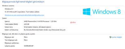
My Operating System

Difficulty
- Intermediate Level
Technical Aspects
- Opacity - Letter Spacing- Box Shadow-Rotate- Flex Grow -Line Height - Position - Absolute - Transform - Transition -Box sizing.
Description
We talked about how to create Flexible Box Hover Effect With CSS&HTML and how to add opacity ,font family,span,border box,transform .I describe the CSS and HTML in video.Also My github repository is HERE I added these all code,information my github repository.You can reach all files from my repository.
Also with CSS and HTML codes we are continue a series
Video Tutorial - Turkish Language - 720p
Using IMG Source1
Using IMG Source2
Using IMG Source3
Using IMG Source4
Using IMG Source5
Curriculum
Horizontal Menu
Vertical Menu
Image Slider
Contact Form
ATOM OFFICIAL WEBSITE & GITHUB REPOSITORY & MY GITHUB REPOSITORY
And More Details About Video
Github Repository

CSS Codes1

CSS Codes2

HTML Codes

CSS&HTML CODES
body
{
  margin: 0;
  padding: 0;
  font-family: sans-serif;
}
.container
{
  width: 100vw;
  height: 100vh;
  display: flex;
  box-sizing: border-box;
}
.container .box
{
  width: 20vw;
  text-align: center;
  line-height: 100vh;
  flex-grow: 1;
  background-size: cover;
  background-position: center;
  transition: 1s;
}
h1
{
  margin: 0;
  padding: 0;
  line-height: 100vh;
  font-size: 2em;
  background: rgba(0,0,0,.8);
  transition: .5s;
}
h1 span
{
  background: rgba(255, 255, 255, 0);
  width: 100%;
  transition: 1s;
  color: #fff;
  padding: 25px 20px;
  text-transform: uppercase;
  letter-spacing: 2px;
}
.box:hover h1 span
{
  color: #262626;
  background: rgba(255,255,255,.8);
  letter-spacing: 10px;
  box-shadow: 0 5px 15px rgba(0,0,0,.5);
}
.box:hover h1
{
  background: rgba(0,0,0,0);
}
.box:hover
{
  width: 40vw;
}
.container .box:nth-child(1)
{
  background: url(1.jpg);
}
.container .box:nth-child(2)
{
  background: url(2.jpg);
}
.container .box:nth-child(3)
{
  background: url(3.jpg);
}

.container .box:nth-child(4)
{
  background: url(4.jpg);
}

.container .box:nth-child(5)
{
  background: url(5.jpg);
}
<!doctype html>
<html>
<head>
      <meta charset="utf-8"
      <title="Esnek kutu efekti"</title>
      <link rel="stylesheet" href="style.css">
    </head>
    <body>
      <div class="container">
        <div class="box"><h1><span>One</span></h1></div>
        <div class="box"><h1><span>Two</span></h1></div>
        <div class="box"><h1><span>Three</span></h1></div>
        <div class="box"><h1><span>Four</span></h1></div>
        <div class="box"><h1><span>Five</span></h1></div>
      </div>

</body>
</html>
Author : @rdvn
Posted on Utopian.io - Rewarding Open Source Contributors
Thank you for the contribution. It has been approved.
You can contact us on Discord.
[utopian-moderator]
Thank you .
Hey @rdvn I am @utopian-io. I have just upvoted you!
Achievements
Community-Driven Witness!
I am the first and only Steem Community-Driven Witness. Participate on Discord. Lets GROW TOGETHER!
Up-vote this comment to grow my power and help Open Source contributions like this one. Want to chat? Join me on Discord https://discord.gg/Pc8HG9x
Your contribution cannot be approved because it does not follow the Utopian Rules.
This is not the official repository of the project.
You can contact us on Discord.
[utopian-moderator]