It looks perfectly fine to me. Opened it in Google Chrome, Firefox and in Inkscape. Looked perfectly fine in all those. Of course if you scale it down you have to make sure you scale the line widths as well.
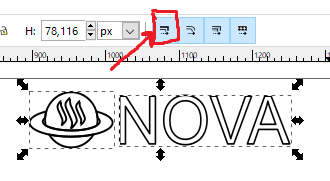
In Inkscape you would do this by making sure this button is highlighted.
its your responsibility to expand lines in order not to have this bug.
Empty text is hard to read in small size.
Doesnt look clear in small size. I agree with his decision.