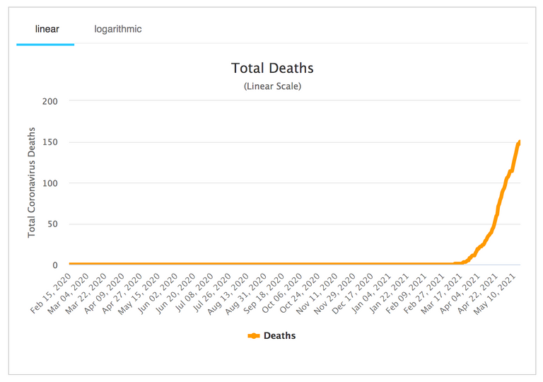
Since starting their vaccination campaign Cambodia has gone from zero covid related deaths to 150+ covid related deaths in just over a month.
Data source here
There is a video going around YouTube (for now) showing this kind of data for all countries individually.
An animation of COVID mortality across the world to examine the impact of vaccination, testing the hypothesis that they are up to 97% effective in reducing mortality.
Credit @britishbennyboy on Twitter for the animation.
The author of the video lists more details here
Source article here
The overall trend is clear and no big surprise, this "vaccine" is killing people in the name of protecting them.
If you are reading this post and the video is not showing because YouTube have removed it, please drop me a message and I will replace it with a blockchain based equivalent.
Love & Light everyone 🌱
Thanks for letting us know about Cambodia, Sam! Nice catch. I had not heard of their recent explosion in deaths. None at all until now, then 154 in a few weeks!
Looks like they began vaccinations on February 10th: https://medicalxpress.com/news/2021-02-cambodia-vaccination-campaign-covid-.html
Cases began spiking February 20th:
And deaths since March 11th:
It truly is hard to see how the "vaccines" are not contributing to illness in Cambodia, as well as in Seychelles, and in small towns that got doses before anywhere else, like Lytton BC. (And the only solution offered is even more doses?!)
At the very least, it's clear these products are not the panacea many have been led to believe.
My first version of this post was rather more punchy with a graph showing 18k Cambodian covid deaths in the first month after vaccinations began (which totally shocked me) but this turned out to not be accurate.
Regardless of number of deaths, the date of spike remains and the connection seems undeniable.
Appreciate your additional graphs showing this chain of events beginning with a vaccination campaign.
Sam, I don't see anything wrong with that graph. The Y axix is denominated in deaths per 10,000 people.
Keep up the great work!
Ah yes! Appreciate the clarification.
Np. One other thing, what portion has been "vaccinated" in Cambodia? Bloomberg says 6.9%. If that's right, the recent spike in cases there is less relevant than in places where a majority of the population is now "vaccinated". It's still interesting data, just saying, it doesn't carry much weight if almost nobody there is jabbed yet, ie most of the new cases are still coming from unvaccinated people.
Great point.
very strange that the website listed in your first chart doesn't seem to have information on Cambodia, at least that i could see...am i missing something?
You are right that Cambodia is not on that list. Perhaps it was too shocking and intentionally removed?
The data can be confirmed here instead.
Appreciate you pointing this out. Will adjust my post accordingly.
Right... looking at that link closer I can see it is only listing 150 people as having died, but the date of spike remains the same. Apologise for not checking my sources more thoroughly.
It could also be explained by the fact that the RNA/DNA from the vaccines ca integrate into the genome of the person who got the jab. Consequently those people will be - due to the hypersensivity of the PCR-tests - "positive" and count as "cases". If they then die, regardless if from the vaccine or not, they will die as Covid-related deaths. So not all those deaths were actually caused by the vaccines, but every vaccine death is one too much. Shows also how flawed all those numbers are.
https://www.pnas.org/content/118/21/e2105968118
Excellent observation! This ultimately makes it impossible to connect the vaccine to the deaths. They will only ever be covid deaths now. Nuts!
Same here:
https://peakd.com/hive-110786/@drutter/seychelles-the-most-vaccinated-place-on-earth-is-being-overwhelmed-by-covid-19
Thanks for sharing @samstonehill
Stay safe
Appreciate the link brother. Great to see @drutter leading the way with this news as always.
You're welcome Sam.Yes, Respect @drutter !
I don't trust any of these graphs without more details behind the numbers. How were they counting deaths and cases a year ago vs. now for example? Why would Cambodia stand out in terms of vaccine deaths vs. other countries? Given how statistics say whatever you want them to and the usual lack of information behind how the data was collected, I guess I'll stick to my own personal observations, however anecdotal they may be.
I know of no one personally or indirectly who has died from the vaccine. I know of no one personally but a couple of people indirectly that have died from the virus. My conclusion? Neither one kills many people but the virus kills more. I've seen pretty much the same with regards to hospitalizations.
What would make this data useful is knowing how many of the people that died were vaccinated. Correlation is not causation and we don't even know (as far as I could tell anyway) how many (if any) of the people died had been vaccinated.
So far it looks like it is being claimed that 150 people have died in Cambodia due to COVID-19. At this point, millions have been vaccinated. Even if you make the assumption that all 150 deaths are vaccine related (which i am quite skeptical of without knowing if these deaths were even among those who had been vaccinated), the odds of dying from the vaccine are still something like the odds of being eaten by a shark while being struck by lightning. Not exactly "shocking".
At least the worldometers link you posted lists 22,544 cases and 154 deaths, not 18,000 deaths. I'm not sure where that disparity comes from.
We live in such a polarized world. I tend to think both the risk of the disease and the risk of the vaccine have been GREATLY exaggerated.
Appreciate you pointing out that disparity. I searched for the worldometers link quickly when @lerkfriend pointed out the problem with the first graph I posted. So the mistake was mine and I have adjusted the post accordingly. And I wonder how (if this is what has happened) someone could exaggerate the numbers so dramatically and post this graph out into the world? For what purpose would they do this??? No matter how hard I try I simply can't get to the source, so I must assume it is fake.
As for viruses I believe they are a non contagious natural seasonal event and nothing at all to fear. The media can make anything look scary by focusing on it in a particular light for long enough. Also, I don't believe the PCR test is an accurate tool to measure its existence. The creator of the test made this very clear before his death. Results can be rigged to favour positive or negative depending on the number of cycles used so in the end it's all pantomime to me. And a very entertaining one at that ;)
Just sorry I rushed my research on this one. Lesson learned and I will be more thorough to scrutinise sources next time.
Accuracy is relative I guess but my understanding is that the cycle counts used most commonly thus far for COVID-19 (30-40 with a possible lowering to 28), there would not be very many false positives. A test in the 35-40 count range would be more likely to pick up early infections and especially recent recoveries than a lower cycle count though.
I read an article somewhere that mentioned how it was desirable to use a higher cycle count among those hospitalized with symptoms as a positive result would not likely be because of a false positive, a recent recovery or early infection in that case. False negatives are actually far more common that false positives and you don't want to get a false negative with someone who has severe symptoms. On the other hand, you want to try to avoid detecting recent recoveries as much as possible (which apparently is more commonly detected than early infections) in the wild so you would want to use a cycle count on the lower end.
I think there is plenty of reason to fear viruses. At least certain ones. I wouldn't want to try my luck with Ebola for instance. Of course, COVID-19 is no Ebola. But there are plenty of nasty, dangerous viruses that can do bad things to you. Fortunately, most of them don't spread too easily or are otherwise not too difficult to avoid.
As for the numbers an graph for Cambodia, most likely somebody's honest mistake somewhere. At least I can't imagine why somebody would want to fudge the numbers for Cambodia. But as Mark Twain said, "There are three kinds of lies: Lies, Damned Lies, and Statistics". Statistics are great but you have to know the details about what was measured and how the data was collected to draw real conclusions.
It's doing the job as intended then..,
Yeah right. Hey, I finally remembered to post using the proofofbrain tag! Thanks for the nudge :)
Unfortunately I took the Pfizer vaccine about 4 weeks ago... Fortunately I am still alive. If I die my kids will carry on with my Proof of Brian blog and let you know how I died. They will inherit all my POB tokens and live like Billionaires in a few months.
Nothing for you to see here kitty. Move on to the next post. It has kittens!