Hi Everybody !
This is the second part of the first of many (hopefully) posts to show you, my fellow starter artists (and curious people of the arts), all the processes that are involved in the creation of a professional artwork.
 Join me in this amazing adventure to create our own universes and your own stories and characters !
(All the images are my own creation and so I own the rights of them)
Introduction: Previously...
On the previous MEGAPOST we went through the very first stages of design for having the bases well built for the rest of the artwork.
This time, we will go through the rest of the process, until we have our final artwork!
First of all, allow me to say that this is a mid to low "effort" artwork. This means that the time we spent on the designing part wasn't really much. In other words: We jumped straight to the artwork instead analyzing it to the point to make a professional final one...
...But worry not! Because we will get started with that probably today. If you are a Riot Games (League of Legends) fan, then listen to my advice:
stay tuned for this;).
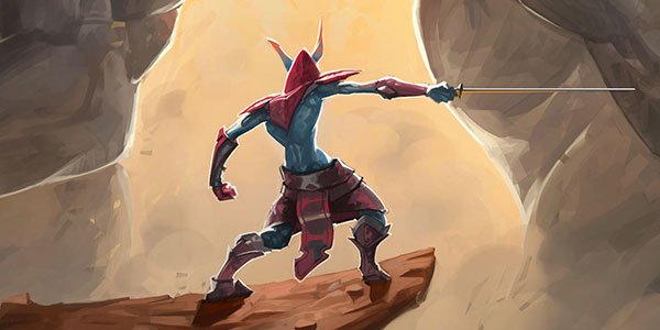
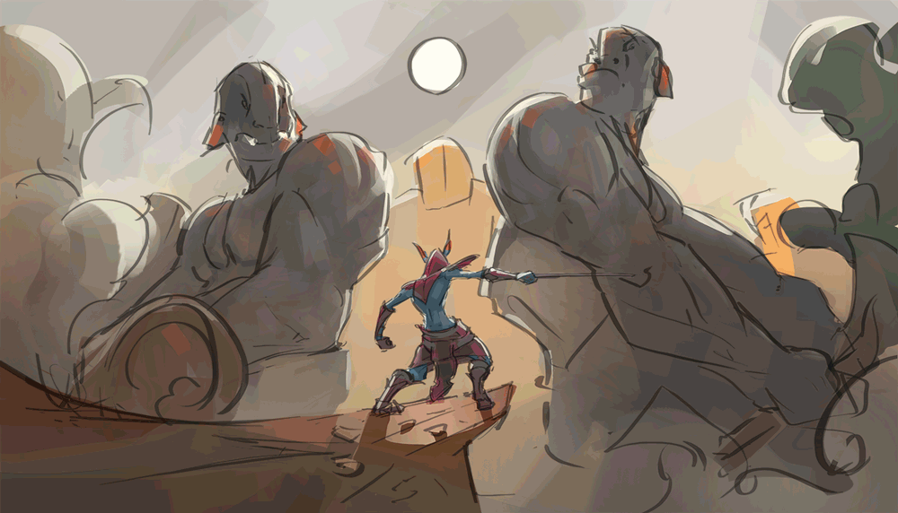
The last thing we saw in our previous MEGAPOST was the artwork that you can see at the right. A very solid base I must say.
The composition is strong, the story-telling is right there and the visual impact is very high.
There is only one thing ahead to do: To finish the goddamn artwork!
Pt4. Areas of Shadow
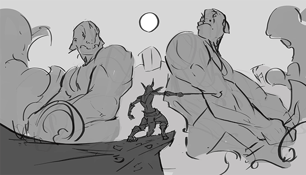
Until now so far we only got the shapes, the lines and the alpha limits (under the line-work) to paint the different planes.
I divided it into four planes:
Front, Middle, Back_1 and Back_2
I separate them in this way so I can put some different effects in between and also control them more easily once the time for painting has to come.
Once we have it ready (part 3 of the previous post) we can proceed to add the shadows. I personally like to add different values in the different areas progressively so I recognize them in an easier way.
This is actually a new technique for me, and it's in essence to go from BIG to small. I think I talked about this so many times already that i forgot when i did for last time.
(General Shadows Added)
So try to imagine how important it actually is to go from big to small! (don't make me say it again on this post D:).
This also means that the stages are as short as possible, to keep the whole painting fresh and with the same spirit and dynamism as it was at the beginning.
This is why you see more like spots of shadows instead any very specific one on this stage, because it is for doing a general understanding of where the areas of shadow are. And also because the main source of light is behind the characters, which leads the painting to have as rim light as main light source.
(If you don t know what rim light is please let me know on the comments and I will explain later on).
Pt5. Color Time
Until now so far we can have a very nice grayscale image, but in order to move forward (if your intentions weren't to make a grayscale finished artwork) we need to add color.
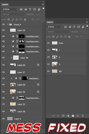
My approach to this is a little bit messy, but I promise you that can be easily clean at the end.
 As you can see here I only modified the colors, not the values. This is why it is better to have your values in a very medium-range of light instead too light or too dark. This is why we didn't make too much contrast yet or messed around with them (with the values).
But how? How do you create such a palette of colors without modifying the whole base you've already done??
Damn, this is too complex to explain in few lines, I will make a post exclusively for that and it will be called Gradient Maps.
If you don't believe me, you can see it is already on my to-do list!
Let's just assume that I explained how Gradient Maps work and therefore you know what I am talking about...
I ended up having a great mess of Layers on my canvas, but as I told you before... this is pretty easy to fix!
You just gotta merge the right properties layers with those that they are modifying and Voilá!
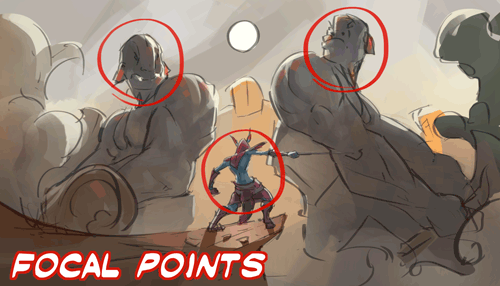
Pt6. Critical Hit: Don't Neglect Your Focal Points.
*From the wall of the commandments, this one should be the one at the top (or close to it at least).
See... when we get started with the rendering in our paintings we just apply zoom and zoom and forget about what was the whole point or idea. This is why we have to put an extra eye on keeping our focal points pretty fresh for our brains.
Why you may wonder. This is purely because the eye will go towards the areas with most information.
This is why we have to be careful with how much we render and where we render. Because you may destroy your painting just by adding too much information on the wrong place.
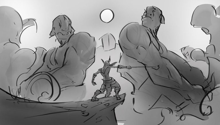
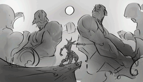
In order to keep your eye fresh and your painting safe from doing wrong stuff, keep a safe distance from the canvas, such as you can see on the image above.
As you can see I also added some more general lights and shadows. For that I haven't applied any zoom onto the canvas. This way, and again, I make myself sure that I won't fuck it up. Or at least not that much.
So I will say it one more time: Don't neglect your focal points.
Pt7. Fun!.
And by fun I mean rendering!
Not much to say here, this is just sit your ass down to the chair and keep adding information, problem solving and nothing more complicated than that.
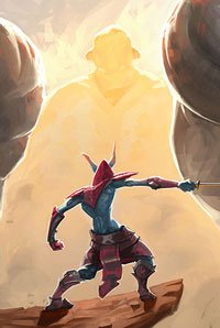
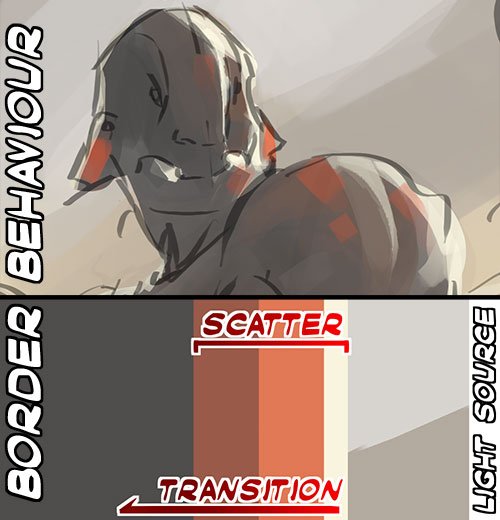
For tis particular painting I could tell you about some specific phenomena that occur on the characters due to the extreme lighting.
The highlight that it receives (the strongest light at the border) is called rim light and it s caused because a source of light is behind. This is way deeper and complex than that. But let's leave it that way.
The complex part comes with other phenomenon: scatter.
As you can see on the painting, the scatter is all around the place. And that's because the light is getting into the materials (such as the flesh of the characters) and going out. And the reason why it s red, is because the blood vessels of the characters hold blood, if it would hold mucus or green blood they would probably generate a green bouncing of light when it goes out from the flesh.
I could write a whole book talking about this (not really), so let's just add that the transition of light goes like in the image at the left (the rim light meets its terminal, the scatter starts due to the light makes its way through the flesh and finally disappears in a gradient to the main color of the mass.
The rest of the painting process is the Rendering. And it goes like this:
I just found out that if I mesh all together since the very beginning and pass it forward pretty fast it looks really awesome ! Let me share it with you :D!
 You can see the final result right in Here. And yes,
it was the first art of the year ;)
Thanks a lot for your support and I see you in the next one!
I always try to listen to the ideas of my fellow followers to improve my posts and to give something back to the community... therefor: What would you like the next posts to be about? What should I talk about? What kind of painting? Would you like some tutorials about arts, about cooking? Maybe some fresh gamming broadcast? I would love to know!
Bye!

you put in so much work and effort into this, awesome work!
I love seeing the new community of artists learning, growing and rising together.
keep going :]
Thanks a lot @donutboy ! I really appreciate your words !!
And as I always say... this is only the beginning ;) There is a very big community of artists, and I am willing to help them all to get further in their technique and quality of work. We can do this together =)
Phenomenal man! Its a very interesting post, and a really great painting to go with it. I haven't digitally painted in a long time but when I did, I remember spending way more time in the grayscale phase. You must have a solid handle on color theory. Resteemed and I hope get some hardcore recognition for this one.
The grayscale practices are really important, they meant the difference between being a rookie and being a professional, so I think that you did great ;)
Thanks a lot man, I really appreciate your words :D
Looove watching your process gifs. Great work. Great post.
Thanks a lot @secora !
I love it! Such a good post. Your so talented!
Thank you =)
That finished artwork looks awesome! The whole thing feels very dynamic. Composition and over detailing are things that I've been struggling with myself, and it's really helpful when you lay out your process like this.
I just joined Steemit, and it's great seeing how many talented people there are here.
Welcome on board! And thank you for your words! Those two things are really hard to handle properly, the thing is that when you try to control them, the fun kinda fades away, but it s still fun if you ask me =)
This post has received gratitude of 1.50 % from @appreciator thanks to: @anritco.
This post has received a 5.01 % upvote from @buildawhale thanks to: @anritco. Send at least 1 SBD to @buildawhale with a post link in the memo field for a portion of the next vote.
To support our daily curation initiative, please vote on my owner, @themarkymark, as a Steem Witness
You got a 0.79% upvote from @upme requested by: @anritco.
Send at least 1.5 SBD to @upme with a post link in the memo field to receive upvote next round.
To support our activity, please vote for my master @suggeelson, as a STEEM Witness
Such a great tutorial. Looks like a lot of time went into this. Im following for more art.