Color Effects
The color of each pigment comes from the kind of light it absorbs and reflects. White light is a composite of all wavelengths, each of which if isolated creates the affect of a single color. When white light hits a pigment it will absorb some waves and reflect others, for example Ultramarine absorbs all waves except blue which gets reflected back to the eye. White pigments absorbs very little light if any at all, while black reflects very little if any light. When these light rays get absorbed it converts into heat. This is why in the summer you can ware white or light colored clothing to stay cool, because white reflects the light drawing the heat away from you. Although in terms of painting it should be noted that there are no pigments on the market that can be considered pure color. For example vermilion, though its a pigment that can be considered the closest to pure red its not, a small amount of yellow is also reflected by this pigment. Same is true for alizarin, while a commonly used red its actually a blueish red. Another reason no color is ever truly considered pure is affects the surrounding medium can have on its appearance.
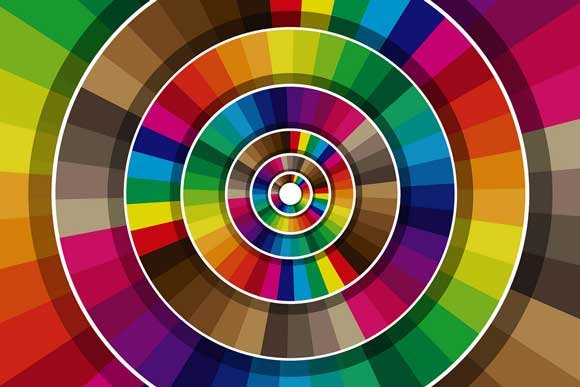
There are 3 primary colors red, blue, and yellow. When any two of these colors are mixed the create the secondary colors green, orange, and violet. The process of mixing is known as the subtractive process, because as you add more color you are subtracting from the light that gets absorbed by the surface. When three or more colors are mixed tertiary or broken hues are obtained. The affects of mixing, due to the impure nature of our pigments, invariably causes the resulting color to be more dull or muddy in comparison to the original hue. This is why colors such as veridian, a brilliant emerald green, is considered superior to any mixture of blue and yellow that could be made, because inevitably this kind of mixture will to a small degree contain red. This affect of light waves is often compared to the same affect you get with sound waves. By playing the same note on two or more instruments they can compliment each other and blend into a single affect, but if you play different notes its easier to distinguish between the two and it can sound unpleasant to the ear. In the same respect mixing the right colors can create pleasing affects while mixing others can cause unpleasant affects.
The mixture of a transparent color with white has little if no effect on the surface color of the paint, rather it affects its clarity of tone. The mixture of more opaque colors usually creates a dulled affect the more you add to it. When these mixtures are viewed under a microscope each color can be seen lying next to each other intermingled together. Each particle still absorbs and reflects the same light it would if they where separate, but viewed from a distance this light gets combined by the eye as a way to make sense of the mixture of tones being reflected. When a transparent color, such as alizarin, is mixed with white the tinting power is much smoother of an affect as the white light has an easier time passing through than if a more opaque color was used.
Occasionally I see newer artists rushing for answers to why there paint seemed to get darker as it dried, or less commonly other changes that occurred during the drying process. Well the answer is yes it did get a bit darker. Most paints will change slightly in tone for a number of reasons, be it a physical or a chemical change, for instance painters using aqueous mediums in opaque techniques, such as gouache, will note that some of their grays or any mixture containing black pigments will have this darkening affect. This is explained by during the drying process the black particles will tend to shuffle to the surface as the paints film is forming. Paint behavior however isn't considered erratic, under similar conditions similar results are to be expected. A painter who has explored these affects pigments have on each other, each pigments characteristics being different, will have more control over the affects they create.
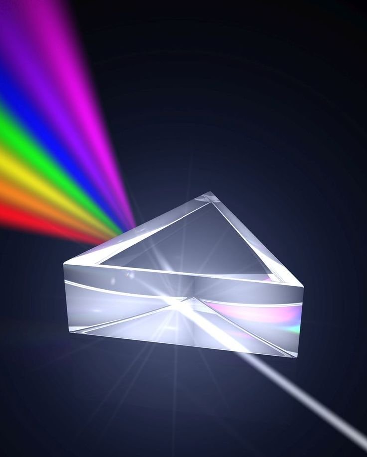
When white light passes through a prism its bent in a manner that causes the individual waves of light to separate and create the affect of a rainbow. The light is bent in a way that the angle of the light is greatest at the violet end and least at the red end. Inferred and ultraviolet light being invisible the naked eye. The process of recombining there separated light rays is referred to as additive, because your adding light rays as opposed to subtracting them in terms of body color mixtures. This process is closer to the affect you get when transparent body colors are mixed because of the lower amount of white light they reflect as compared to more opaque colors.
In the style of French impressionists they used the additive process by substituting the jextaposition of small spots of pure color that when viewed from a distance the light being reflected from the surface merge the tones into one. This style produces a blended hue that in some cases would be impossible had the color been mixed on the palette. The effect is very clear and has a vibrant, luminous quality. A similar affect is created by not completely mixing the color on the palette before application. This additive behavior is principle in styles with the attention to playing with light rather than thinking of it just as paint.
A color affect that is rarely seen utilized in painting is diffraction colors. Best example of this is what soap bubbles look like. Acting as a mini prism some surfaces in nature can give off an almost metallic appearance without any pigmentation. These iridescent colors are produced when the surface refracts light in all directions causing the waves of light to separate. This effect can only be approximated with paints, and would take great skill to make it look accurate.
If your an artist make sure you get yourself involved with my Weekly Sketch Contest!
https://steemit.com/art/@dcrockete/3rd-weekly-sketch-contest
Your continued support is much appreciated. I'm glad you guys are enjoying this journey through education of the arts as much as I am. In arts recent past "education" has been a very low priority for many artists, limited to only learning the application and completely ignoring the technical. My goal with these posts are to change that idea as its clearly having an affect on the art community.
Nice Drawing and art @dcrockete
Thanks
good post upvoted
Thanks
I really enjoyed this post,I will be following now so I can see your other work also. @dcrockete
Thank you, glad you enjoyed it. Several other educational posts further down on my blog if your interested. I do my best at pumping out at least one of these a day... given I don't have other things to attend to.
In less than a minutes received 3 comments, I am sure nobody read texts! :D