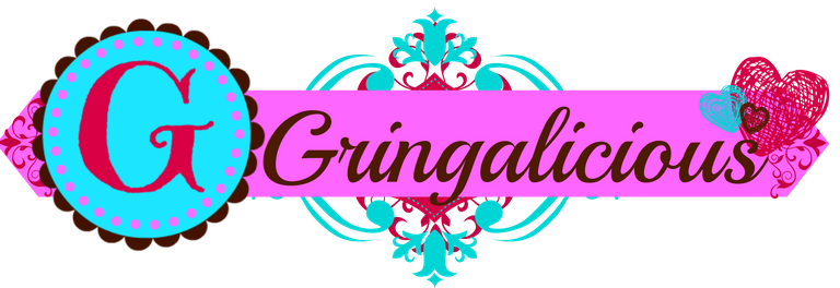
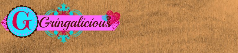
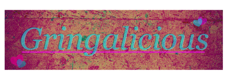
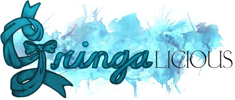
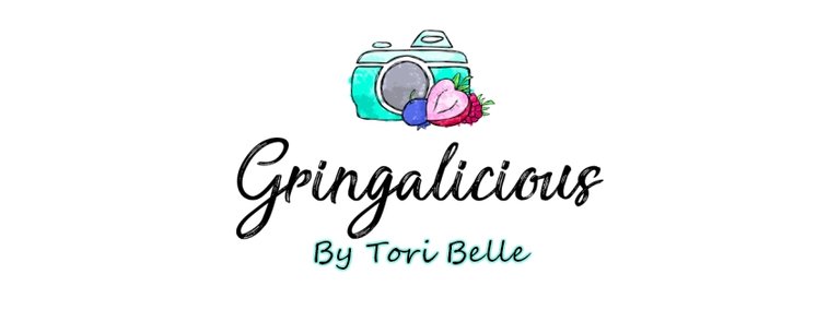
I was going through some super old files and found some of my first mockups of logos for Gringalicious. Brings back fun, childish memories of first starting into the world of blogging and crypto. You can clearly see them change as I grew up.
Which one do you like best?
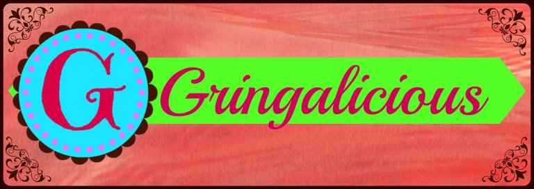
I remember all of those stages. And I still think the first one is my favorite
I actually like the first one the most.
I recently revamped my logo and it makes a huge difference.
Even megacorporations have iterative changes and complete logo overhauls. It takes time to find your branding.
Congratulations @gringalicious! You have completed the following achievement on the Hive blockchain and have been rewarded with new badge(s) :
You can view your badges on your board and compare yourself to others in the Ranking
If you no longer want to receive notifications, reply to this comment with the word
STOPTo support your work, I also upvoted your post!
Check out the last post from @hivebuzz:
Nice progress. I like them all but I think the last one really says the most about what you do plus it's fun and light at the same time.