Hey there, its me Jeremy, hahaha, just kidding guys, its me again Bob!!!
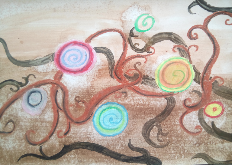
Today, I borrowed again my kid's coloring things hehe. Just to relax myself off from work I did this illustration of random circles with vines behind it. It looks weird and too simple right? But actually there are some theories in it. I'll tell it to you while I explain how I did it.
So I used my kid's oil pastel again and his watercolor set together with a flat brush and a pointed tip brush. Nothing much more to say about them so let us move on the process.
How did Bob did it?
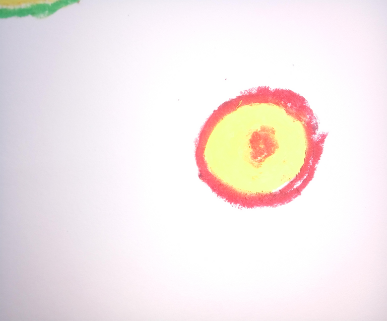
First off, I took of the pink pastel and made a pink circle.

I applied red around the pink circle.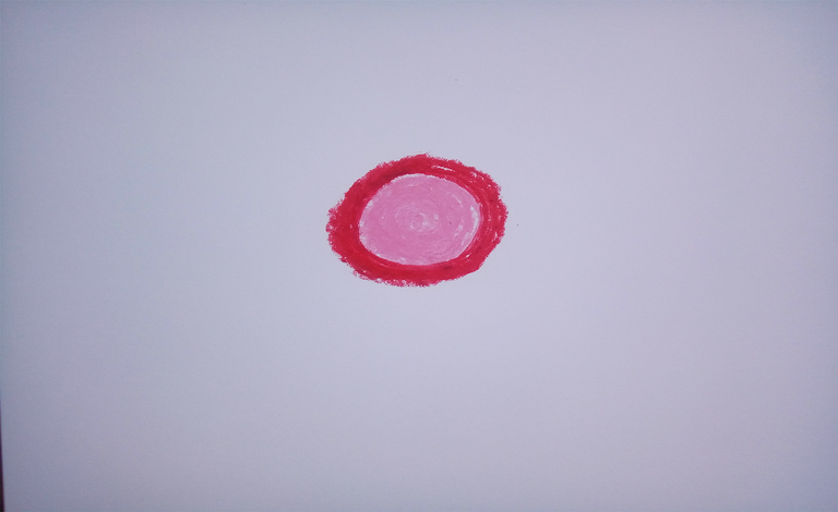
I then applied pink around the red border.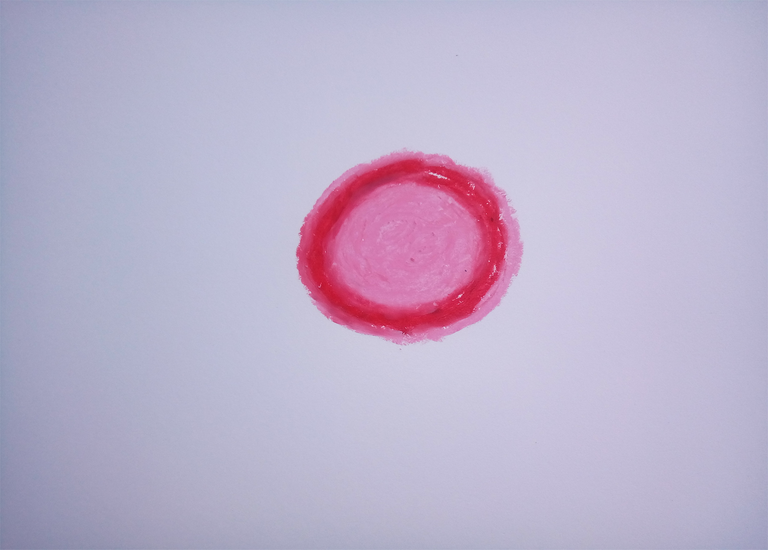
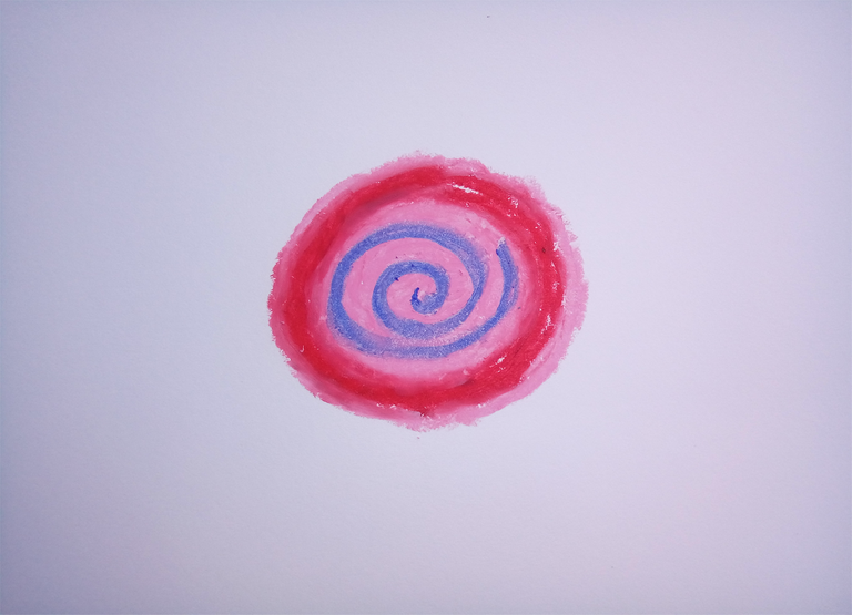
After that I added a spiral inside the circle using cobalt blue.
By the way, in Japanese spiral is called Uzumaki. That is the reason why Naruto's costume has that spiral behind it because literally Naruto's clan name is spiral.
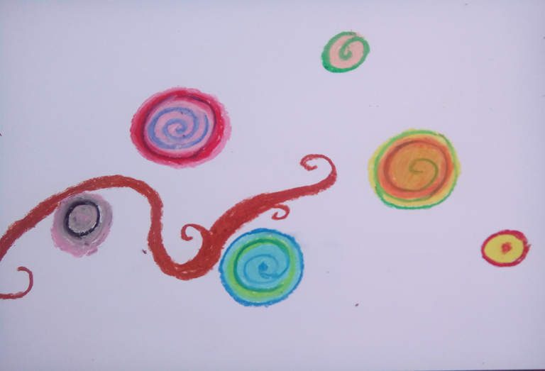
 I drew another circle using the oaker color
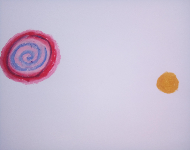
I added orange color around the oaker color..
Same thing with what I did with first CD, I added a spiral.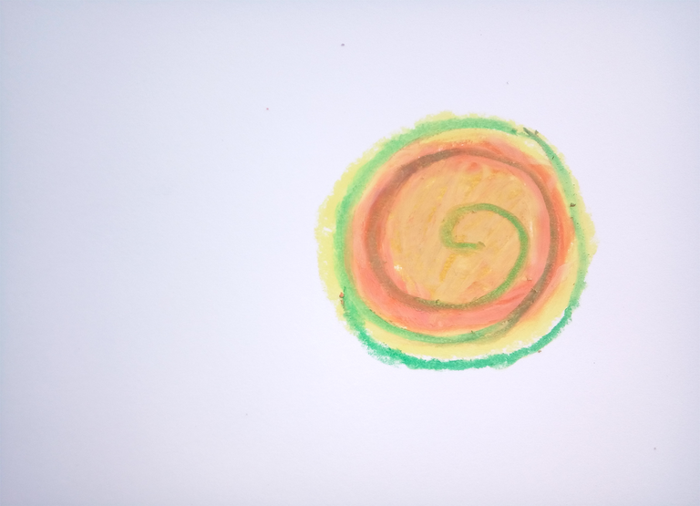
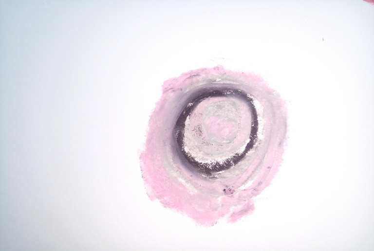
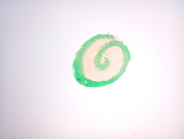
I added more of that CD in the illustration in different colors and sizes. I just took each CD a zoom shot just for presentation in this post.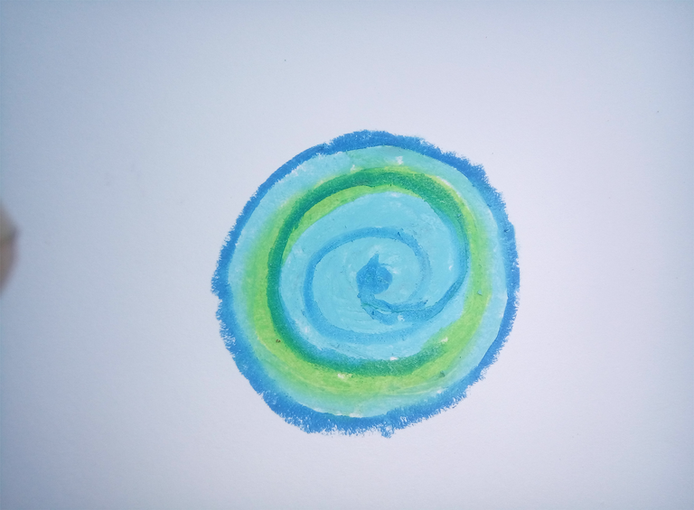
I then started drawing the branches with burnt sienna.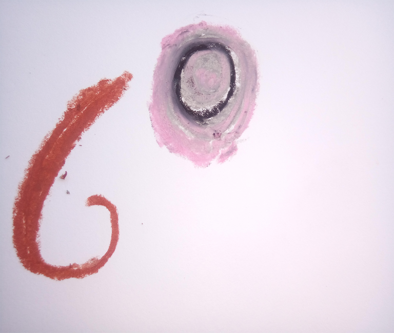
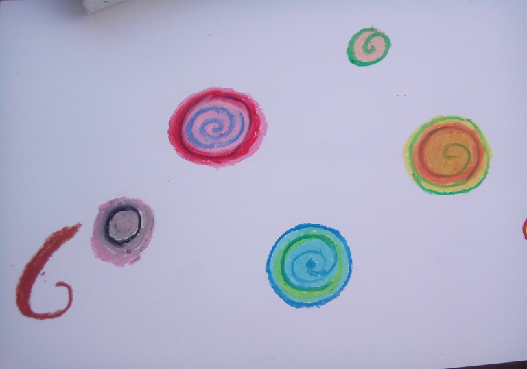
The thing that I wanted to achieve here is to make an illustration that has a random pattern and to tone it down with an approachable color like brown, as you can see here as I make the this illustration the colored CDs looks so lame and underwhelming alone in the eyes, I intended to do that so. Those CDs will be the subject along with the vines that will fill up the spaces to avoid dead spaces.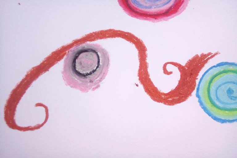
I applied black linings on the vines to give variations and harmony in this piece. Those linings will also give details and some eye attraction for the illustration.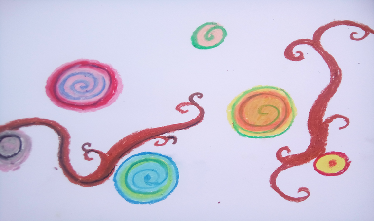
I added more of those vines for more details.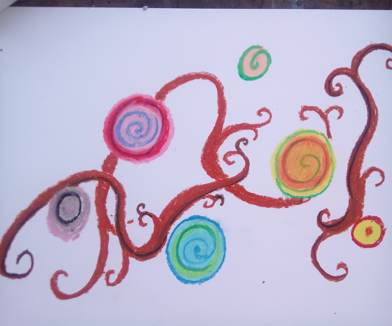
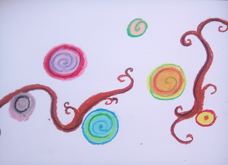
Then I applied brown watercolor over the color pastels.
Do not worry about the pastels, they're water proof, just wipe off some tissue over them to remove the unwanted water color on it.
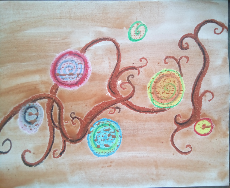
I added a darker variation of brown on the lower part of this illustration.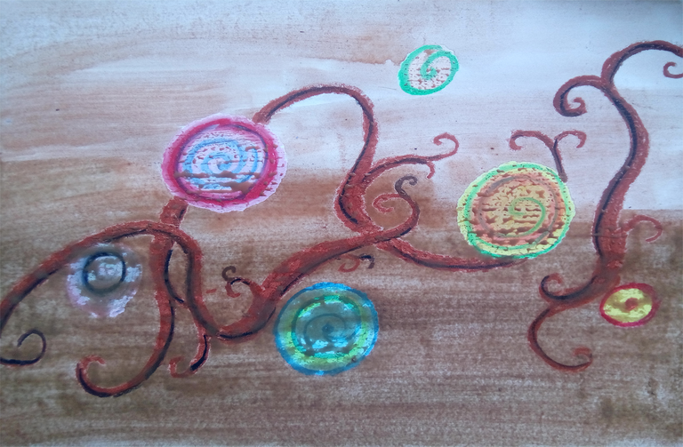
Then I cleaned the oil pastel with a tissues and did let it dry for a little while.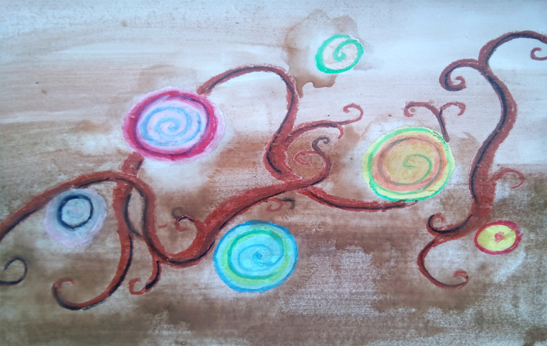
I added black with the brown water color to make a darker variation of vines behind the light ones.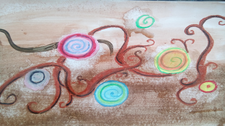
And there you have it an illustration made out from the borrowed schools supplies from my kid. Man, i think I need to buy him another set of these things, they're about to be emptied in the box. Hehehe.
So how was it? Did the illustration made you smile? Hope so...
Everything here is mine except for the video, just wanted to share it. This is a song from my favorite mobile music game Deemo. Check that game out, I play it between my work breaks its a really relaxing game.
I love the way you explain things man. Very detailed. Keep it up bro!