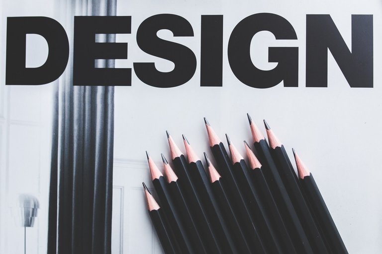
If when you hear the word "design" you imagine elegant items, items that the average Joe is not using because they are too expensive, then I would love to invite you to read this article. It is about the design of everyday things, not some kind of luxurious items. It is based on work done by cognitive psychologist Donald Norman and his book "The Design of Everyday Things". The book was first published in 1988, then as "The Psychology of Everyday Things", which was a misleading title as the author says and so the new editions are named "The Design of Everyday Things".
This book is showing us that design is not only about the outlook. Good design must also mean the usability of the item, its intuitiveness, and safety! As we will learn later, sometimes it is mostly about safety. We could provide many, many examples of bad designs, starting with classics as a door, then thermostats and finally modern software interfaces that we deal with daily. But this article is not about "Top 10 funny designers fails", I wanted to give you some knowledge and show that design is really important contrary to what some people think. So I will provide examples, but I hope that they will be woven into something more interesting than just a set of examples.
Not only the outlook but also ease of use
Ease of use and intuitiveness, to be precise.
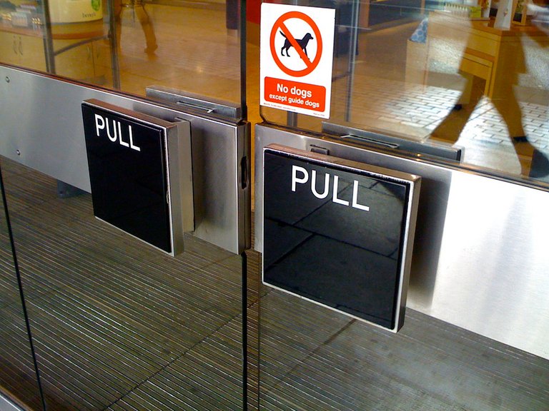 Handle says to us "push" because of it's shape, but lettering says "pull"
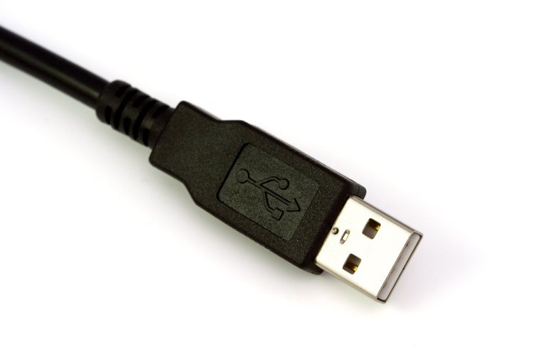
Let's start with a classic example that Norman paid attention to - door. This example became so popular that poorly designed doors are called Norman doors. What do poorly designed means here? It means that you don't know if you should open them by pushing or pulling. Where handle suggests that it should be pushed, because it is flat, as if created for pushing, but instead you need to pull. Where the handle is created to pull but you need to push. I think that everyone was in a situation where you were grappling with the door in some building only to realize that it should be opened by doing the opposite of what you were doing - pushing or pulling. Maybe you felt even ashamed that you did something that silly. It is similar to the situation with USB ports, older than USB type C, where you can try to plug in cable this way and that way and it seems that nothing work and finally you don't know how it should be plugged. In case of USB, it is a problem of both design and not respecting the standards by manufacturers. The design is to blame because USB should not be symmetrical if it can not be plugged both ways like USB type C can. The manufacturers are to blame because USB standard says that the cable should have USB logo on top of it, and you have to always plug the cable with the logo upside.^. But some manufacturers don't even put USB logo on the plug or put it the other way. Or sometimes the socket in your PC is upside down, so even if the cable has USB logo on top of it, you need to plug it in with logo on the downside.
Let's look again at the doors and list 4 things that we could learn from it
Doors are simple devices, usually, we just need to know if we should push or pull. If there needs to be some kind of instruction in a simple device, lettering saying "push" or "pull" then it means that the device is poorly designed. Of course, more complicated things require instructions, but the better the design the less instruction is needed.
Physical constraints. Answer to the question "to pull or to push" should be embedded in the form of the door itself, in its design, in the way how the handle looks. In traditional doors that we can see in our homes usually the "jamb" is also showing us in which way the door moves. This is the example of "physical constraints", they should be used in design because thanks for them we will not put the batteries the wrong way, because AA batteries fit only the right way. They have a bulge on one side and the device that needs the batteries have a concavity for this bulge. The same goes with old floppy disks - they were not perfectly square, but rectangular and not symmetrical, with a series of "tabs" and because of that, you could not insert the floppy disk the wrong way. The same goes with more modern memory cards that you might use in your camera. They just physically cannot be inserted the wrong way. Sometimes it is impossible to create physical constraints but then we could use what Norman calls "affordances"^ - it means that positions of the object that are desirable, or actions that are desirable are more visible, seems more natural, the user naturally wants to perform those actions or set the object in those positions. The undesirable, improper actions and positions of the object are hidden, to discourage the user from them. Affordances can also depend on our experience - when you enter the room with a ball and a chair, you will not throw a chair and sit on a ball. You will kick or throw a ball and sit on a chair because of your experiences with balls and chairs and thus your knowledge of how things that look like ball and chair should work.
Cultural standards. In most countries we are driving on the right side of the road, this is the standard and thanks to it the traffic is more efficient because everyone knows the side that he should drive on, we have fewer accidents. Red buttons are for something important, dangerous, maybe irreparable. This is also the standard that we have in our heads. And in the same way, it could be a standard that flat door handles are for pushing and handles with something to grip are for pulling. Some designers, unfortunately, do not take into consideration usability but only how things look. And there are people who are choosing doors and handles and don't even think about usability, only looks. What would it be if people were designing cars with red lights on the back of it that light up not when someone is pressing car brakes but when he is accelerating? Red could be associated with speed and so it would be logical for some designer. Here the law prevents such things from happening but similar standards in design could prevent smaller problems also, for example in case of doors.
People are blaming themselves when they fail while using a device that is not intuitive. We need to differentiate situations in which we are to blame because we are being klutzy, and situations that happen because the design of an item is bad. Blame the designers no ourselves when some problems happen too often, when we can not plug in the USB or when we are struggling with the doors at the mall. So what that the doors are nice and glassy? So what that someone will say to us "can't you read? it says here - PUSH" when good doors do not require reading. Norman uses the example of a computer system that secretaries were using. It was changed for a newer system, better one but not intuitive. Two buttons were close to each other and secretaries often pressed the wrong one but no one reported the problem. Why? Because when the system crashed when it was clear that it was the system fault and they reported that. But when they misclicked the button the blamed themselves. But is it not the fault of the designer, if many people and often misclick the button? Maybe it should be relocated?
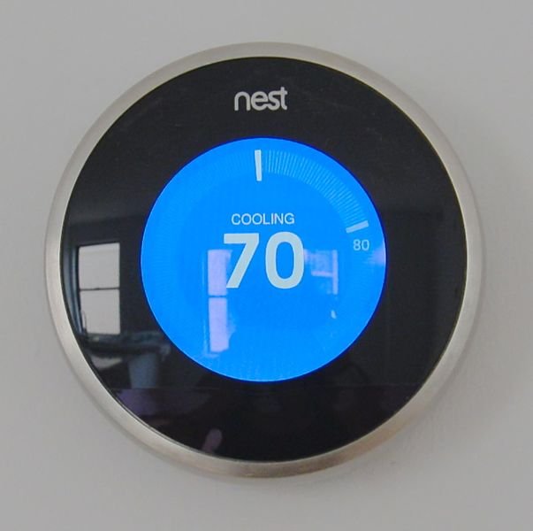
Let's take a look at a more complex example - the thermostat. Here we can say something about mental model which the user has in his mind and thanks to which he can imagine how the object works. A properly designed object should create in your head right mental model, that will help you use the object. A thermostat sets the temperature that we want to have in the room. Some people think that the higher the temperature they set, the faster it will get warm. If they want 21 Celsius degrees and right now it's 19 degrees then it doesn't matter if we will set the thermostat to 21 or 24 degrees. In both cases, thermostat will start the heater and it will heat our room. In the first case, it will stop at 21 degrees, in the second it will keep warming our room until it will be 24. But 21 degrees will not be achieved faster. Why there are people who believe that it would be faster to set 24 degrees? Maybe they got the wrong mental model of how the thermostat works, maybe they think that it works like in a car. In a car (at least some cars) the heating and cooling system have two settings - 0 and 1. Warming up or not, cooling or not. Often to get the temperature in a car to the level that the user wants, the system mix warm and cool air. In this case we will get warmer faster if we will set the temperature that we want to the "max", wait until it will get warmer (since right now the system feeds the room with hot air) and when it is warm already, we can then set the temperature to the value that we desire, so it will keep warming up if it will get cooler. But it does not work like that in thermostats that we have in our houses. It's the user that has a wrong mental model in his head. The good design tries to show the user what is the proper mental model, how things work inside the machine.
So devices should give us a feedback. They should show us that we pressed the button just right, not too light and not too hard. by showing us the light, playing a sound, vibrating. Did you click something on your computer someday not knowing if the action is being done or maybe the computer crashed? Because the program did not show you an hourglass, spinning circle or thing like that. There was no feedback. And sometimes the spinning circle is not enough, it's good to see a progress bar or percentage.
If you want more examples of poorly designed doors and learn about "Norman doors" then watch this video.
Not only ease of use, but safety too

Properly designed control/management panels could prevent deadly accidents. In nuclear power plant in Three Mile Island, there was an accident in 1979^ resulting in partial core meltdown. In short, the problem was that the button closing the valve in the pipe that was draining the water was pressed, but the valve stayed open. Light on the panel was indicating that everything is fine. But the panel was checking only if there has been an electric signal sent to the valve, not if the valve actually closed as a result of receiving that signal. No one suspected the problem, no one suspected that the signal has been sent but the valve did not actually close. The crew that was in that plant knew that the panel is checking only the electrical signal, not the state of the valve itself. So we could say that it was their fault because they knew how the panel works. But was it? It is not about making it hard for people to detect problems, we should make it easy for them, the panel should be redesigned.
A similar situation is related to airplanes. Some small airplanes had identical switches to hide the chassis, landing gear and to hide the flaps on the wings. Many pilots confused those switches and hid the landing gear while being on land, which resulted in destroying the plane. So many pilots did that that National Transportation Safety Board made a report and safety recommendation because of that, to redesign the switches. I even found this report online here:
THE SAFETY BOARD REVIEWED ITS FILES FOR EVERY INADVERTENT LANDING GEAR RETRACTION ACCIDENT BETWEEN 1975 AND 1978. THESE ACCIDENTS TYPICALLY HAPPENED BECAUSE THE PILOT WAS ATTEMPTING TO PUT THE FLAPS CONTROL "UP" AFTER LANDING, AND MOVED THE LANDING GEAR CONTROL INSTEAD
Again, we could blame pilots that they do not think before using a switch. But it is not about making it harder for pilots, we should make it easier for them because sooner or later everyone will make a mistake. Good design should minimize chances to make a mistake or minimize the effects of mistakes.
Golden mean
Maybe I convinced some of you who thought that design is all about "pretty expensive items", that design is needed. But I could offend those of you who appreciate art and pretty items. Items and things that we use should not be only practical and only pretty. Beauty and art are very important elements of our lives. Good design means good usability, ease of use, safety and being pretty. I believe that often if something is to be easy to use then it is easier to make it look pretty. We should thrive to obtain equilibrium between looks and practicality:
Art and beauty play essential roles in our lives. Good designs will have it all - aesthetic pleasure, art, creativity - and at the same time be usable, workable, and enjoyable.
Real life examples
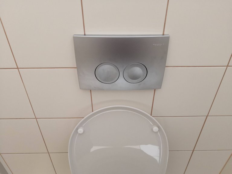
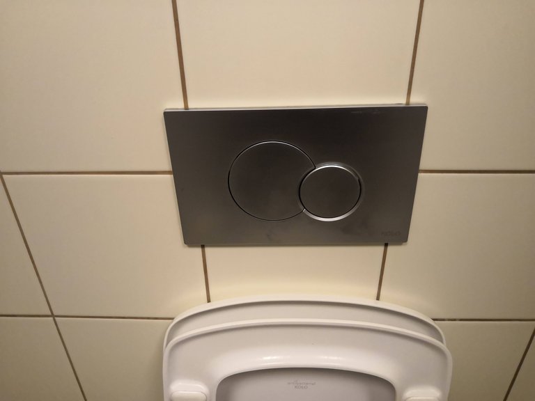
I decided to take some photos and provide you with some examples myself. I tried to observe my environment and spot things badly designed. One of those places was... public toilets. Maybe it is not the most elegant and pleasant example, but it is an "everyday example". Let's look at the WC flush. We can choose if we want to use a small amount of water or a big amount, it depends on our needs. It helps us conserve water.
On the left, we can see flush with two round buttons. One button has a bigger cavity/recess/depression the other has a smaller cavity. So the button with a bigger cavity should result in more water being flushed, right? It is not that clear because the bigger depression is also shallower and smaller one is deeper. So if I want more water should I use the button with a deeper cavity or bigger one, with a bigger diameter? (not sure if you could see that on the photo, here is original size photo). Some people intuitively might think that deeper cavity, more pronounced results in more water. I consider it a bad design.
On the right, you can see more intuitive flush. Big circle and small circle, simple. Big = more water, small = less water. Here there is not much space for ambiguity.

Another example. This is the old photo that I posted on Reddit a few years ago in "crappydesign" section. On the left, we can see a ramp for wheelchairs, bikes, a stroller. On the right stairs for pedestrians. But after using the ramp on the left we will meet something like a doorstep that we need to go over. It might be hard with a bike or wheelchair. But if we choose stairs as a pedestrian then... we will not meet the doorstep later, we will have a ramp later. Maybe the artist wanted to say to us that "no matter what way you will choose in life, you will meet difficulties and problems anyway", as someone on Reddit joked? I don't know, maybe. ;)

Here is a freezer with frozen vegetables. I opened the first "window" from the left. I did that by sliding the handle near the left edge of the "window" to the right. I was unable to found vegetables that I was looking for, so I closed it and turned to the next "window", on the right-hand side. There, the handle is also near the left edge of the "window". I tried sliding it to the right, just as before - nothing happens. It turned out that I should slide it to the left this time because the windows are interchangeably opening to the left and right. Some open to the left, some to the right. So they could at least mount the handles in the way that always makes you slide it from the edge or to the edge... Almost like "Norman doors".
Sometimes things are unintuitive on purpose. To attract attention. I saw an ad in my country where the image was upside down but the lettering was not. It draws your attention as you might think that something is not right with this billboard.
What can we do about it?
Unfortunately, it seems like not much can be done by regular people. Often we can vote using our money, by buying things that are well designed but if we rent a flat then we do not decide what kind of appliances are inside. Sometimes even when we buy appliances ourselves we don't have a choice because we don't have much money.
But it is worth to be conscious of this problem. So we can make the right choices when we can. And we could defend ourselves when someone will laugh at us because we can not open the door or we constantly make some mistake in poorly designed software interface :)
If you would be interested in more detailed reading about things like that, and how to design things properly, I recommend "Design of Everyday Things". The book contains much detailed information and uses areas such as psychology.
sources of images: main, door1, USB, separator, cockpit, thermostat, any other photos ("real life examples") are my own
Hello @inquisitiveguy, thank you for sharing this creative work! We just stopped by to say that you've been upvoted by the @creativecrypto magazine. The Creative Crypto is all about art on the blockchain and learning from creatives like you. Looking forward to crossing paths again soon. Steem on!
Congratulations @inquisitiveguy! You have completed the following achievement on the Steem blockchain and have been rewarded with new badge(s) :
You can view your badges on your Steem Board and compare to others on the Steem Ranking
If you no longer want to receive notifications, reply to this comment with the word
STOPDo not miss the last post from @steemitboard:
Vote for @Steemitboard as a witness to get one more award and increased upvotes!
Congratulations @inquisitiveguy! You received a personal award!
You can view your badges on your Steem Board and compare to others on the Steem Ranking
Vote for @Steemitboard as a witness to get one more award and increased upvotes!