Hello everyone, this is my first design for the #curielogo contest. I hope you like it.
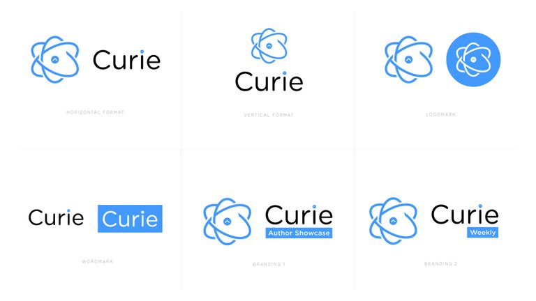
Everything starts with an atom and this shows the collective creativity of the Curie community. The ellipses going round the upvote sign depicts the quality voting process of the Curie community.
The ellipses are rotated in a way that the vertical one looks like a C, which stands for Curie.
I went with the blue colour I picked from the current Curie logo as I feel it works, It's portrays a cool, friendly and relaxing vibe.
There's a circular format of the logo without the wordmark which would work well as display picture.
I included designs containing the "Author Showcase" and the "Weekly" posts artworks to show how they'd look.
Thanks for reading, I'm really glad about this.
I love the idea :) great work!
Thank you.