
Hello Steem Community,
The Curie community is glad to announce a second logo design contest, for its newly-developed, soon-to-be-implemented curation frontend, and general usage.
Who/What is Curie and What Do They Do?
A little backstory, the name “Curie” was suggested by one of our curators, inspired by the works of both Marie Curie and Pierre Curie.
“The most surprising (or maybe not) discovery in researching about great minds is that behind every great success is mostly luck. There’s obviously a lot of effort involved, but there are many who are just as smart and work just as hard, never quite had the luck.”
- One of our Curators, on the inspiration behind the choice of “Curie.”
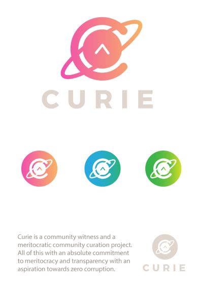
@Curie “is a community witness and a meritocratic community curation project… with an absolute commitment to meritocracy and transparency with an aspiration towards zero corruption.” Read Whitepaper.
We would not want to limit the creativity of the designers, but imperatively designers should go through the whitepaper (linked above) to get in-depth knowledge on what Curie is about. Let it dictate the concept.
However, it is very important to note that logo has to be in DIGITAL ART format, CIRCULAR and FULL forms – ideal for use as display picture and on posts, respectively.
Submission, Judging and Contest Prize
- All entry designs must be submitted as a comment to this post before 3.00 PM UTC on 13 February 2018.
- Multiple submissions are allowed.
- The Top 10 designs (by a number of votes cast, NOT payouts) will be selected.
- Curie top curators, reviewers, and operations contributors, will deliberate and decide on the 1st, 2nd and 3rd place logos from selected designs.
- 1st place designer will be rewarded with 50% SBD from this post.
- 2nd and 3rd place designers will each receive 25% of SBD of this post.
Disclaimers and Further Clarifications
- Curie reserves the right to use the design entries as it deems fit and appropriate. Participation in this contest is an agreement to this term and the ones below.
- Designs MUST be original.
- Curie reserves the right to forfeit submissions that are misleading.
- Curie may decide to rotate among the 1st, 2nd, and 3rd place logos in anything Curie-related.
- Ties in number of votes are counted as one position in the top 10 designs.
- Winning designs will be announced in Curie Discord server by 3:00 PM UTC on 14 February 2018.
- Logos which are only available in low-res raster or non-editable format will be disqualified.
Our present logo is the birthchild of a similar contest and the winning design was submitted by @konti.
And a little tip:
Designers, feel free to make a post detailing your design process. A good one makes for a great content. Use the tag #curielogo only for such posts. Remember you MUST submit your entry designs as a comment on this post. 😊
Remember to have fun. We look forward to your amazing submissions.
Contest Update
A bounty of 200 Steem has been added to the prize pool by the curie team.
We hope this update inspires you guys more :)
Here is my entry:
Simple C + upvote
I made a few variations, here are the most important:
Created by smaller particles, curie team
There are more variations in my post: My entry for CURIE logo contest.
If you think this deserves to be considered, please upvote :)
I like this one
thank you!:D
The best
thanks a lot!
Totally pro!
thanks =)
without any doubt this is the best option !!!!
thank you :D
Entry to Contest
https://steemit.com/curielogo/@matytan/curie-logo-design-contest-entry
Love how the hexagon forms around to create a circle hexagon.. :)
I entered
great good luck
Great work! But now I feel bad because I used a similar circle consisting of smaller circles. I didn't use hexagons though :)
I really like you design. Do you do this for a living? If so would you be willing to make one for me?
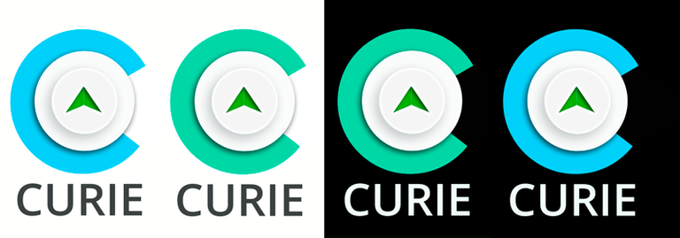
I made a logo that could be use only the isotope as a round image to use for thumbnail, nd a full logo with the "CURIE" word. Also I made some variations, positive and negative in colors and positive and negative in black and white for different applications.
This is my first entry and I will keep working on it, maybe try some different colors, even that the steemit palette fits great on this one, also I'll be trying some different typographies to see how it works.
Fabulous
thanks a lot my friend :)
Marvalous mate! :)
i love it!
I think this is an awesome opportunity to show what you got inside
thanks mate :)
thanks a lot my friend :)
Awesome!
thanks a lot :)
Great! I think @femcy200 plagiarized it, did you see his post?
Great work
OMG..! Good job, I like it! I will see a great future like a designer! Thanks for sharing!
Hello everyone,
This is my submission to the contest:
I've also made a post, explaining everything, and you can find it here.
Much love,
AlenThin.
Awesome. I love the colors.
I really like this one - fresh, current and encompasses the idea of Curie
Hi @alenthin. Your logo curie is awesome, I like it. I’ve follow you, because I like graphic design, my be you can teach me someday.
Elegant with other sample colors, fits everywhere, great design skill, it matches perfectly for the marketing aspects.
nice :)
Wow, this one's a winner for sure. Simple, elegant and to the point. Great work man!
I like it, a lot. Looks fresh and great.
Thank you! :)
My explorations were based on the "C" shape and an arrow pointing forward, symbolizing progression. The colors I chose were a mixture of the Steemit platform logos and a gradient that signifies the blend of both of them together. Thanks for the opportunity!
Great! I like the second one the most.
What a fantastic contest! And so many amazing designs already. :)
I designed a beluga whale curling around into a "C." I chose the beluga whale because they're playful, friendly, and willing to connect with others. Read more on my post.
I love these animals, and I feel the same way about @curie, so...
And INTRODUCING: "Cutie the Rainbow Curie Whale."
(credit @enginewitty for naming her Cutie) I did a second post with this colourful version.
If you're reading the comments and like my design, please upvote to support this entry.
Thank you so much! 💖@katrina-ariel
Cutie the Curie whale lol
OMG! lol! I love this. YES! "Cutie the Curie whale." Growing bigger every day. 💖
This one is too cute, such a lovely design it's like a baby whale soon to grow strong. Good luck!
Yay! Thank you. Yes, such a sweet whale. I haven't done a design from scratch like this in years, doing the whale click by click. I'm really happy with it. 💖
Aww.. This one is really amazing I love this 😊
Great job my friend and I wish you all the luck.
Such cute whale 😉
Thank you @saffisara! I wanted to make it friendly, personable. It is a cute whale, isn't it? ;-)
Panda and baby whale would have much fun gaming together, I like this.
I think so, too. Baby whale is a playful soul. Loves making friends. 😊
Love this design, nice work! Good luck my friend. :-D
Thank you very much for your support! 💖
I love that you described why you chose the beluga. It is totally super cute
I try to have a reason for everything. ;) Big gratitude for your encouragement! :)
This is just like my second design, the only difference is that you made a real picture like fish and I used abstract like fish. I like it. Good luck mate.
Hi! I hadn't seen your second design. It is a little similar, though the font is also different and the circle with the up arrow, but yes, a good way to group the design. I do need to give you and @edxserverus credit for bringing this contest to my attention. Good luck to you as well! I voted you up. :)
I like your design my friend. It is much better than mine. :)
I don't know about better or worse. It's all art. Good to create. But thank you, so glad you like the design. :)
I love this design!! Its so cute! Good luck, I love it! :) (I didnt know you design logos as well! ) )
Thanks so much! Yes, I went to design school. Art is fun. :)
You're such a special talent, Katrina. LOVE this!
Aw, thank you! ...blushing... ((hugs))
Very nice work! Love it!
Thanks so much, Denise! 💖
So perfect. This is my favorite by far.
Aw, thank you so much! 💖💖💖
I looove this design and the colours you choose for it.
Muchas gracias, mi amiga! 💖
Love her!
I'm so glad. 💖 Thank you!!!
I've looked at ALL the entries - so many of them. This one has such great personality. It's engaging, friendly, supportive, and happy! That's a good image for Curie.
Yay! Thank you for such a wonderful compliment. Your support is greatly appreciated! 💖
Tu diseño esta genial. éxito.
Muchas gracias, Karlin. 💖
cutie indeed 😊 and you have good chances to win 😊
Good luck !
Thank you, Hazem! 💖
Hope you get it Katrina. Belugas are awsome!
Belugas are awesome, I agree. :) Thanks so much for your support!
I really like your entry @katrina-ariel, it's cute & friendly, great job! You have my vote <3 Good luck <3
Thank you so much! 💖💖💖
Hello Fellow Steemians,
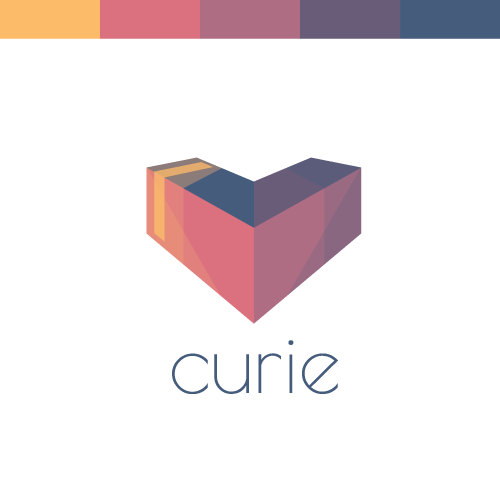
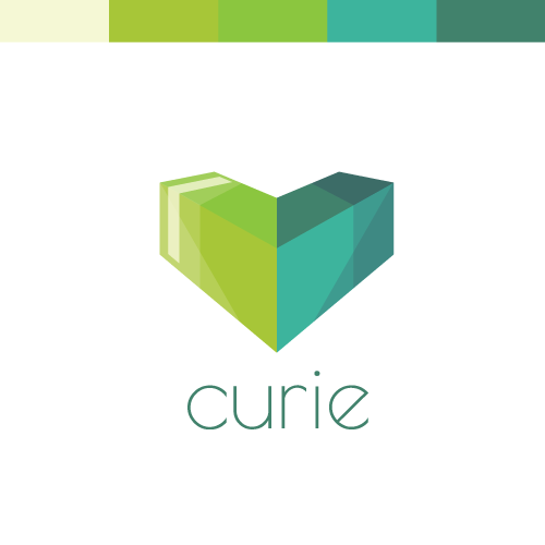
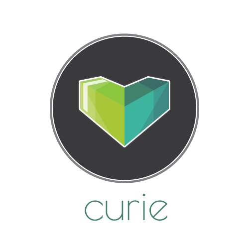
Here is my submission (two colour variants) to the contest:
My Post: Curie Logo Design Contest - Curie Heart
Here you can find a detailed description of how I came up with the shape, colour and font. Hope you guys enjoy it, I sure did! 💚
heh... it just struck me that the red one might be seen as a downvote kinda arrow?!
but that's unmistakeably not the case on the green version... totally love the green version!!
💚

 💚
💚
That's true, although hopefully the fact that it makes a little heart keeps it positive. :P That being said, I also like the green since it represents Radium and the radiation green, which fits in well with (Marie and Pierre) curie. :D
I agree with @fraenk
But the effect looks good, maybe just flip it? ;-)
up-up positive!
I actually thought about swapping it, but then it lost the heart which was important to the representation of curie I feel, "sharing the love" and all that. Also, if you read the post about the design, I described it as a 3D upvote arrow that "fell over" or in essence it is pointing out of the screen towards the user.
That being said, and apart from losing the heart shape, it does look pretty cool flipped. I might add a flipped version of the icon if there is a need, I would however miss the heart shape a bit. 😋 So thank you for the input @fraenk and @overdye, I really appreciate it!
ooooooh and make it green
but now it doesn't really look like a heart anymore though... but damn that's cool, too
Love that Logo! Great work @skippyza! :)
Thank you @w0olf :D Appreciate it.
Sweet logos! Each one has a great feel to it :)
Thanks @niko3d, I couldn't decide myself, hence the two colour options. :P
my googly eyes are loving THIS one!
Thank you, maybe all this logo needs to really shine is some googlyeyes. ;P
heh... well, a wise man once said: "everything is better with #GooglyEyes"
Really awesome logo!
Thank you @warrkin, much appreciated. :D
My entry here
Great work!
Hello everyone,
Bellow is our logo contest entry. We described the full process in one of our first post on Steemit and we will really appreciate every comment from the community. Here is the link: https://steemit.com/curielogo/@headmade/headmade-curie-logo-design-contest-entry
And here is a preview of our entry:
We also fully described the development in our post, but here are some possible applications of sign in different context:
We are happy for every feedback. Good luck everyone!
This one is awesome!
Hello All Steemians,
This is my curie logo entry:
You can look at my process in making the logo thru the link below;
https://steemit.com/curielogo/@mulkanjs/curie-logo-design-contest-entry-by-mulkanjs
Thank you very much for your attention.
Warmest regards from Aceh Province, Indonesia.
@mulkanjs
A Graphic Designer
Kereen nie.. seperti mau tes kesehatan.. kalau buta warna enggak bisa lulus.. mantaaapp..!!!👍👍👍
👍🏻👍🏻 thanks u abang
Semoga beu meuhase kiban hajat.
amin
The best logo from Indonesia.
Ini yang di sebut steemians kreatif bang,
Keren abis deh bang 👍👍👍
Great job!
Thank you
Good jobs @mulkanjs
👍🏻
good looking, its a great post. I hope you will be a winner. goodluck!! @mulkanjs
Awesome...... Its a great job. I hope you will be winner in this contest....
i hope..thanks
Mantap ..
ok..ok..hehehehee
Mantap
thanks ...
@mime
I like this design. Sangat simpel namun berkualitas... semoga menang kawan
thanks bro.....
Keren bg, desainya simpel tapi sangat menarik
terima kasih @fahmi.moul88
gron. keren
bereh..heheheheh
Logo For Curie Simple, Sederhadana dengan Desain Yang Elegan, Selamat Berjuang @mulkanjs semoga Berhasil...
terima kasih banyak
Sama-sama demi kemajuan bsc
Tetaplah berjuang dengan Teguhh...
👍🏻
Mantap. Sekadar saran, lambang vote tidak sama banyaknya dan tidak sama besarnya di setiap huruf. Mungkin perlu dipertimbangkan. Trims
terima kasih sarannya @hermanrn..siap sya pertimbangkan
Nice post broo,,
Singgh juga ke blog saya
siap adun
Fantastis @mulkanjs selamt berjuang, semoga menjadi pemenang nya.
amin.....thanks @gilangarif131294
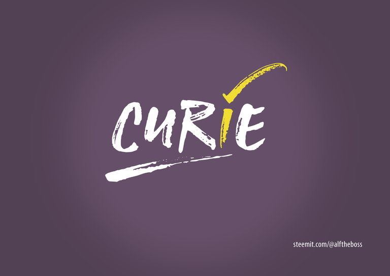
Kau telah mencurie hatiku... Hatiku....., hahahaha....
nakaaaal kamu..
Nice logo, i hope you win
thanks...
I love the colour of the logo and I hope @curie will choose this logo. Amazing!
siap broo
Desainnya terlihat simple bg tp keren, creative deh
anak bireuen harus kreative semua...amin
Good jobs @mulkanjs I like
thanks...
Logo yang simple dan fantastis @mulkanjs saya suka, selamat berjuang
terima kasih adun
Amazing, i like @mulkanjs
thanks @saiful-bahri
Sukses ya
terima kasih @musiismail
Mantap. Logonya hidup dan penuh makna.
thanks adun...
simple dan keren
saya berharap logo ini yang akan menang
👍🏻
Mameh that hasil desain droe Bg @mulkanjs. Bertuss. :D
Neu kalon sit ata lon nyompat. Bek tuwoe neu "nyan" bg beuh. Ngat sama2 teuh selamat u siploh besar. :D
Mksh
manthap...
Sebenarnya saya awam sekali masalah design, maka saya tak tahu mau komentar apa @mulkanjs... Good luck...
thanks @safwaninisam
Pasti sukses
Amin
Mereka, kami dan dia..
Mendukungmu kawan.
Good job sob
Lanjutkan !
Semoga menang ya aduen....
👍🏻
Keren. Beretus.
Good job dipegah le gob.. 🐔🐔🐔
😂😂
Bereh, kreatif dan inovatif....heeeheeee
Pokok jieh mantaplah👍
😂😂 ok...teima kasih @rahmads
I like logo. Best
terima kasih bang @rismanrachmad
mantap bang grafisnya
semoga menang dan di berikan yg terbaik bang
amin....
Hope you will winning this contest
thanks...for support
Mantap Djiwa,maju terus, terus maju.
pokok ji maju bang @mahlizasafdi....heheheh thanks bro
the design is very nice, one color. and simple.
caaaaaaaaak.....cak dulu..hehehehe
cak bek ngen bahasa inggreh payah kutranslit
😂🤣🤣
Gambar sederhana dengan Desain Yang Sangat Bagus..
Selamat Berkarya
thanks U bro...sukses untuk semua..
Bang Mulkan memang mampu
Mampu pu bang..... Rollling hehehehe
Good Luck My Friend @mulkanjs
Thanks you my friend @teukuhanis
Nice design. Hope you win this contest!
👍
This is my entry. Thank you
I love this design, @curie but really you should use them ALL!!!!!!!
Change your logo every day for a year!!!! But I vote for this one by @soundwavesphoton !!
Curie, being a group promoting good/quality contents, must have a logo that represents originality. And I would say that this logo does this job perfectly. Good work @soundwavesphoton
hahah that is amazing I love it!~
Hello Curie team! I'm simply a steemit newbie, looking for contests around, when finally found Yours.
Beyond the contest, I find the cause very interesting, The meritocratic term, in my mind explains exactly that state, the thought of a value that has not reached the worthy attention. But that deserved it.
Concept on which we could, and we should debate more in our life :-)
However the concept of meritocracy, is based in my humble opinion, on a judgment of fact, and this implies as many people as possible.
From this concept I preferred to put stylized people, in a circle to recall the concept of community. In the next eleaboration I have inserted the symbol of the upvote, as an element of common validation. Finally I opted for the red / orange color.
The reason is simple. Your proposal is clearly anti-political, as such, it makes sense to give a connotation of party color, just because you are not. The fact of declaring oneself anti-political, inevitably calls us to replace a polite superior concept, we are going to replace the political concept itself.
In short, it's a risky as a solution, but it could work =D
Hope you like it!
At least you gave an explanation for your entry, how nice... As said ib the post, you could blow this out too and make a post on your blog.
We'll love to share from how you came but the concept of the logo and maybe how you designed it too.
Cheers
Hello @dorth thanks for the kind comment! And thanks everyone for the upvotes.
nice sensation! =D
The design process, when is part of your days routine becomes pleasant and happy to explain, to make sense of it, to support your choice, in a natural way. It's the nice of contests!
Representing meritocracy, in a logo, is not something that is done every day :-) and the challenge is very interesting from this prospective.
In continuation of the previous concept I add another version, made with curved shapes, and typographically supported by the shaped font.
It is a simpler version, which expresses the same concept, but this time, the support comes from below, as a sustaining energy. The even more essential forms make it little playful, and funny/easy/quick to use in the graphic compositions, posters, banners, like below.
Below other two variations, based most on a concept of "protection":
Note: The gray color is used to get a good result in light/night steemit mode
Just continuing =D
Cheers!
If You like it here the full version with graphic blog elements:
https://steemit.com/contest/@overdye/curie-logo-design-contest-here-my-entry
💚
Hi, apparently you didn't like the video I posted. I just wanted to help, so, if one of your designs is missing or you want me to delete your design, please let me know.
Helping who? 😆
Not me.. In next video please:
put my logos at the very end..
at a resolution of 25x25px
in black and white color
👍
People who want to see the logos without scrolling for hours. It may help them to find the logos they like. You can find your logo at 5:00. The order is more or less random. Why do you want your logo at the end? The video is 1920x1080 px. 25x25 px would be to small. Also: Why should it be black and white? I' dont understand why you flagged the video. Was it because of one of these:
?
So, you cannot tell me the reason you flagged me? Please stop abusing downvotes. You're hurting the steemit community.
Your video does not help to get any information.
Where did you put them?
Thanks for understanding
Thanks for understanding!
Have a great day!
I like the Mandala feel that this logo has, well done. Think the yellow and red one is my favourite. :)
hello @skippyza! Thanks for the feedback. You have mine.
Yes looks like a mandala, that's the power of adobe illustrator Ctrl+D "Mandala Maker" tool =D
It's the last, and my favourite from my series.
It return an evocative feelings, and energy that's spinning around the upvotes.. =D
Here's my entry and the process/explanation behind my design concept
kinda late..but still want to give it a try.
*Update: High res logo variations here
What a great representation of what it stands for!
Really impressive!
wow looks absolutely amazing!
Thank you
Placing my bet on this one. Great job!
Thanks! Appreciate your support
I like this one ;)
Thank you!
this is a clean design which really fits for curie. =) Like this very much.
Thanks for your support!
This is really nice! Good job! What a creative work!
Thank you so much :)
My contribution for the contest
Lovely contribution especially the one with the globe reference.....lovely colour as well.
All the best.
Cheers.
Thanks for the support.
WOw these designs are awesome you get my vote
Thank you mate. I appreciate
Awesome man, you quite the designer.
Great design really creative. Got my vote 😉
Excellent!!! ^^
Beatiful @edxserverus
Wow these are amazing. Great designs and a lot of thought gone in to them definitely my favourite.
So many great options, I like these color scheme for these
I like it!
this is very cool! I know who to call on when we need a design :)
Super design, I like the upvote cradled in the C of Curie
I like the world logo the best.
it'll be hard to beat these designs 😉
Perfect...
Big fan of this one, so cool!
Great work @edxserverus!
You are really professional in style me friend. Good luck!
Congratulations great job
Congratulations, I really liked the creativity in your design. Very successful, for me you have already won
https://steemit.com/curielogo/@bryanlornemez/curie-logo-design-contest
here's my own entry @curie ...
that's a lot of hard work in there . #Good job
HI everyone. Here's my submission for the contest.
![Logo151[1].png](https://images.hive.blog/768x0/https://steemitimages.com/DQmUGzfMpdehsjsU6AmXebjQkZWDqnXTN7S9ZTDtm8xhgm2/Logo151%5B1%5D.png)
I have also written a post about it here
Yours steemfully
@bisodun
Nice logo, I like it
Thank you for you interested
Hi guys, here's my submission to the contest:
First of all thank you for this opportunity @curie. I made 3 variants of one design here. I went with the pleasing Orange // Blue contrast because it felt clean and professional. The main thought behind the design is that the big C shaped logo is wrapped around the upvote insignia, and it's guarding it.
Thank you,
T.
Hello Steemians!! Hello to @curie and all the people working in this awesome project.
This is my entry for #curielogo design
https://steemit.com/teammalaysia/@arelonz/curie-logo-design-contest-entry
My theme design is community, inside is the process how i came up with the idea.
Hi , this is my entry
https://steemit.com/curielogo/@steemotion/curie-logo-design-contest-curie-crew
The logo represent the curie's crew and the same time a concentric filter that let "flow" only high quality contents
Have a nice day
This is the logo that I designed for the contest.
If you would like to see the original post, you can click the link below (The post includes proof of work):
Thank you
#love this font. #good work
Love the overall look, design and representation
Alternative Version:
Missing a round form. Read guidelines again.
Updated version in circle:
bottom left could be simplified profile pic or favicon …
Here my entry
https://steemit.com/contest/@homalamba/curie-logo-design-contest-my-work-70cf366352058
This is nice! Gives off an upward vibe!
Thanks @honjun88
Hello Curie team! Here's my take on the illustrated concept:
Cheers!
I thank you for this opportunity, I think graphic designer is a great initiative in designing a logo, This is my design to the #curielogo contest and I hope you guys like it, I accept you guys are free to criticize me so I can fix it.
Thanks @adiahmad
#creative !! #AWESOME job @adiahmed .
Simple on your design, but looks really good.
Good working @adiahmad
https://steemit.com/curielogo/@crapit/curie-logo-design-contest-my-artworks
here is my entry and I will create more #curielogo
Hello @curie this is my 3rd logo with some cartoonic design thanks.
This is my 4th design and I put different color variation hope you like it thanks #curielogo
As @thatdamiguy said I tried my best for it.. It tooks time to create single line :D
may b You like it
Here's my go at it.
This one is really good. And it's simple enough to work in low resolution. I hope @curie will add it to their list.
Good work. One of few actual logos in this contest. Keep it up!
Thank you! I appreciate the kind words :)
I agree with @alftheboss, nicely done. :)
Hi, i have some designs for curie too...
Thank you. HERE
I have a new DESIGN !
HERE
Good job! 👊
thanks
Beatiful logo. Good luck.
Thank you
Creative work, very nice.
Hello!
Here's the post where I explain the logos, and here are my entries:
Patterns
I could also apply various patterns to the first logo like so:
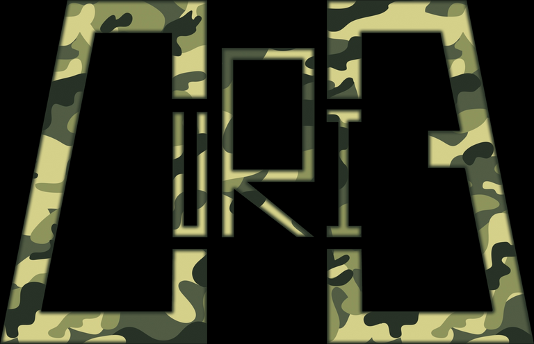
Since the logo is a binocular, I've applied the military pattern.
If you liked 'em, do upvote. Will appreciate your support. :)
#well done for your hard work .
Thank you @blue-eye012!
It is very beautiful
Thank you @lavanyalakshman! Appreciate your support!
I like the concept behind d middle entry
Thanks @dorth! :)
Hello everyone, this is my first design for the #curielogo contest. I hope you like it.
Everything starts with an atom and this shows the collective creativity of the Curie community. The ellipses going round the upvote sign depicts the quality voting process of the Curie community.
The ellipses are rotated in a way that the vertical one looks like a C, which stands for Curie.
I went with the blue colour I picked from the current Curie logo as I feel it works, It's portrays a cool, friendly and relaxing vibe.
There's a circular format of the logo without the wordmark which would work well as display picture.
I included designs containing the "Author Showcase" and the "Weekly" posts artworks to show how they'd look.
Thanks for reading, I'm really glad about this.
I love the idea :) great work!
Thank you.
https://steemit.com/curielogo/@drigweeu/contest-logo-for-curie-cbd8dd840789a
THIS IS MY ENTRY POST
lovely
As usual, I saw about the contests too late =(
Now I do not have time to get votes. But I do it freely :))
That's kind of stupid. There are so many good designs with just 2 or three votes. It shouldn't matter when you enter, as long as you do it in time. I really like your designs :)
This is my submission:
Read more details in my post
edit: here you can see how the logos would look like in "real life":
(click on the image for full size)
edit:
I created a short animation.
⬇️ vote here if you like this design
alternative 3
⬇️ vote here if you like this design
alternative 2
⬇️ vote here if you like this design
No, had no idea you tried for this one too! Will go to the original and vote. Wonderful job once again, you are very talented.
Thank you very much :) I think you can just vote for the comment, that's the vote that counts (I think).
I'm watching from a cel phone and there are so many comments that I can't find you. Send me the direct link to your participation comment.
Yeah, I know, its quite confusing with more than 500 comments :D, just scroll up and vote for the design you like. Or use this link: https://steemit.com/contest/@crypticalias/re-curie-new-curie-logo-design-contest-calling-all-designers-20180211t044203499z
i put arrows in the comments to make it less confusing
alternative 1
⬇️ vote here if you like this design
Regards @curie. This is the logo for @curielogo I created. I adjust the meaning in philosophy, from curie substances of radioactive material to cure all diseases in chemistry and physics. Hopefully pleased.

https://steemit.com/curielogo/@fooart/curie-logo-design-contest-a3af11e28f29b
It’s awesome @fooart. I love this logo, I hope your logo’s can win this contest.
😘😘😘Thank you @munadikiehl
I like your logos, especially the first one :)
Thank you @crypticalias, Greetings from me.
Thank you @curie for this amazing opportunity. Here's my entry for the contest.
( )
)
what the fcking golf logo
Hello everyone, I know I am late to the party, but I wanted to be part of this amazing contest.
The first logo contains three different shades, first is when you post it and you don't get too many upvotes (being a minnow), second is when you get a few upvotes, and the last shade represents when curie upvotes it.
The second logo is simple, with small blocks and an upvote sign. The small blocks represents all steemians.
HERE IS MY 2ND ENTRY @curie
Here are my entries.
Entry #1
Full Form
Circular Form
Entry #2
Full Form
Circular Form
https://steemit.com/contest/@scuzzy/scuzzy-s-curie-logo-design-contest-entry
On the design details and process, check out my post:
https://steemit.com/contest/@scuzzy/scuzzy-s-curie-logo-design-contest-entry
https://steemit.com/curielogo/@cuboegraff/curie-logo-design-contest-here-s-my-entry
Eiger wtf
Hello everyone, I thought I'd like to participate in this contest. This is my entry to this #curielogo contest hope you guys like it.I used flowers because Marie Curie logo also has a flower !!

Really? Gardening?
Curie is all about the cultivation of new users :)
Wow Woo! I am in!
This the Entry to this awesome Contest Organized by Curie, I find myself lucky been able to participate in this.
You can read about the detailed Process+ Conceptualization of the Project here:
Curie Logo Design Contest (Conceptualization, Logo Creation Process + Steps)
Thanks,
Ufxpression.
Simple and beautiful design.
Good day everyone, i'm from the @airhawk-project community and this is my entry for the contest
Curie has been my everything on steemit and on behalf of everyone we sat a very big Thank you to @curie
My logo design: https://steemit.com/curielogo/@oscarcc89/curie-logo-design-contest-1
Clean and precise designs that describe the Curie community.
I hope you like them.
Greetings and good luck friends Steemians.
Hi @curie! I would like to join your logo contest and below are my designs for my 1st entry.
Like that crescent.
Thank you! :)
Definitely clean!
Thank you @christheaudioguy!
Wish you the best of luck. Voted 👍
Thank you for appreciating my design. It means a lot. :)
Very clear lines. Like it!!
I am glad that you liked it. Thank you!
Super clean and a clever design, very impressed.
Thanks @coff33a! I am more encourage to do logo designs because of your comments guys!
I like your moon logo. I clicked the app icons to open the app - but the app it did not open.
nice work
good luck with the contest 😍
Thank you @hazem91!
Nice @coinbelly I'm all in on red
I do like that one also. Thank you!
this is my entry for the contest. I tried as much as possible to keep it simple.
Love this bro,good job.
I like it, its simple and nice
Nice work
Dope
This is beautiful, love it
Nice one here.