Hello @dorth thanks for the kind comment! And thanks everyone for the upvotes.
nice sensation! =D
The design process, when is part of your days routine becomes pleasant and happy to explain, to make sense of it, to support your choice, in a natural way. It's the nice of contests!
Representing meritocracy, in a logo, is not something that is done every day :-) and the challenge is very interesting from this prospective.
In continuation of the previous concept I add another version, made with curved shapes, and typographically supported by the shaped font.
It is a simpler version, which expresses the same concept, but this time, the support comes from below, as a sustaining energy. The even more essential forms make it little playful, and funny/easy/quick to use in the graphic compositions, posters, banners, like below.
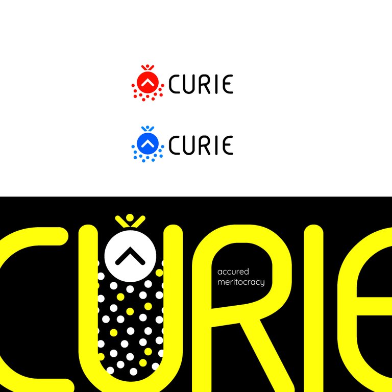
Below other two variations, based most on a concept of "protection":
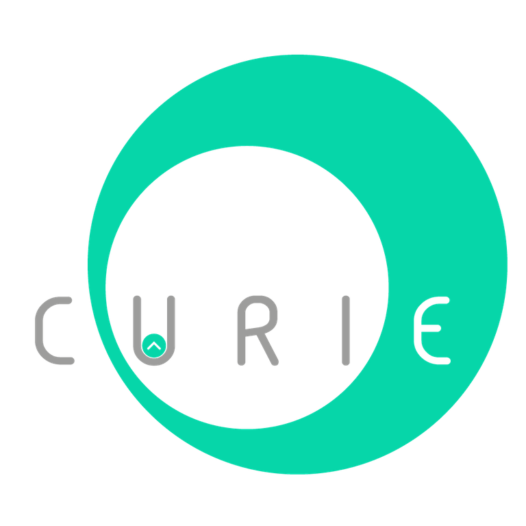
Note: The gray color is used to get a good result in light/night steemit mode