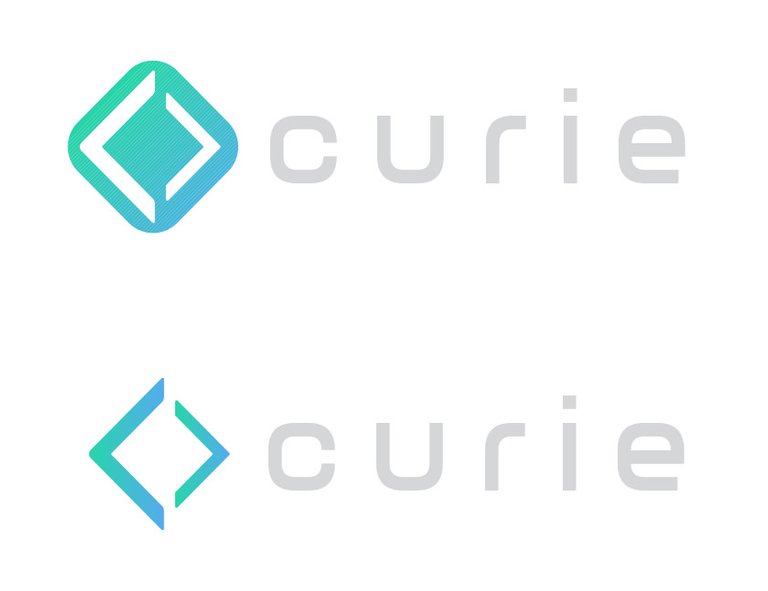
My explorations were based on the "C" shape and an arrow pointing forward, symbolizing progression. The colors I chose were a mixture of the Steemit platform logos and a gradient that signifies the blend of both of them together. Thanks for the opportunity!


Great! I like the second one the most.