Click here for a full size chart image
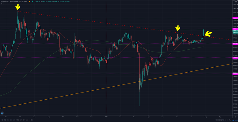
What we are looking at here is the longest term downward trending line you can draw on the Bitcoin chart.
The three yellow arrows touching the line are dated
- 17th December 2017
- 26th June 2019
- 1st June 2020
The green arrow on the right shows today's candle breaking that line on:
- 27th July 2020
What Does This Mean???
Ah, ah, aaaah!
That's the kind of question that will cause you to lose all your money.
It doesn't MEAN anything. There is no meaning in a candlestick chart. It's just data. You and I add the meaning to it, and that's just in our head.
This is just an objective observation. What happens next is anyone's guess.
Make your own investing decisions, but always pay attention to how much risk you are taking.
More From Me
Create a free HIVE account, follow me and I'll tip you with crypto for your comments.
Click here to create your HIVE account now
Learn new skills at Cryptoversity, the world's first online school for Bitcoin, cryptocurrencies and blockchains.
love the "what does this mean" segment Chris. It shows you really do care about the people who listen to your advice, cheers
I feel many people will get trapped by this breakout but... I might be wrong of course^^
Fomo is a very powerful force.
Yeah I had to learn that the hard way and I am grateful I got scathed a bit back then and got the lesson ;)
I love this trading article breaking our expectations :) It is always good for someone to remind us to not get over-hyped
Highest we've been in nearly a year, hoping to see a good daily and monthly close 🚀
Good teaser indeed, it means with 100% certainty that it will go one way or another :-)
"Ah, ah, aaaah!" Lol love it