This post is in response to @pkaterra's request here
The central problem is information density. On a 27" 4K screen running at 175% scaling, I can see only 6 posts in one page. On Reddit, I can see 16. Granted, Steemit has an extra line for description, but that still means Steemit's feed is less than half as efficient as Reddit.
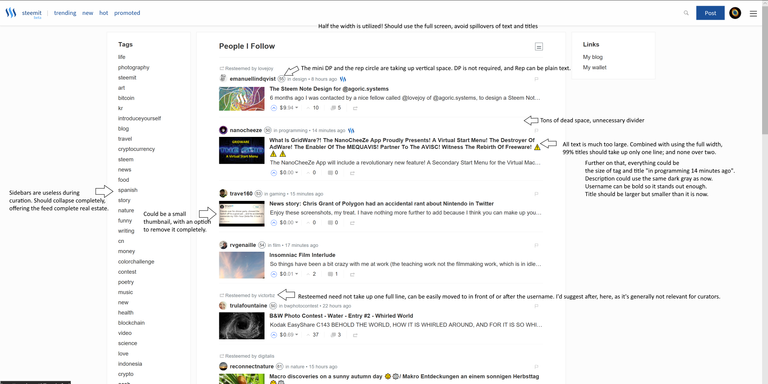
So here's a very rudimentary illustration that points out everything. Here's a link to the full 4K version - https://imgur.com/a/ovUyo
I'd even suggest dual paned feeds, but that would be controversial. Maybe something to think about in the future.
PS: This is an example of dual paned feed. It's the Reddit app called Readit. It's easy to see how this will be a lifesaver for curators. No need to constantly shuffle between feed view and post view!
In addition, I'd love to see a sophisticated filter feature. More details in an older post here, but here are some of the parameters important to me -
- Min / max Rep of author
- Tags to match / avoid
- Min / max pending payout
- Min / max votes
- Min / max comments
- Min / max length (characters)
- Min images
- Min / max SP holding of the author
- Title keywords to match / avoid
Filtering is absolutely crucial for curators. Currently, there are many workaround solutions, but we'd like to see an intuitive UI with it.
Curators, do you agree? Please add further feedback, so I can incorporate it into the image. Better still, for graphic designers, feel free to make a better infographic out of it :)
PPS: In post view it's even worse! It uses less than one-third of available screen real estate. This should be expanded too.

The filters are a to-die-for feature! I'd want that. As of the moment I'm using something from Tampermonkey that can add some filters but all it does is grey out some posts. It will be nice to see more intuitive and in-depth filter options. Something that functions properly, like those in shopping websites. Where you are provided multiple filtering options that you can choose to use in any combination possible.
Having an option to change the number of columns in your feed will help those with larger resolution screens.
If you can add in color options that will be nice too. I've seen some websites that allow people to switch layouts and colors freely with 2-5 options available for them.
Post view is a pain when you make graphics - you have to make sure to make it less than 670 or so pixels to make sure they won't reduce the size of your photos and graphics. The uniformity is appreciated though, since I know definitely that all people will see the same thing I'm seeing. But I'm sure we can add other things into a screen's real estate without cluttering it. The post view will not look so much barren/boring if you'd add a background image or a colored background (that users can set themselves probably), and just add in a content box for the post itself. If there's extra spaces on the sides then automatically show up a sidebar (which users have the option of setting up on their own as well).
Just some of my thoughts.
Some great feedback! I'd love to see a "dark mode" (like the Readit app)
Everything that everyone has said here is incredibly crucial, and I know a lot of us 3rd party devs have built stuff on top of Steemit just for it to be usable for curation, etc.
I do have a suggestion about content saving, and sessions which I believe should be also incredibly important as far as reliability of service goes:
A much improved content saving cataloging system: Right now if a post does not go through (due to a transaction error / connection errors), sometimes it might save in the session so when you click back on post some/most of it might still be there, However if you click on post again (say from another browser tab) the content can disappear as a new post-session has been generated. So my suggestion would be to have an actual front-end 'pseudo-perma store' of posts, which can either be saved as a cookie or some other method of JS-storage, such that if you write a post and decide to leave it for a bit (or crashes/connection issues occur), it will/can saved as a 'draft', these drafts can be cataloged client-side and will allow the user to select from their drafts when they write a post again (hence saving the posts/comments and not being destroyed). This would obviously drastically reduce the impact of server instability / client issues in terms of people writing posts/comments.
Thank you for making this post @liberosist. I absolutely do not like the new UI. I had no big issue with old UI, I loved it.
First of all, why not give users an option to go to old UI with a "classic" link? So many major sites have done that when they made major changes to UI. Why break something that has worked fine?
It seems to me new UI is targeting easy changes for multiple size device supports. But I should say I have used old UI only multiple phones, tablets, pc and mac. It worked just fine on all of them.
Top line with username, etc should be at the bottom. I think a title should always be at the top. Title tells the most about the post. username, rep, category, time, resteemed, etc they all should be at the bottom before the upvote, resteem, etc line.
I don't think there is a need for sidebars to be visible by default. They should be collapsed, and only accessable upon need. That can give more real estate for more info on the post and/or more condensed view.
Toggle view is good, but if it doesn't give a more condensed view or two-pane layout, I don't see much use for it. As many have mentioned already, we would like to be able to see as many posts as possible.
Filtering option would absolutely be great.
Having a sophisticated filtering option is absolutely necessary so curators can find what they are looking for easily.
I agree on everything you said here, there's lots of white space that can be utilized and post itself condensed so it does not take so much vertical and horizontal space.
I like the dual paned feed idea, that could be a life saver. Although there should be an option for viewing author's whole profile as well, cause I rarely take a look at just a single post without glancing at history.
Another question for the curators:
How much curation do you do on mobile vs desktop?
Desktop, always.
That said, I'm probably an outlier - I rarely use mobile, I find it far too clunky and inefficient. Only for phone calls, messages and some quick consumption. The least I need to be productive is a convertible such as Surface Pro.
Thanks again for putting this list together. I agree with most of your annotated suggestions (e.g. the presentation of reputation, smaller images etc.).
I also agree with you that post titles shouldn't take up multiple lines. Within this update, I actually placed some CSS that limits titles to 1 line using a CSS property called 'line-clamp'. Although this property is supported on Chrome, Safari and Opera, it's not supported on Firefox or IE yet http://caniuse.com/#search=-webkit-line-clamp
Filters would be fantastic. Dual panel feel is interesting idea–for it work well and feel snappy, we'll have to keep improving performance.
Anyway, let me follow up with you when we start designing this out.
Thanks for your comment! Of course, reliability and performance need to come first before niceties like dual-pane. Do keep us updated about progress with the UI enhancements!
There are tons of great feedback by other curators in this thread - hope you'll take all of it into account.
The double paneled view would be useful when curating posts. However simply being able to view more posts on the page would be beneficial as well. There is a lot of scrolling required currently, and anyone who curates knows how much time the process takes. Anything that could improve the rate upon which posts could be viewed would be a useful addition. So I am in favor of both or either of your suggestions.
As for filtering, at the barest minimum we should have the ability to concurrently view a subset of tags at the same time. Curating multiple tags is a chore, especially considering the overlap of content. Being able to bring them all together at once would save a lot of time as well.
I would like to suggest one additional feature - Hide the post when Upvote by anti-spam bot - cheetah, blacklist-a.
Cheetah gets a lot of posts wrong, but what could be done is a filter option. Filter if a certain author has commented on it etc. Then you can add in the bots of your choice :) It'd also be useful to filter out posts where authors have bought votes etc.
It's absolutely critical that there is at least a prelim solution to this problem within the next month or so. I agree that curators need a better way to take advantage of more screen real estate - I feel that's a no-brainer.
More controversial, in my opinion, is what form the filtering options should take. Depending on what form shakes out, it could end up really making life different for authors. So I'm anxious that these options give authors more exposure in general, not punish them for not using on of a couple in demand topics.
Totally resteemed. This is a community discussion that needs to happen before too many more UI changes are implemented.
That's a fair point, but ultimately a good filtering system will be beneficial to authors as curators can find your posts easily.
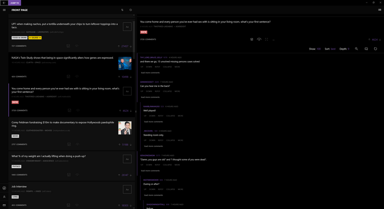
You covered mostly all of what we need and @deveerei did some useful additions too. Just emphasizing here on my IPad the old UI gave me a view of 10 posts at a time, the new one gives me two which is a degrade in my opinion. Good to see we can make suggestions, hopefully they get looked into
That's crazy! That doesn't sound right, something must be totally broken on iPad. Post some screenshots?
I wish it was iPad i doubt it tho, i think it's just the UI. Here are some screenshots.
Before
After
The images are clearly taking too much space.
Ah, it's defaulted to the expanded view... There's still a compressed view, but I don't know why the button to toggle it doesn't show up for you. You should file a bug report here - https://github.com/steemit/condenser/issues
Wow so I have been missing out lol, thanks will do.
my hope is that we will see some kind api theming studio either as part of condenser or a library that can interface with the blockchain easily. i started looking at the open source react version of connecting to steem and i much prefer that over this current version of condenser for sure.
Those are interesting observations, and suggestions. I think that with the recent update, less posts fit onto one page for us to view and we need to scroll more. I too find this a little less accommodating than the previous format.
We'll find the format that works, we just need to try more things out and tweak it all.
Yes, the new update makes it even less condensed than before.
Oh, that's good!
Hey @liberosist,
I think that the look is "cleaner" because of that white space, and may be a good appeal to new users coming into the platform. I'd be entertained to see dual panel as well, be a lot easier to browse. I thought I was just super slow at scrolling through posts, but it's a good thing to point out in the comparison to reddit.
I browse TIL quite a bit and the layout "feels" a lot smoother than where steemit is currently.
@minboot resteem this Post .

Follow me to Resteem!
my hope is that we will see some kind api theming studio either as part of condenser or a library that can interface with the blockchain easily. i started looking at the open source react version of connecting to steem and i much prefer that over this current version of condenser for sure.
Introducing Filters is absolutely must , far down the line i think curation will become a tonne easier , which would reduce the whole concepts value i guess.
What do you think people ?
I'd also find it extremely useful to have a view specifically for trying to curate photographs. This would probably only work when there is a single image in a post but I guess the first image could be shown in a larger thumbnail or maybe show posts in a grid format in this mode. Steepshot does a pretty good job of this, but that kind of view would be awesome if it was integrated into Steemit itself. I do see a future for the use of Steemit for professional and fine art photographers but it is currently really, really hard to separate the wheat from the chaff (and then you also have the issue of photo ownership and plagiarism, but that's a whole different ball game)