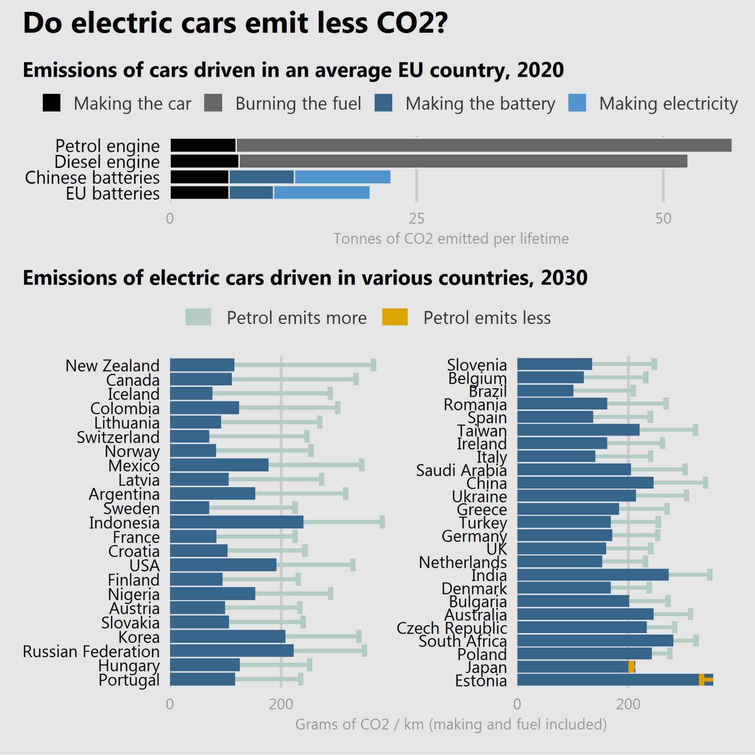
Depending on where you are in the world, you might be actually doing more damage than good driving an electrical car.
The following image shows the emissions of electric cars driven in various countries and what's expected to happen in 2030 assuming the current technological trajectory.
To lower the emissions as much as possible, batteries need to be produced in countries that pollute less, and electricity needs to be generated from "green" sources.
Getting electricity from fossil fuels to charge an electric car because you don't want to use fossil fuels makes no sense. Electricity needs to come from renewable sources.
#datavisualization #visualization #data #sustainability #tesla #renewablenergy
Hey dude this is awesome! You should post this in my Data Viz community! I'm so glad that you're into it as well. That looks like Tableau, isn't it?
You also appear to be more advanced than I am, so I love that! I can see if you can give me some tips for formatting particular things.
Hi! Thanks! I appreciate it!
The image is not my original work btw, I've added the source bellow in the comments. The opinion is mine though :)
Having said, I worked with specifically with data visualization in a research lab from 2013 to 2014 called Computational Design and Visualization Lab and even though I moved to a broader application of data science, including AI/machine learning, I've kept my interest and I try to share nice visualizations every week on LinkedIn (started to do it here as well) :)
I can definitely give you some tips if you want, but I must warn you though...the visualizations I used to develop were custom made and made with tools like (processing)[https://processing.org] and similar.
I'm not an expert in tableau, power BI or other more "generalist" products, and even though I respect their power I'm afraid I wouldn't be much help...
Ah good to know. Still glad that you like the Data Viz things! I think they are really cool. I think it's awesome that you have started sharing visualization stuff here, we really need to have more of that type of content on here. I hope I can fill a decent void on the platform to get a good presence on here for it. Feel free to post any of those things in the Data Viz community and I will gladly check them out!
No worries on the knowledge base with Tableau, I'm learning myself so I at least appreciate you share the content but I would like to expand to Power BI in the future, one of my colleagues uses it and he absolutely loves it. One step at a time for me though!
This got me thinking, I remember some time ago spending one or two days finding all Steem profile listing Portuguese cities in their profiles and visualizing them on a map. All done with custom code, maybe you'd be interested in checking it out. It's not beautiful, but it's real :)
EDIT: Completely forgot to link it. Here it is.
Awesome dude! That’s great, I love it. Visualization like that is really cool to have. I will add that to one of the things I’ll do when I get hive user data. To check all the users and their locations. It’s not the most reliable but a lot of people add their at least basic location so showing that will be something really interesting!
Appreciate you sharing that with me!
!ENGAGE 40
Thank you! ^^
And yeah, the data is not reliable, but it rarely is.
The important thing is to be able to take some concrete conclusions that allow us to understand a little bit better, right? ;)
Can't wait to see your analysis!
ENGAGEtokens.Source
Congratulations @manuellevi! You have completed the following achievement on the Hive blockchain and have been rewarded with new badge(s) :
You can view your badges on your board And compare to others on the Ranking
If you no longer want to receive notifications, reply to this comment with the word
STOP